DPChallenge: A Digital Photography Contest You are not logged in. (log in or register
 
Browse Settings
Currently viewing:
Registered Userphotom

Show comments:

Per page:

Order:

Comments:


Comments Made by photom
Pages:   ... [77] [78] [79] [80] [81] [82] [83] ... [259]
Showing 791 - 800 of ~2590
Image Comment
Painted Desert, Arizona
08/11/2004 03:57:16 PM
Painted Desert, Arizona
by j8xman

Comment:
A very good submission. Like mine, your parallel lines curve; I can't believe someone voted me down because my lines were not straight and headed for the horizon! Good exposure and composition - the clouds really add to the country feel.
Photographer found comment helpful.
.
08/10/2004 02:42:40 PM
.
by David.C

Comment:
Hi David and Greetings from the Critique Club.

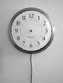
Congratulations on your 12th place finish in a very competitive competition. There are several reasons why it finished so high, primarily because it defines the "ultimate" freedom - time. No matter what else could define freedom, time has to be number one. As I recall, you are the ONLY person who used this theme - which shows a good imagination along with creativity.

I'm doing this critique wothout looking at your 29 comments - just to see how it goes. I suspect most of what I'll say has already been covered. This is why I made the post in the forum - that once a CC member sees this - just drop a note saying the prior comments already "said everything I would."

Now - about the image:

Composition The composition is very effective - there's not much I'd chnage about it, although I'd like to experiment with the cord angling towd the left bottom, just to see what it would do for it.

Exposure Spot on, the white in the clock face is just white enough to stand out against the off-white wall.

Lighting Besides the great idea and composition, your photo is all about texture. The wall texture is absolutely perfect for the clock. (I disagree with your thoughts on that.) So - given that, what would be the best way to optimize the texture? I would love to see you shoot this with almost 90 degree side lighting coming from the right and producing long shadows on the left (main light.) I think long shadows would emphasize passing of time.

Then a small, well diffused light on the front - but not "straight on." The goal of this light is to light the face without producing the glare on the frame. It would probably work best to use a white reflector rather than direct flash.

Title I think your title is great, but not for DPC purposes. The voters here are very particular - so it just may have gotten a few more points with a title like "Who Cares?" (But if points aren't that important, as I said, I really like the one you used.)

Hope this gives you an idea of how I personally do a CC Critique.

Keep shooting and sharing - and congratulations again.

-Tom-
Photographer found comment helpful.
It's Freezing!
08/09/2004 03:52:10 PM
It's Freezing!1st Place
by EddyG

Comment:
Superb idea and nice capture. I'm more concerned what you did after the shot though, colors seem a bit "too vivid", skin a bit like plastic. Black background is perfect.
Photographer found comment helpful.
Discovery
08/09/2004 03:48:16 PM
Discovery
by mrorange002

Comment:
Excellent idea. From what I can tell - it would be a great example of selective focus in that the feet appear crisp while the face is soft. Colors seem very nice. Not sure about the diagonal line at the top. I want to give it a higher score but it is just too small to do so.
Photographer found comment helpful.
Got Enough Paper?
08/08/2004 05:53:05 PM
Got Enough Paper?
by Tiberius

Comment:
This works exceptionally well in B&W. Unusual TP - not much texture showing. I don't care for the white-line border.
Photographer found comment helpful.
Lord of the Rings
08/08/2004 05:51:42 PM
Lord of the Rings
by caba

Comment:
Perfect background brings out the other colors very nicely. Your lighting is just right. The pun in your title - with the pineapple rings - is pretty clever too.
Photographer found comment helpful.
Vine Ripened: Original and Cherry
08/08/2004 05:49:47 PM
Vine Ripened: Original and Cherry
by banmorn

Comment:
Great subject photographed with the perfect background. The soft lighting really makes this a strong image. I think you could have found a more artictic way to create the composition.
Photographer found comment helpful.
Home Sweet Hole
08/08/2004 05:47:39 PM
Home Sweet Hole
by scalvert

Comment:
It's a fantastic optical illusion. I would guess the crayon is way OVERSIZED rather than miniature, due to its relationship with the wood. But I still like the image a lot - one of the most creative in the challenge.
Photographer found comment helpful.
a foot short
08/08/2004 05:44:16 PM
a foot short
by annasense

Comment:
That is one gorgeous slipper. Great composition and lighting. One of the best in the challenge.
Photographer found comment helpful.
Care For A "Little" Beer?
08/08/2004 05:43:03 PM
Care For A "Little" Beer?
by TommyMoe21

Comment:
Excellent composition and lighting - the entire image really works well. Background color selection is perfect. Have your model quit the nail biting.
Photographer found comment helpful.
Pages:   ... [77] [78] [79] [80] [81] [82] [83] ... [259]
Showing 791 - 800 of ~2590


Home - Challenges - Community - League - Photos - Cameras - Lenses - Learn - Help - Terms of Use - Privacy - Top ^
DPChallenge, and website content and design, Copyright © 2001-2025 Challenging Technologies, LLC.
All digital photo copyrights belong to the photographers and may not be used without permission.
Current Server Time: 08/27/2025 08:59:42 AM EDT.