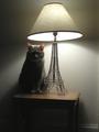
DPChallenge: A Digital Photography Contest You are not logged in. (log in or register
 
Browse Settings
Currently viewing:
Registered Userphotom

Show comments:

Per page:

Order:

Comments:


Comments Made by photom
Pages:   ... [67] [68] [69] [70] [71] [72] [73] ... [259]
Showing 691 - 700 of ~2590
Image Comment
McZoom!
08/19/2004 01:35:48 PM
McZoom!
by dwterry

Comment:
Creative shot and title. One of the better sign shots - yours shows imagination and skill. Tilted perspective is great. Border = ugly and distracting.
Photographer found comment helpful.
Requiem for a Hangover
08/19/2004 01:10:14 PM
Requiem for a Hangover
by JJacobson

Comment:
Very graphic. The vibrant colors are superb. Good seeing - one of the top 10!
Photographer found comment helpful.
Gravitrons Pull
08/19/2004 01:05:39 PM
Gravitrons Pull
by smokeditor

Comment:
Now this is what the neon challege should have been about! Great composition, perfect exposure!
Photographer found comment helpful.
The Tourist
08/17/2004 05:06:18 PM
The Tourist
by Elemmennope

Comment:
Hi Jennifer and Greetings from the Critique Club

First let me say I really liked your Balance Entry - on several levels.

Before we disect your The Tourist let's discuss the scores a bit. I suspect that a) some voters (many perhaps) may not have noticed the Eifel Tower replica - and spent time looking for the "miniature" cat. b) Some voters felt like there needed to another "similar" item to make the size comparison - that is a miniature spoon with a regular fork, but they would have trouble comparing a cat to the tower. c) Some voters plainly "hate" cats and vote them low. d) Others may not have drawn the connection to the title and the mood you were trying to convey.

Having said all that - now lets try some of the "standard" ways of looking at the image.

a) For those that "got it" - the moodiness of the lighting, or the mystery of a tourist in a foreign country, these comments won't apply. Let's face it - you "violated" some sacred rules.

1. The most obvious area is the lighting. a) The entire bottom of the picture (below the table) is in shadow, so the traditional lead-in line(s) is/are missing. b) The main subject is in shadow (most would think the subject is the cat) except for the ears. Many would really want more light on the face and especially the eyes.

2. The composition is also pretty non-traditional. There are several items that are not "straight" or "level." The lampshade, the angle of the table to the ground, and the angle of the baseboard all create an unnatural tension.

To get the attention of those who didn't get it, there are a couple things you may have tried - to EXAGGERATE the effect you were after. I know it probably would not work, but can you even imagine the cat in a tiny trench coat? Another approach would be a title in French instead of English - like "Regardez des champions du Mars" may have helped some.

In any event, I got the feeling you had fun doing this - and that's the most important thing!

Keep shooting (for yourself, not the voters) and sharing. It's more fun that way!

-Tom-
Photographer found comment helpful.
This Bud is for You!
08/16/2004 08:34:03 PM
This Bud is for You!
by vtruan

Comment:
Excellent! You've done a great job of setting this up, perfectly composed and exposed.
Photographer found comment helpful.
Lilly
08/16/2004 08:32:11 PM
Lilly
by GBServis

Comment:
Lovely water lily - in nice soft lighting. Very well composed.
Photographer found comment helpful.
Trees on the River Stour
08/16/2004 06:54:24 PM
Trees on the River Stour
by e301

Comment:
A very peaceful scene with nice subtle colors.
Photographer found comment helpful.
memory lane
08/16/2004 06:51:58 PM
memory lane
by willem

Comment:
Is that snow?!! What a pleasant sight for me - it's been over 100 degrees the past few days! (It may be some take off on infared, but I don't really think so.) In any event, this is a creative and well execued B&W. Great blacks and good tonal range. The snow in the shade is a bit grayish - but behind is perfect. Composition could not be better. Overall - this is full of impact and wow! (Just finished voting on 100% - and expect you to be the pround owner of a new ribbon soon.)
Photographer found comment helpful.
Orange Sunburst
08/16/2004 06:46:19 PM
Orange Sunburst
by mattrix

Comment:
Brilliant orange - but overexposed I'm afraid. You needed softer or more filtered lighting. The orange line in the border is a bit muc.
Photographer found comment helpful.
Helianthus annuus Pastiche
08/16/2004 06:44:31 PM
Helianthus annuus Pastiche
by banmorn

Comment:
Cool. The whit background really sets off the plant and flowers. I'm not a huge fan or borders, but this one is fairly non-obtrusive and holds it together nicely. Exosure seems perfect as does the focus.
Photographer found comment helpful.
Pages:   ... [67] [68] [69] [70] [71] [72] [73] ... [259]
Showing 691 - 700 of ~2590


Home - Challenges - Community - League - Photos - Cameras - Lenses - Learn - Help - Terms of Use - Privacy - Top ^
DPChallenge, and website content and design, Copyright © 2001-2025 Challenging Technologies, LLC.
All digital photo copyrights belong to the photographers and may not be used without permission.
Current Server Time: 08/26/2025 06:00:51 PM EDT.