| Image |
Comment |
| 04/17/2004 01:51:03 PM |
|
 Photographer found comment helpful. Photographer found comment helpful. |
| 04/17/2004 01:49:07 PM |
Would YOU mess with this one?by rmahanComment: Definitely a stong animal. The texture on the fir is nice. Improvement areas: 1) Needs more light on the face - perhaps fill flash of wait until he turns his head a bit to his left. 2) The out-of-focus white brach in the upper right corner is very distracting 3) The white trunk behind the animal leads your eye up and out of the frame. |
| Photographer found comment helpful. |
| 04/17/2004 01:42:58 PM |
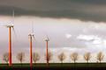
Colourful Windpower after the Rainby simbambaComment: Nice seeing - wonderful use of repeating shapes. Composition great, colors very effective. The only thing that detracts from this picture for me are the powerlines, poles and building in the very background. |
| Photographer found comment helpful. |
| 04/17/2004 01:35:49 PM |
economic strengthby fstopopenComment: Nice silhouette. Colors very nice. The merger of the pump with the top of the frame is a bit disturbing. |
| Photographer found comment helpful. |
| 04/17/2004 01:30:51 PM |
|
| Photographer found comment helpful. |
| 04/15/2004 06:14:31 PM |
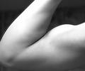
The Power Of Manby DamianComment: Black and white was a good choice for this. Don't like the "haze" abot the arm in the upper left. |
| Photographer found comment helpful. |
| 04/15/2004 05:58:10 PM |
Strength is in the Cardsby rudacbComment: Nice studio setup - like the use of all black and white in a color photo. I think the lighting seup could have been better executed as the top of the glass seems a bit weak. Both the left and right side of the top of the glass tend to merge into the background. |
| Photographer found comment helpful. |
| 04/15/2004 05:55:12 PM |
Freestyle Wrestlingby pmichaudComment: Definite show of strength - and you don't need either face to show it. The yellowish cast detracts a bit as does the ref's legs at the top. |
| Photographer found comment helpful. |
| 04/15/2004 05:53:43 PM |
The power of elementsby DBoyComment: Pretty busy photo. The green diagonal area is a nice touch. Flat lighting didn't help much, might have been better with afternoon long shadows. |
| Photographer found comment helpful. |
| 04/15/2004 05:50:07 PM |
No Nonsenseby toekneeComment: The face and arm are great shows of strength. The geen background is a perfect choice for his skin color. Unfortunately, the area of most contrast - the white band at the bottom with a black base - draws way too much attention. This cost a couple points - would have been a 9 without it. |
| Photographer found comment helpful. |
Home -
Challenges -
Community -
League -
Photos -
Cameras -
Lenses -
Learn -
Help -
Terms of Use -
Privacy -
Top ^
DPChallenge, and website content and design, Copyright © 2001-2025 Challenging Technologies, LLC.
All digital photo copyrights belong to the photographers and may not be used without permission.
Current Server Time: 08/24/2025 03:23:29 AM EDT.