| Image |
Comment |
| 05/03/2004 09:43:12 PM |
Global Warmingby ArtifactsComment: You've picked the perfect colors for this. Very pleasant. I like the diagonal composition too. But dummy me, I must be missing something on the title - but there's no deduction for that. It's better than some that just said "abstract" for their title. Nice job. |
 Photographer found comment helpful. Photographer found comment helpful. |
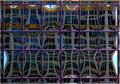
| 05/03/2004 09:40:27 PM |
Separate Realityby flip89Comment: Very nice abstract. Colors work very well together. The varying rectangle sizes not being consistent gives it a nice randomness. I wish all of the brightest areas were not so close to the outer edges, as they lead you out of the frame as is. The very narrow border on the outside tends to mitigate this though - although normally I'm not a big fan of borders. |
| Photographer found comment helpful. |
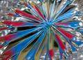
| 05/03/2004 06:16:11 PM |
Primarily Prismaticby MWittComment: Nice colors and lines. Your placement of the "center" of the main subject is also well done. |
| Photographer found comment helpful. |
| 05/03/2004 06:13:38 PM |
Water On Fireby bruskiComment: The colors are marvelous asare the textures. Compositionally it is a bit unnerving for me. I think I would be much happier about it if I could see the rest of the large gray/silver shape at the bottom. It may also be stronger if the grey/silver shape were positioned a bit more CCW in the image. Overall though - this is a very stong submission, it should do well. |
| Photographer found comment helpful. |
| 05/03/2004 06:08:00 PM |
Dawnby instepsComment: Excellent composition - the gradual transition of brightness from bottom right to upper left is quite effective. |
| Photographer found comment helpful. |
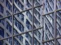
| 05/03/2004 06:06:42 PM |
Mellon1835Blueby banmornComment: Very nice reflection I presume and a wonderful abstract. Colors work very well together. The diagonal lines add a bit of tension. Very well executed. |
| Photographer found comment helpful. |
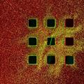
| 05/03/2004 06:05:23 PM |
Nine Squaresby artvetComment: Very nice colors that work well together. The dark squares add a bit of mystery. Well done. |
| Photographer found comment helpful. |
| 05/03/2004 06:04:14 PM |
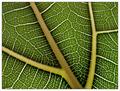
Pathfindingby vadviragComment: Definitely an abstract in my opinion even though the guidance was "if you can tell what it is, it's not." No point deducted from me for not being an anstract. It is well composed and a pleasing image. My comments for improvement are:
1) A stronger backlighting would add and 2) The larger veins are a bit soft because they are not quite on the same plane as the main leaf. If you did not stop full down - f32, f45 - try it again if yu can. |
| Photographer found comment helpful. |
| 05/03/2004 06:00:20 PM |
Earth, Wind, and Fireby karmatComment: Very interesting and well done. I like the way the colors are not repetitive and predictable. Although it works in this composition, I'd like to see what it would do if it were not so centered. Some of the whites are a bit bright. Overall a very nice image that meets the challenge without a doubt. |
| Photographer found comment helpful. |
| 05/03/2004 03:00:43 PM |
|
| Photographer found comment helpful. |
Home -
Challenges -
Community -
League -
Photos -
Cameras -
Lenses -
Learn -
Help -
Terms of Use -
Privacy -
Top ^
DPChallenge, and website content and design, Copyright © 2001-2025 Challenging Technologies, LLC.
All digital photo copyrights belong to the photographers and may not be used without permission.
Current Server Time: 08/26/2025 05:04:31 AM EDT.