DPChallenge: A Digital Photography Contest You are not logged in. (log in or register
 
Browse Settings
Currently viewing:
Registered Userphotom

Show comments:

Per page:

Order:

Comments:


Comments Made by photom
Pages:   ... [191] [192] [193] [194] [195] [196] [197] ... [259]
Showing 1931 - 1940 of ~2590
Image Comment
Shall We Dance?
05/14/2004 06:35:41 PM
Shall We Dance?
by OneSweetSin

Comment:
Hi Anna *Greetings From the Critique Club *

Well - you are certainly an active "old timer" to DPC! Congratulations.

As you most liklely have guessed - some folks felt your image was not abstract enough for their taste. That's probably a good part of the reason you didn't score higher.

I think it's really interesting when an image gets both "I hate it" and "I love it" comments. It sure shows the diversity of the DPC crowd.

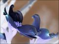
Since you already have a nice image, how could it be changed to be even better? (Since it is an abstract - we shouldn't discuss things such as focus as an abstract could be totally blurred if the photographer wanted.)

Therefore the key lies in composition, line and shapes - coupled with colors. YOur image definitely has some excellent shapes and texture - and some very interesting colors.

A viewer's eyes - when first looking at a picture - will dart right to the point of the largest contrast. From there the eye will follow a natural lead-in you provide. In this image - the area of most contrast is the dark petal above the bright area on the left side. The problem is that there's not a real lead-in back to the nice blue colored shapes. That area is pretty bright.

You can kinda tell how an image will make your eyes behave by squinting at the picture just to see the bright and dark patterns.

My suggestion would be to crop the bright part of left side out since the challenge did not allow spot editing.

Since many felt it was too literal - you could also try some other things that would make it harder to read such as filters, rotating, etc.

Bottom line - it's a nice image and thanks for sharing it.

Keep submitting - you have a good eye.

-Tom-

Photographer found comment helpful.
Fork Lift Chains
05/12/2004 06:35:09 PM
Fork Lift Chains
by goinskiing

Comment:
* Greetings from the Critique Club *

You are very fortunate - receiving 20 comments already! But, as is often the case, they don't necessarily agree. Since this is your second best finish to date - you are probably happy, but would still like to determine why it didn't finish higher.

The really strong points of your image:

a) The diagonal composition is superb.
b) Textures in the areas of sharp focus are both interesting and colorful.
c) It cetianly meets the challenge.

There are just 2 areas that I see that could have moved your image up in the standings; one of them has been mentioned in other critiques. That is your Depth of Field. Since this is a "macro" shot, you were fairly close to the subject. That in itself leads to a shallow DOF. But, you elected to shoot wide open (f 2.8) and used a shutter speed of 1/20th second. You could have increased the depth of field by shooting at any correct exposure (f 4 at 1/10, f 5.6 at 1/5, up to f32 at just over 6 seconds.) If the chain was not moving - and you have a steady tripod - try the shot again to see how you like it with more area in focus.

My other area of concern is that the viewer's eye tends to head for the area with the greatest contrast. In your image - that's the 5 white areas next to the dark colors. Two of them (the one on the top left and the right edge) are right on the border. These would tend to lead the viewer right out of the picture. Your border helps mitigate that, but ideally - you could just crop them out.

The othet two - the ones under the main chain need to be toned down somehow. Perhaps you could figure out a way to place that area in shadow somehow. (Since this was an open submission - you couldn't tone it down during post-processing.)

Having said all that - remember these comments are my opinion only - and are NOT saying your image isn't a great one already. These are just my thoughts on how you could make it even better yet.

Keep up the good work!

edit for spelling

Message edited by author 2004-05-12 18:37:37.
Photographer found comment helpful.
Black and White Apples and Oranges
05/12/2004 01:51:55 PM
Black and White Apples and Oranges
by Shakey

Comment:
Ah - a "double" entry - very clever. Your colors are right on as is the exposure. But I do have a problem with your composition. The top of the appleorange is very crowded at the top, should be a bit more space above. And, I think it would be better if the entire orange half on the right were included in the frame. Overall - a very ORIGINAL idea very well executed.
Photographer found comment helpful.
Fierce Competition!
05/12/2004 01:48:18 PM
Fierce Competition!
by doctornick

Comment:
Guess Coke won, huh? Nice shot - very nice job of "printing" the black and white - with crisp whites and deep blacks evident. The top of the center can is a bit soft, but not enough to deduct any points for. Likewise the bottoms of the cans have a jagged edge (guess they are sitting on some kind of cloth?) Overall - a very competitive entry (pun intended.)
Photographer found comment helpful.
The Optimist and the Pessimist
05/12/2004 01:44:50 PM
The Optimist and the Pessimist
by L1

Comment:
Great take on the challenge! The image is very effectice - nice composition (but a bit crowded at the top), nice DoF. Lighting could have been a bit better.
Photographer found comment helpful.
Chess Anyone?
05/12/2004 01:42:58 PM
Chess Anyone?
by Chefboz

Comment:
Nice idea.
Photographer found comment helpful.
sheet rust
05/12/2004 02:18:51 AM
sheet rust
by beckettboots

Comment:
* Greetings from the Critique Club *

cybele,

First - Congratulations on being in the top 10% on only your 3rd challenge! There are many, many members who have only dreamed of a finish that high.

Your image is one I commented on during the voting, with "Your image, intentional or not, is an optical illusion. Sometimes it looks like the rusty area is the object and other times like the green area is the object. Nice rust and texture therin. If you rotate it 90 degrees counter clockwise it may be a stronger image - kinda like a human figure. If you re-shoot try to tone down the background a bit by making those bright yellow / orange objects fall into a shadowed area."

I stand by my earlier comments - and note that most of the commenters have positive comments about your entry. So, having said all that - it's time to take a great submission into a ribbon winner. How can we do that?

a) Most of the suggestions for improvement revolved around composition. Studying the image objectively - as if it were someone else's image - you may note that: 1) There is a stranded triangle at the bottom right corner, which means the image doesn't have much of a "base" to work from.

b) Maybe more importantly, a few felt like the image would be stronger if the left edge became the bottom.

But - hey - don't lose the fact that this image was rated better than nearly 400 other submissions. Now it's not a matte of starting over - but instead - just "tweaking" what you've already done.

Keep up the great work.


Photographer found comment helpful.
Shadows of your light
05/11/2004 08:31:06 PM
Shadows of your light
by ostrogotul

Comment:
* Greetings from the Critique Club *

The proportion challenge had an exceptional group of entries. Competition was very strong.

The idea to show how a shadow that's cast from an object can take many shapes and "lengths" based upon the position of the light is a good one. Here, the length projected is about 1/2 of the object casting the shadow.

Your image has very subtle colors which adds some interest.

Unfortunately, there's not a lot of impact in the image. It just doesn't seem to have anyplace when the eye "lands" initially - and then starts exploring.

The bright area in the front is a bit harsh which makes it difficukt to explore the nice cracks in the floor tile.

I see this is your very first challenge entry. Congratulations - and please keep sharing your vision with the DPC group.

Photographer found comment helpful.
New reflections on my vacation
05/11/2004 01:33:55 PM
New reflections on my vacation
by ccraft

Comment:
A very peaceful image - that lake is so still. Colors are nice but you've lost a lot of detail in the shadows on the right side.
Photographer found comment helpful.
A Surprise in the Garden! :-)
05/11/2004 01:31:53 PM
A Surprise in the Garden! :-)
by Gracious

Comment:
Wonderful colors! Composition is pretty much dead-centered - but I think that's ok for this image. I'd like to see more of the clover leaves under the left side of the image, instead of the busy stick like things.
Photographer found comment helpful.
Pages:   ... [191] [192] [193] [194] [195] [196] [197] ... [259]
Showing 1931 - 1940 of ~2590


Home - Challenges - Community - League - Photos - Cameras - Lenses - Learn - Help - Terms of Use - Privacy - Top ^
DPChallenge, and website content and design, Copyright © 2001-2025 Challenging Technologies, LLC.
All digital photo copyrights belong to the photographers and may not be used without permission.
Current Server Time: 08/26/2025 03:31:01 PM EDT.