| Image |
Comment |
| 05/15/2004 10:54:23 AM |
|
 Photographer found comment helpful. Photographer found comment helpful. |
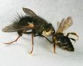
| 05/15/2004 10:52:19 AM |
Dead or Alive / Kill or be Killedby JackoComment: Superb macro shot - loads of detail. Exposue right on. The only minor point is the few pieces of dirt/hair on the background area - but that's very minor. Great submission. |
| Photographer found comment helpful. |
| 05/15/2004 10:49:57 AM |
Black house - White houseby Mad-DComment: Exceptional reflection. The placement of the curving lead-in line starting in the bottom left corner is marvelous. Once you start there - there are numerous arcs that gently lead the eye up into the buildings and sky. It's a work of art, but perhaps a bit of a stretch for the challenge. It doesn't shout "OPPOSITE" but it does indeed whisper "opposite." |
| Photographer found comment helpful. |
| 05/15/2004 10:43:25 AM |
Country Town Originalityby sleekrComment: Good colors - nice lighting and a perfect sign showing opposites. I was going to say you needed more light on "side street" but finally concluded that is was a nice irony that the side street is shadowed. Composition seems a bit centered - and just wonder what would it look like if it was shot with the sign pole being a little diagonal instead of straight vertical. |
| Photographer found comment helpful. |
| 05/15/2004 10:39:54 AM |
Cookie Contrastby BillEComment: Me cookie monster. Great job! It may be better if the white on the bottom cookie didn't have the yellowish cast to it - but that's a minor point. Nice idea and execution. |
| Photographer found comment helpful. |
| 05/15/2004 10:37:39 AM |
Focusby katlynComment: Very nice! Texture and soft colors on the top flower are very nice. The repeated shape of the out-of-focus flower adds a nice compositional element. I was wondering about the lighting on te back flower but finally concluded it helps separate the colors of the petals front to back. Fills the frame very nicely. |
| Photographer found comment helpful. |
| 05/15/2004 10:31:36 AM |
S & P in B & Wby KylieComment: Simple, effective and nice to look at. There are some things I think could improve your image: 1) The triangle of white on the top left edge is not needed, 2) Try moving the white phone just a bit to the right so that you can see the entire line of the boundary of the white/black, and 3) The whites should proably match better - remove the yellowish cast to the area under the black phone. But that's not saying it's not a great submssion as it is! Very well done! |
| Photographer found comment helpful. |
| 05/15/2004 10:26:07 AM |
NEAR....farby lizbeth010Comment: Very nice handling of your extreme depth of field. Great exposure on the close face - and a pretty one at that. The hair coming in from the top left leading you down to the eye is a GREAT touch. There are two suggestions for improvement: 1) The bight sky in the top right corner is unfortunate and 2) The reddish object to the left of the legs is a minor detractor. |
| Photographer found comment helpful. |
| 05/15/2004 10:21:27 AM |
Chilly Chiliby lindsayComment: Catchy title, made me chuckle. Great selection of colors - but it would be more effective if the chili manitained a dark crisp green instead of the muted yellowish green. The way the red is bouncing around in the ice is really tremendous. |
| Photographer found comment helpful. |
| 05/15/2004 10:16:19 AM |
|
| Photographer found comment helpful. |
Home -
Challenges -
Community -
League -
Photos -
Cameras -
Lenses -
Learn -
Help -
Terms of Use -
Privacy -
Top ^
DPChallenge, and website content and design, Copyright © 2001-2025 Challenging Technologies, LLC.
All digital photo copyrights belong to the photographers and may not be used without permission.
Current Server Time: 08/26/2025 05:21:04 PM EDT.