| Image |
Comment |
| 04/22/2006 02:42:42 PM |
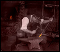
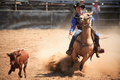
The way things used to be madeby arminComment: This is a good idea. It would be a stronger photo if the figure was more toward the left side of the image so he would be facing more toward the center of the frame. It's usually good to have less space behind the main figure than in front of him. Good lighting and focus. |
 Photographer found comment helpful. Photographer found comment helpful. |
| 04/22/2006 02:40:31 PM |
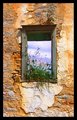
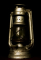
Window in to the skyby facesastheycomeComment: This has very nice colors and focus. I think the window *might* look better if it were off-center. The sky color looks a bit purplish. |
| Photographer found comment helpful. |
| 04/22/2006 02:38:51 PM |
|
| Photographer found comment helpful. |
| 04/22/2006 02:38:17 PM |
|
| Photographer found comment helpful. |
| 04/22/2006 02:37:08 PM |
|
| Photographer found comment helpful. |
| 04/22/2006 02:36:42 PM |
|
| Photographer found comment helpful. |
| 04/19/2006 09:30:48 AM |
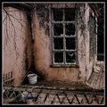
Cottage For Saleby gsalComment: Great tonalities. The little bit of blue really sets off the rest ofthe image. 8. |
| Photographer found comment helpful. |
| 04/19/2006 09:29:42 AM |
|
| Photographer found comment helpful. |
| 04/19/2006 09:29:00 AM |
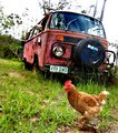
Hippie Chickby emmylouComment: Great juxtaposition! The blown out sky detracts from teh overall image. YOu also need abit more shadow detail around the lower edge of the tire and front
bumper. |
| Photographer found comment helpful. |
| 04/19/2006 09:27:21 AM |
|
| Photographer found comment helpful. |
Home -
Challenges -
Community -
League -
Photos -
Cameras -
Lenses -
Learn -
Help -
Terms of Use -
Privacy -
Top ^
DPChallenge, and website content and design, Copyright © 2001-2025 Challenging Technologies, LLC.
All digital photo copyrights belong to the photographers and may not be used without permission.
Current Server Time: 12/21/2025 05:23:46 PM EST.