| Image |
Comment |
| 04/06/2005 12:47:02 PM |
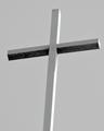
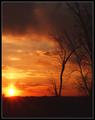
T-for Trinityby AJFIComment: Umm well I must admit I'mm scoring this one a little low. as for why I feel that way.. well it's not interesting. Its a couple of straight lines and some shadows. There is nothing to hold the veiwers attention for and period of time. Give us mountains in the background, some trees on either side.. anything.. I just feel that this image was way to plain and simple. BTW the center post is tilted. I didn't meen to sound mean.. But I feel that honest is the best tool for learning. |
 Photographer found comment helpful. Photographer found comment helpful. |
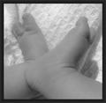
| 04/06/2005 12:26:52 PM |
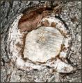
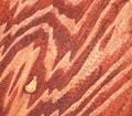
Wood-yby dahvedComment: Interesting technique.. Pretty average shot and fairly boring Y. However the technique you used to make this high contrast B&W shot realy took the plain shot and stepped it up a knotch. Great job. |
| Photographer found comment helpful. |
| 04/06/2005 11:45:18 AM |
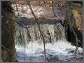
Qby msdoubletroubleComment: I see the Q it fits the challenge. The photo lacks in interest. Boom Q!!! then nothing. Aside from the Q there is very little in this shot to hold the veiwers interest.. |
| Photographer found comment helpful. |
| 04/06/2005 11:43:08 AM |
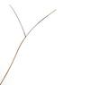
Y is; my hair braking!?.by ErenComment: Fits the challege and ist a technicaly good shot. I don't find it to very interesting or exciting. It lacks the power to pull ahead of the pack IMO. Leaving it feeling like a pretty average photo here on DPC.. not that being average here is all that bad. |
| Photographer found comment helpful. |
| 04/06/2005 11:39:54 AM |
The Alpha and the Omegaby rblantonComment: Very pretty but I think I would have flipped this image so the Alpha was left of therefore comming before Omega.. Takes a second to spot the letters but is still very well done. Very pleasant image to look at that fitsd the challenge well. |
| Photographer found comment helpful. |
| 04/06/2005 11:37:58 AM |
W is for Woodby fotodudeComment: Woo hoo Macro letters.. Fits the challenge well. The heavy red color looks realy weired to me. I like it but I don't know what to think.. honestly don't know how to vote this one.. so I'll comeback and probably bump it up some more later.. |
| Photographer found comment helpful. |
| 04/06/2005 11:35:19 AM |
Phantom Lettersby JordanZComment: Very pretty image. I don't feel however it fits the challenge very well. While I could sit for hours finding all of the hidden letters in this photo, I feel that the subject of the photo should be the letter. Weak for meeting the challenge but very nice photo otherwise.. crip, nice colors, pretty to lok at.. so I go with a decent score regardless. |
| Photographer found comment helpful. |
| 04/06/2005 10:06:36 AM |
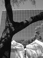
N formed by distorted reflectionby nrulkovComment: hey isn't it illigal to do that to a building?.. Nice image one of my favorite abstracts so far on this site. I did however have to look for a bit to see the N theres infact 2 one on the top and one in the middle of all of the ribbons. The one in the ribbons takes a bit to make out, and the one on top takes a moment to find because my eyes were instantly drawn to the ribbon. I also think I would have cropped out the bushes in the bottom. |
| Photographer found comment helpful. |
| 04/06/2005 10:02:40 AM |
The letter Oh!by PhotoholicComment: has a strong snapshot feel to it. I liile bit of soft light on the face and a big bubble would have won me over for sure. Great concept but image is a little weak as is and likes the punch to stand out from the crowd. |
| Photographer found comment helpful. |
| 04/06/2005 10:00:38 AM |
Very Valuedby mlhop05Comment: Cute and imaginative. It does however give me a feeling of not being accedental.. I can't prove it so good score anyways. Nice job and feel the B&W was peferst for this shot. |
| Photographer found comment helpful. |
Home -
Challenges -
Community -
League -
Photos -
Cameras -
Lenses -
Learn -
Help -
Terms of Use -
Privacy -
Top ^
DPChallenge, and website content and design, Copyright © 2001-2025 Challenging Technologies, LLC.
All digital photo copyrights belong to the photographers and may not be used without permission.
Current Server Time: 08/20/2025 04:33:24 AM EDT.