| Image |
Comment |
| 01/26/2005 01:28:12 PM |
|
 Photographer found comment helpful. Photographer found comment helpful. |
| 01/26/2005 01:26:43 PM |
|
| Photographer found comment helpful. |
| 01/26/2005 01:25:06 PM |
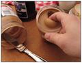
Breaking The Surfaceby sibelingComment: If your camera has a white balance setting, using the "indoor" or "tungsten" setting will improve the image -- notice how the whites on the label, milk & table cloth have a pinkish cast? The WB setting will fix that. Perhaps a bit more sharpening for web viewing as well. Awesome concept! |
| Photographer found comment helpful. |
| 01/26/2005 01:18:58 PM |
|
| Photographer found comment helpful. |
| 01/26/2005 01:13:11 PM |
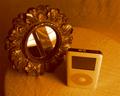
i pod and mirrorby leifurComment: The orange tint is excessive. If you could keep the iPod white (or at least mostly white) that would improve the image. If you built the image using photoshops duotone function, adjustment of the curves will achieve this. Also, it seems as if there is a lot of detail in the photo, but it could use a touch more unsharp maksing for web viewing. |
| Photographer found comment helpful. |
| 01/26/2005 01:06:28 PM |
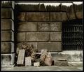
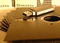
Storage progressby MuudzisComment: wow -- those still exist? I threw all mine away in '88 or so... I understand that the backdrop are the sleeves for the diskettes, but the printing on the sleeve is quite distracting and doesn't contribute anything to improve the grasp of the subject or concept. I can take or leave the gold cast. |
| Photographer found comment helpful. |
| 01/26/2005 01:02:40 PM |
Old times, new times.by totiComment: Nice composition, nice color. The highlights are a bit blown out tho. It also wouldn't hurt to clean the fingerprints from the watch bezel. I noticed a big wad of gunk on the subject of my shot after I submitted it... a lesson in preparation, I guess... |
| Photographer found comment helpful. |
| 01/26/2005 12:59:05 PM |
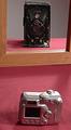
Grandfather's Voigtlander vs Grandson's Nikonby nsmithComment: Having the digicam closer to the frame would have allowed a tighter crop, and better detail in both images. The right side of the frame is distracting, and the image would have worked fine without it. |
| Photographer found comment helpful. |
| 01/26/2005 12:56:29 PM |
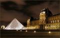
Le Louvre by GabrielComment: What a Louvre'ly picture. Oooh, sorry for the English pun. All joking aside, it's beautiful, and the sky really adds interest. |
| Photographer found comment helpful. |
| 01/26/2005 12:53:39 PM |
Downsizingby jamijcComment: Nice idea -- especially funny for someone who remembers 8-tracks. I find the un-even lighting somewhat distracting. Perhaps a tighter crop would allow more detail in the iPod. |
| Photographer found comment helpful. |
Home -
Challenges -
Community -
League -
Photos -
Cameras -
Lenses -
Learn -
Help -
Terms of Use -
Privacy -
Top ^
DPChallenge, and website content and design, Copyright © 2001-2025 Challenging Technologies, LLC.
All digital photo copyrights belong to the photographers and may not be used without permission.
Current Server Time: 08/04/2025 05:58:36 PM EDT.