|
|
| Image |
Comment |
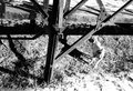
| 02/20/2010 01:37:42 PM | Night At The (Glass) Museumby smardazComment: Hi, Critique Club here...
I like a lot of things about this image. I like the richness of the blacks, The direction of the glass sculpture and the leading lines of the row of lights. Problem is though that I'm not sure I like them all in the same photograph. To me, there are a lot of elements competing for attention. It's hard for me to follow the sculpture into the picture and not be distracted by the bright lights and lines on the left. Same with the single bright light on the right.
There are a couple issues that stand out for me.
1) as already mentioned, too many strong elements competing with one another.
2) the subject, the glass sculpture, is devoid of detail in some areas. I realize shooting glass is difficult, but since you chose it as your subject matter...
3) the composition could be a little tighter. I played a bit by moving this around on my monitor to see if I could find a stronger composition and I found that (to me) it was stronger if I cropped from the right to the edge of the sculpture to eliminate the bar and the majority of the light on that side. From the bottom just past the blue reflection, which to me is a distraction. From the left just past the first yellow/orange light. That was just to move the end of the glass sculpture a little more off center. The result of the crops above would result in more of a pano crop but I don't think that's bad. Of course the cropping is all artistic vision so I'm just presenting you with something to think about, not what's right or wrong.
Once again, I like the image but these are my opinions about what would make it better for me. |  Photographer found comment helpful. Photographer found comment helpful. |
| 02/19/2010 08:16:29 PM | On the Other End of the Lensby InsomniacComment: Hi, Critique Club here...
I love the idea of this shot. I like the "photographer" giving direction.
What holds this back for me is
1) why is the flash going off, it's inconsistent with what's happening. Someone could be testing the flash, but whoever
that would be should be paying attention to it.
2) the only thing in focus is the MUA's shoulder
3) while I can live with the fingers being cut, I can't with the eye chopped in half.
So, for shots to do well on DPC, on has to pay attention to the little details because the audience here doesn't miss much.
Once again, this is a stellar idea and I would definitely want to try it again if I were you.
If I had voted in this challenge, I would have given this a 6. If the issues with the MUA didn't exist, an 8. | | Photographer found comment helpful. |
| 02/15/2010 10:11:51 PM | i bet your chair doesnt take you skiingby chrispComment: Hi, Critique Club here...
Keep in mind this is only one person's opinion.
Firstly, I really like most of the image. The colors are great, I love the blur of the wheel, and I like the background with the hills and lights. I like the action shown with the blur of the skier and chair.
What I'm not so keen about is that while I like the blur of the rider on the lift, I would have liked just a hair faster shutter speed so I could actually see a person. The operator in the middle is awkward in that I don't think he adds anything to the image, but because he contrasts so much with the lights, he draws attention. I wish he was gone and the rider, a little more recognizable, was in the frame a little more. Of course the operator has to be there, so I'm just sayin...
One of the comments was that the picture really doesn't say "chair". I agree with that. While the challenge simply stated a chair should be in the photo, I think most people are looking for one that is more easily identified. If I were asked to describe this image, the word "chair" wouldn't come up.
But after all that, I do like the image. If I had voted in this challenge I would have given this a 6 or 7.
| | Photographer found comment helpful. |
| 02/12/2010 07:14:42 AM | schnoodlecopterby posthumousComment: Critique Club here...
I spent a good deal of time looking at this image trying to figure out what works a what doesn't work (for me).
Works: I am drawn to the gritty, harsh look of this. The hard light and crisp shadows give it kind of a edgy look. I think what I like best, and what creates the most tension in the picture is the disinterested dog.
Doesn't Work: The structure along the top is really distracting. There is no clear focal point for the viewer to hone in on to answer the question "what is the point of this image", but maybe that's not a bad thing either, if someone bothers to enter and look around. The main diagonal leads the eye right out of the image. I think if you flipped it horizontally that same diagonal would lead the eye into the image - just the way our brains work I guess.
I think this would be received better in a gallery than in a challenge like this where you have a but split second to either engage the viewer, or not. If I had voted in this challenge, I probably would have given this a 4 or 5. If I took the time to delve into it as I have now, a 6, maybe a 7.
| | Photographer found comment helpful. |
| 02/10/2010 09:24:15 PM | TV heavenby landon1013Comment: Greetings from the Critique Club...
A couple things stand out for me that I think hurt this image. I think the background is too busy with all the knobs and reflections. I think her pose is stiff and unnatural looking and I think you should have gotten rid of the stuff on the carpet. I realize it's artistic impression regarding the hard contrast of the lighting, but personally I don't care for it much. I would have liked it better with the shadows on her right side opened up. I also think there are too many body parts cut off by the crop. In general, you shouldn't crop at a joint and you've essentially done that in four places. It tends to create tension with the viewers.
If I voted in this challenge, I would have given this a 5.
I hope this was somewhat helpful, and maybe helps to explain the finish in this challenge. | | Photographer found comment helpful. |
| 02/10/2010 09:14:42 PM | Goals and Resolutions for the New Yearby GeorgeComment: Greetings from the Critique Club...
You got great color in that morning sunrise. I think your own critique pretty much sums up my thoughts on this. In particular, the goal is very distracting because the eye isn't sure what the focus of the picture is. If it's the goal, the sun is too bright and pulls the eye right to it. If it's the Sun, the goal posts are extra stuff that just gets in the way.
I get what you were going for here, I just don't think this composition works very well.
Hope this is at least somewhat helpful. | | Photographer found comment helpful. |
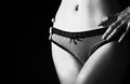
| 02/10/2010 09:07:33 PM | Lesson of seduction : Feigning indifferenceby keyzComment: Greetings, Critique Club here...
Like the off centered composition and the crop. Some had issues with the harsh light, I don't and I consider it artistic license in this case. Black and white is a good choice as well.
I'm not keen on the lower part of the legs, the skin is a little "muddy" to me. I also think it would have benefited from some softening/blurring of the skin to reduce the effect of the hair/fuzz. I am not terribly fond of the way the crop cuts the hand on the right. Fairly minor.
I think this is a good image and I guess it's expected that you found a couple of antianythingresemblingnudity people here.
Hopefully this is somewhat helpful. | | Photographer found comment helpful. |
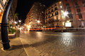
| 02/03/2010 09:33:19 PM | Napoli-Via Santa Luciaby Rino63Comment: Hi, Critique Club here...
Congratulations on a nice image. I really like it. I think the exposure is great and I love the low angle you chose. I think the fisheye distortion adds interest to the image as well as the taillight trails. The pattern in the cobblestones is also interesting to look at.
I'm not keen (as others have said) on the distorted pole on the left, it's a very powerful element that some will love, and some will hate. I think the difference in contrast and brightness tends to pull the eye away from looking deeper into the image. The leading lines down the street are great, just can't overcome the pole. My opinion is that the pole is what prevented this from being a 6.6 or better.
If I voted in this challenge I would have scored this a 7. I do not think this deserved the one or two votes it got.
I hope this is helpful. | | Photographer found comment helpful. |
| 01/31/2010 01:38:28 PM | Forgotten by Timeby PhotoDaveComment: Greetings from the Critique Club...
Congrats on a good example of a long exposure shot. Very sharp, very well exposed and the colors are great.
I think what hurts the image IMO is the composition, even though many commenters spoke of how much they liked it. I think the busy left side distracts from a relatively small waterfall, which by your comments, is the subject of the image. I would suggest you play around with different crops. I moved the window around on my screen and found the waterfall to be much more the subject of interest when I cropped vertically and gotten rid of all the stuff on the left right up to where the top tree crosses over, and then a bit off the right, may an inch. That would have focused the attention on the waterfall as well as eliminated all the distracting stuff on the left while keeping the one tree that creates such a great leading line.
If I had voted in this challenge, I would have given this a 6 as is and an 8 with a different crop.
Hope this is somewhat helpful for another point of view. | | Photographer found comment helpful. |
| 01/30/2010 09:39:10 PM | Miss Malayaby tjbel05Comment: Greetings from the Critique Club...
Boy, this is a really nice picture, tough to find constructive critiques. Keep in mind my comments are all merely suggestions and musings from my point of view.
I love the expression on her face! Who couldn't have happy feelings looking at this? The exposure is right on the money and the colors really pop.
I feel slightly disconnected from her and think it's because she is looking away. I think if she had the same expression but was looking at the camera, this would have scored a full point higher. Speaking of her eyes, they are really sharp, almost unnaturally so. To me, perhaps a bit over done probably because they contrast so much with the softened skin. I would have liked to have seen the crop a little different regarding the hands. In general, it is not good to bisect a joint or to cut off fingers and I think that hurts the image a little. Just a minor nit, since this is advanced editing, I think I would have toned down the bright spot above her head. You might have even cropped a little tighter on top.
Overall, I like this image and probably would have given it a 6 to 7 had I voted in the challenge.
Hopefully these comments are somewhat helpful to you.
| | Photographer found comment helpful. |
Home -
Challenges -
Community -
League -
Photos -
Cameras -
Lenses -
Learn -
Help -
Terms of Use -
Privacy -
Top ^
DPChallenge, and website content and design, Copyright © 2001-2025 Challenging Technologies, LLC.
All digital photo copyrights belong to the photographers and may not be used without permission.
Current Server Time: 08/01/2025 10:26:54 AM EDT.
|