| Image |
Comment |
| 07/04/2004 02:36:27 PM |
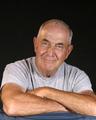
King Bondoby trying2bstillComment: Lighting: The ligting works well, although a small light behind the head would have provided some needed separation.
Pose: The pose is a good one, but the hunch in his shoulders and the open shirt change lay of the clothing to form leading lines pulling the eye away from his face. Cropping his left arm off would not have been my first choice.
Background: The black is done well, with the chairs balancing the composition, but I would have liked to have seen more separation between his hair and the background. |
 Photographer found comment helpful. Photographer found comment helpful. |
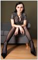
| 07/04/2004 02:22:30 PM |
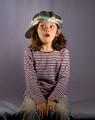
sophisticatedby hopperComment: Lighting: The lighting is excellent
Pose: I like the pose, but the nail-biter curl of the fingers does not seem to fit with the rest of the image. I am assuming the shallow DOF was intentional on her shoulders, but I found the back of her hair being OOF to be a bit distracting.
Background: Well done, with wonderful seperation. |
| Photographer found comment helpful. |
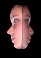
| 07/03/2004 06:46:23 PM |
Portrait Doubleby ColeyComment: Lighting: The lighting is well done. Considering the subject is wet, it is suprising the highlights are not more hot than they are (which is not at all hot).
Pose: There is not much in the way of pose, but I would like to suggest that the camera's viewpoint and the drection of the eyes are at odds with each other. One (the perspective) moves the eyes into the frame, while the modes expression pushes it out of the frame.
Background: Wonderful black, although I would have liked to have some separation between the background and the model's hair. |
| Photographer found comment helpful. |
| 07/03/2004 06:31:35 PM |
Veroniqueby sahkoComment: Lighting: The lighting is mostly good, but is hot in a few places (right arm, wrist). She could use a stronger catchlight in her eyes to give them some life.
Pose: The pose and expression really don't tell me anything abou the person. It could be from the perspective of an infant or pet, but the lack of expression make me think of someone watching zoning out in front of a TV. Which if that was your intent, it succeeds very well.
Background: The background compliments the over all tone of the image, well chosen. |
| Photographer found comment helpful. |
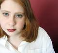
| 07/03/2004 05:28:56 AM |
Janetby redmoonComment: Lighting: Well balanced, but a bit too harsh on her skin. The catchlights make for a strong expressiveness in the eyes.
Pose: The pose is good, but I think the crop should have placed her more toward the center.
Background: The background completments the various shades of red throughout the image. Nicely chosen. |
| Photographer found comment helpful. |
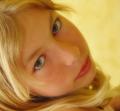
| 07/03/2004 05:24:52 AM |
Blond light by LouisonComment: Lighting: The light is well balanced with a good catchlight, but perhaps needed difused a bit more as its treatment of her skin is a bit harsh in places. The yellow cast works well with the hair, but not with the blue of th eyes and the reds of the skin and lips.
Pose: The pose works well.
Background: The yellow background works well against the hair, but the color-cast it is giving the rest of the image does not work for me as I mentioned above. |
| Photographer found comment helpful. |
| 07/03/2004 05:19:00 AM |
Captain George Highlighted.by graphicfunkComment: Lighting: The lighting is amoung the best in the challenge, although I would have liked to see it a bit more diffused to try and counter the shine on some parts of his skin. The catchlight in his eyes is just barely noticable, just enough to subtly do its job.
Pose: The pose is good. It and his expression communicate a lot.
Background: The black works well with this and is well done. |
| Photographer found comment helpful. |
| 07/03/2004 05:14:29 AM |
Funny Girl (my first portrait attempt)by BassieComment: Lighting: Nicely done, although the shadow on the nose may be a bit strong.
Pose: Her expression is the shot, so a tighter framing around her face and shoulders would have made this a much stronger portrait of her. Other than that, I would have prefered the camera angle to have been a bit above her eye level.
Background: The background is great. It compliments her shirt nicely. |
| Photographer found comment helpful. |
| 07/03/2004 03:17:08 AM |
Mr. Mattby postoakinversionComment: Lighting: Well balanced with good catchlight.
Pose: Pose is good, expression is a bit odd for a portrait. The DOF was a bit short, the right shoulder is blurred slightly.
Background: Very licely done black. |
| Photographer found comment helpful. |
| 07/03/2004 03:14:18 AM |
The Journalistby ImagineerComment: Lighting: Too bright, and could use a fill light on his left. There are several hot spots.
Pose: Well posed.
Background: works well. |
| Photographer found comment helpful. |
Home -
Challenges -
Community -
League -
Photos -
Cameras -
Lenses -
Learn -
Help -
Terms of Use -
Privacy -
Top ^
DPChallenge, and website content and design, Copyright © 2001-2025 Challenging Technologies, LLC.
All digital photo copyrights belong to the photographers and may not be used without permission.
Current Server Time: 08/01/2025 08:31:25 AM EDT.