| Image |
Comment |
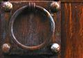
| 05/07/2004 12:22:42 AM |
knock knockby rananculusComment: looks a bit out of focus. I don't like the crop for a subject that's not perfectly square... makes it look misaligned. The lighting could be better.. bottom right bolt/ball/? is reflecting too much light |
 Photographer found comment helpful. Photographer found comment helpful. |
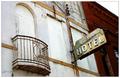
| 05/07/2004 12:20:19 AM |
The Old Hotelby tyt2000Comment: I think this is the first border I've ever liked. I also like the contrast between the red brick and white (stucco?) buildings. |
| Photographer found comment helpful. |
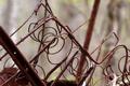
| 05/07/2004 12:17:16 AM |
Spring has Sprungby willtataComment: I'm having trouble finding anything in this photo that's in focus. I'd suggest a smaller aperture (larger DOF), but the (trees?) in the background might become too distracting. This is a really tough shot to make look good. Perhaps just focusing a little more on one thing would help. Also, this image was compressed too much. It's less than 50K, the limit is 150K. That might be part of the reason it looks out of focus. |
| Photographer found comment helpful. |
| 05/07/2004 12:12:08 AM |
Sharpby Toby-DogComment: You could've used less compression to improve image quality (your image size is less than 50K, limit is 150K). From this point of view, the nails don't look sharp at all, so it's not clear what you meant by the title. Otherwise it is pretty well done |
| Photographer found comment helpful. |
| 05/07/2004 12:10:11 AM |
waiting in vainby bayonicComment: noisy. i see little (blue?) dots on the right edge. the fuzzy border bothers me a little. to be honest, I really don't like the colors in this picture.. they make it a little depressing to look at. but it succeeds in provoking an emotional response, and that alone is worth several points |
| Photographer found comment helpful. |
| 05/07/2004 12:05:10 AM |
|
| Photographer found comment helpful. |
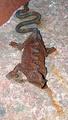
| 05/07/2004 12:03:19 AM |
Rustic Lizardby PDavisComment: a little on the bright side.. less light or shot later in the day would help. the texture and contrast of the rock makes the lizard not stand out very well (though this was probably beyond your control, as it looks attached to the rock). also, the focus appears to be near the center of the body, thus making the head a little out of focus. otherwise nice colors |
| Photographer found comment helpful. |
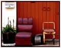
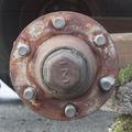
| 05/06/2004 11:58:09 PM |
Missing Wheelby skalman69Comment: a little noisy, colors are a little flat, might look better with slightly smaller DOF. looks like it was taken with a cheap camera, but overall not bad. |
| Photographer found comment helpful. |
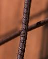
| 05/06/2004 11:52:48 PM |
Rusted Acrossby BooZonComment: great colors. i like how the dark lines in the background parallel the subject. |
| Photographer found comment helpful. |
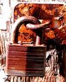
| 05/05/2004 01:52:00 AM |
Old Lockby vtruanComment: overexposed (on purpose?), but that's why I like it so much.. makes the rusty colors really stand out... 9 |
| Photographer found comment helpful. |
Home -
Challenges -
Community -
League -
Photos -
Cameras -
Lenses -
Learn -
Help -
Terms of Use -
Privacy -
Top ^
DPChallenge, and website content and design, Copyright © 2001-2025 Challenging Technologies, LLC.
All digital photo copyrights belong to the photographers and may not be used without permission.
Current Server Time: 08/20/2025 12:30:11 AM EDT.