|
|
|
Showing 191 - 200 of ~261 |
| Image |
Comment |
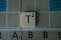
| 02/09/2003 11:26:04 PM | T-Square(d)by RoseytoneComment: Greetings from the Critique Club!
This shot has a lot of potential in my eyes. Unfortunately, the first thing I can tell you is that there is not enough light. It seems like it's in the shadow, did you try a shot with the flash? Or a few lamps around it?
The composition needs some work too. you have a lonely little tile in the middle of a very large ground, did you try some more angled shots, from the side? The other thing about the composition is the crack in the board just between the A and the B which is VERY very distracting; my eyes just keep on going to it and staring at it, because it is so interesting, hehe.
Another weird thing about the presentation is that the Tsquare isn't exactly in line in the square on the board, which is also a bit strange in my eyes. Did you try to get closer to the square?
It certainly fits the challenge, and I look forward to seeing more from you in the future! |  Photographer found comment helpful. Photographer found comment helpful. |
| 02/09/2003 10:51:28 PM | Speeding in Leicester Square £20 fineby PaulkComment: Greetings from the Critique Club!
I'm so happy I got this image to critique! The composition is amazing, and very well put together. Very very clever how you set up so you can read Leicester Square several times in the photo, and you have to strain to see the one little one in the right corner. So Clever.
The colour is superb too, so I wouldn't change anything about that.
The motion is very well done, and I think it makes your eyes read the letters right under the car, which are "Leicester Square"..
I think the only reason your score may have suffered a bit, was because there was no "specific square" element, other than the word "square." Personally, I didn't let that affect my scoring this photo, because it works so well out of the box.
Well done! I like your work, and I hope to see more in the future! | | Photographer found comment helpful. |
| 02/09/2003 09:07:33 PM | mmmh..yummy squares.... getting less with every shot!by miss parkerComment: Hello from the Critique Club!
Subject:
YUMBO! This picture just makes me drool, you wouldn't believe how much; I'm a chocoholic, which means I can appreciate this shot a lot.
Composition:
I like it, I think if you had cropped it a bit closer to the packaging, you may have had a much tighter job there. Other than that, good job!
Background:
White, obviously. Not much more I can add there. It's not over exposed, it seems just right. The lighting is nice, and brings out the brownishness of the chocolate, and it's packaging.
I like the border, I think it fits. You also got a very decent score! The only fault I can find is that the focus is a bit fuzzy, maybe if you'd tried a touch closer or just a touch further away to get a better focus. A very yummy idea, very well executed! Thanks for submitting it. | | Photographer found comment helpful. |
| 02/09/2003 05:33:37 PM | 1.44 MBby snowleopard10101Comment: Hello from the Critique Club!
An interesting idea!
Composition: As a few people mentioned in your comments, I think this picture is rather cluttered, and although it's obvious what the subject is, your eyes are being constantly drawn to other areas of the photograph. For instance, mine is being drawn toward the CD in that background which has some kind of reflection on it, and I just really want to know what is going on there. It would have worked better if you'd have propped the case as it is there, but without all the clutter behind it.
Background:
Too cluttered, honestly, people might not be sure of what they are looking at. As I said above, it may have worked better if you'd propped the diskette on something with a nice darkish background, maybe a cloth?
Camera work:
There seems to be a bit dark, although I'm partial to dark photos myself. I think if you had added a bit more light somehow, and had the table covered, you would not have had the weird bright mark just below the diskette.
Digital Processing:
I don't think you did any. You should try and do some experimentation, with levels and curves (those are my two favorites at the moment), and just try and see what you can come up with. You could have made this a lighter picture by just using curves, and hopefully without losing any of the colour.
Overall:
I think this photograph would have done better in a much more controlled environment. I know this is your first challenge, and I am hoping to see a lot more from you! Good work on your first go :)
| | Photographer found comment helpful. |
| 02/08/2003 09:20:11 AM | From Concept to Lapel Pinby lisaeComment: I can't place why, but this photo looks straaaaaaaaaaaangely familiar. I like the fact that you can see the pin very clearly, I mean the details are great(!) and I love the graphic thingy on the left, and the base drawing. It all looks superb, bravo. | | Photographer found comment helpful. |
| 02/06/2003 12:20:29 AM | Coal to Diamondby karmatComment: Is this Redfig? If it's not. oops! Very very lovely picture. I would have made it differently by turning the diamond toward the camera. It would probably have added a million problems though. Good work. 9 -Annida | | Photographer found comment helpful. |
| 02/04/2003 02:17:03 PM | three movie starby ivanaComment: Too cute.... I had it at 9, but my mouse keeps on being chased to 10 ! -Annida | | Photographer found comment helpful. |
| 02/04/2003 02:04:24 PM | Pretty as a Pictureby RLSComment: This is such a beautiful photograph, and I hope you don't get me wrong, everything about the photograph is right. The only reason I am removing 1 point is the border. It's just wrong, and I hate saying it, but the border is so distracting and takes away so much from an otherwise perfect photo! 9 -Annida | | Photographer found comment helpful. |
| 02/04/2003 02:00:23 PM | Innocenceby magnetic9999Comment: Classically beautiful, I wish I could give you 11. But here's a 10 :) -Annida | | Photographer found comment helpful. |
| 02/04/2003 01:57:46 PM | | | Photographer found comment helpful. |
|
Showing 191 - 200 of ~261 |
Home -
Challenges -
Community -
League -
Photos -
Cameras -
Lenses -
Learn -
Help -
Terms of Use -
Privacy -
Top ^
DPChallenge, and website content and design, Copyright © 2001-2025 Challenging Technologies, LLC.
All digital photo copyrights belong to the photographers and may not be used without permission.
Current Server Time: 08/01/2025 09:38:11 PM EDT.
|