| Image |
Comment |
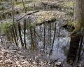
| 05/14/2004 11:12:11 AM |
Focusby katlynComment: I would have preferred to have some light on the flower in the foreground. |
 Photographer found comment helpful. Photographer found comment helpful. |
| 05/14/2004 11:10:45 AM |
more to the pointby PixelproseComment: The colors look a little washed out on this. Nice DOF. Overall I find the subject of this photo not too interesting. |
| Photographer found comment helpful. |
| 05/14/2004 10:41:40 AM |
Opposite Reflectionsby DonatienComment: I like this photo from a technical standpoint, but the light seems "off" on it. Some white balance adjustment might help compensate for the artificial light. |
| Photographer found comment helpful. |
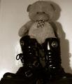
| 05/14/2004 10:39:23 AM |
Hard & Softby kevrobertsonComment: The lighting looks too harsh for this picture. The glare on the left part of the wall around the boots is distracting. The shadow and bright area of the wall on the lower right tries to pull your attention out of the frame. This looks to me like Sepia tones were used to try to make an dull picture more interesting, but I don't think it worked in this case. |
| Photographer found comment helpful. |
| 05/14/2004 09:58:57 AM |
Otherworldby KaDiComment: I don't find this picture to be particulary interesting. It feels very busy with lots of different elements vying for your attention. I like the focus and depth of field. |
| Photographer found comment helpful. |
| 05/14/2004 09:57:04 AM |
The Gameby MrZedComment: The colors look very subdued and unnatural in this picture. If this was done in PS, I don't particulary care for the effect. If it came from the camera, you may want to re-evaluate the use of backlighting for this shot. The reflections on the floor distract from the main subject. A table cloth or sheet or something under the chess set might have removed or at least softened these reflections. |
| Photographer found comment helpful. |
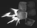
| 05/14/2004 09:44:13 AM |
Fire and Iceby JukomoxComment: The ice looks out of focus and is awfully dark. It doesn't stand out from the background at all. The fire is interesting and by itself might make a good photo, but this combination is pretty dull. |
| Photographer found comment helpful. |
| 05/14/2004 09:42:18 AM |
Left & Right in Black & Whiteby GeneralEComment: Nice deep blacks and contrast. That is about all this photo has going for it. Maybe there is some personal sentiment in it for you, but it's lost on me. |
| Photographer found comment helpful. |
| 05/14/2004 09:26:37 AM |
She and Heby greslizzzComment: This photo suffers from blurriness. The background is also not very photogenic. The framing of the composition puts the two interesting elements at opposite ends of the frame and has them seperated by more of that uninteresting background. This makes it difficult for me to view the photo as a whole- it almost seems like two photos side by side (is this a double exposure?) I can see what you were trying to do in terms of opposites, but I think the execution could be better. |
| Photographer found comment helpful. |
| 05/12/2004 01:49:42 PM |
|
| Photographer found comment helpful. |
Home -
Challenges -
Community -
League -
Photos -
Cameras -
Lenses -
Learn -
Help -
Terms of Use -
Privacy -
Top ^
DPChallenge, and website content and design, Copyright © 2001-2025 Challenging Technologies, LLC.
All digital photo copyrights belong to the photographers and may not be used without permission.
Current Server Time: 08/16/2025 08:58:16 AM EDT.