| Image |
Comment |
| 08/19/2005 07:44:11 PM |
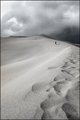
Forgotten Water (JPG-based retouch)by Zed PobreComment: Zed, you've done a nice job with this in general but I want to highlight a few things I think are important.
You said you rejected some edits because they "didn't seem to go along with the story" you were telling. I think this is tremendously important. It is easy to get caught up in edits for their own sake, but we need to remember we ARE telling a story and whatever edits we do should contribute to the story.
Secondly, you used a light touch with the tools. I am a big fan of "the light touch." As with women's fashions, sometime what you don't see is more exciting than what you do. A light touch allows you to imply something rather than shout it out loud.
Well done! |
 Photographer found comment helpful. Photographer found comment helpful. |
| 08/19/2005 07:35:48 PM |
re-edited-horse.jpgby sheapodComment: You've started with a well exposed photo SOOTC. That's a great start. Clearly your second attempt is much improved over the first one. for all the reasons stated inthe comments. One of the things about the second attempt is that you have used your tools with a lighter touch. I like to think of these tools a little bit like cod liver oil. A little may be good, but often more than a little produces unintended consequences!
Nice job onthe second edit especially! |
| Photographer found comment helpful. |
| 08/19/2005 07:18:02 PM |
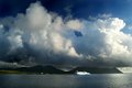
stepping awayby armelleComment: Armelle, your photo proves the rule that when you start with a great image, it's easier to end up with a great result. The original image is terrific right out of the camera. It's funny, when I look at the two thumbnails together, I like the edited version best. When I look at the two full size images together I like the original best. I think the contrast in the edited version makes a more dramatic thumb, but the subtle colors are terrific in the original.
I think the magic here would be to obtain the improvements in contrast and the highlighted lines without losing the color. Zed's done a nice job with his edit. Hopefully, you'll try to duplicate his edits to learn how he did them.
We all have our personal bias about color ... from my perspective, if God had wanted us to shoot B&W, he wouldn't have invented color film. Which is to say my personal bias runs toward color. But don't pay too much attention to my personal bias ... it's certainly not universal. |
| Photographer found comment helpful. |
| 08/19/2005 07:07:15 PM |
Edited-small.jpgby TallblokeComment: Steve, this is nicely done. You've taken a very good, well exposed photo and improved it with post processing. The work in levels and curves boosted contrast enough to increase the drama. Saturation punched up the whole photo. Dodging and burning added some drama as well. In your thread comment you talked about the sea being over sharp and that you'd like a silkier appearance. What if you selected just the sea, copied it to a new layer and worked on it a bit with a blur filter, or even a slight motion blur? |
| Photographer found comment helpful. |
| 08/17/2005 08:47:06 PM |
plays itselfby graphicfunkComment: Terrifically well executed out-of-the-box photo. This is the sort of thinking and execution that should inspire photographers at DPC. What a gem! |
| Photographer found comment helpful. |
| 08/04/2005 12:54:42 AM |
Private Paradiseby SammieComment: I grew up in a place where this kind of spread was true affluence. It may be my history and personal experience, but I believe you have captured very well the notion of Western Affluence. Outstanding photo. Among my top 3 picks.
If I had a nit to pick, and if we had advanced editing available, lightening the forest just slightly would have increased the contrast with the logs and made this an eye poppingly great photo. |
| Photographer found comment helpful. |
| 08/04/2005 12:48:32 AM |
Using A Normal Lighter Is Injurious to Pride (Or Smoke them away)by WilltorecordComment: Choose your own comment:
1) The soft focus & over saturated colors really don't resonate with me. My counsel would be to back off on post processing ... where I believe less is more ... and let your camera do the focusing for you. Your title is a bit obscure as well. Sorry to be negative.
2) I assume you are trying to convey the chemically induced state of "way too drunk to drive ... or even walk" to which my reaction would be, "Nice capture!" |
| Photographer found comment helpful. |
| 08/03/2005 12:49:46 AM |
|
| Photographer found comment helpful. |
| 08/03/2005 12:49:22 AM |
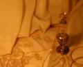
Goldby nidnodComment: If this had been bigger, I would have been able to see more detail, possibly given it a higher score. |
| Photographer found comment helpful. |
| 08/03/2005 12:48:22 AM |
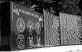
Perspectiveby RN PattiComment: To the disinterested observer, there doesn't seem to be a direct link to the challenge theme. |
| Photographer found comment helpful. |
Home -
Challenges -
Community -
League -
Photos -
Cameras -
Lenses -
Learn -
Help -
Terms of Use -
Privacy -
Top ^
DPChallenge, and website content and design, Copyright © 2001-2025 Challenging Technologies, LLC.
All digital photo copyrights belong to the photographers and may not be used without permission.
Current Server Time: 08/28/2025 03:42:38 PM EDT.