| Image |
Comment |
| 01/16/2006 04:58:34 PM |
Six String Musicby DottieDComment: For me, too much dark at the front end, too much light at the back end. The composition is nice but a little less of the extreme contrasts, perhaps, would enhance it. |
 Photographer found comment helpful. Photographer found comment helpful. |
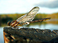
| 01/16/2006 04:51:03 PM |
Dragonflyby HighwayFlowerComment: For me, there's a little too much of the foreground out of focus and the white in the upper left is also a little too much--to the extent that it distracts. Other than that it's really nicely done. |
| Photographer found comment helpful. |
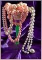
| 08/09/2005 09:18:02 PM |
Idle Wealthby sartobrComment: A different angle without the big empty expanse in the center might have been more effective. |
| Photographer found comment helpful. |
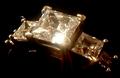
| 08/09/2005 09:09:05 PM |
The goblet overflowsby hannafateComment: Not a bad idea, but the green goblet stem distracts and it might have been more effective with just the white jewelry. |
| Photographer found comment helpful. |
| 08/09/2005 09:03:37 PM |
|
| Photographer found comment helpful. |
| 11/09/2004 11:21:33 AM |
Betty Crocker's Februaryby toddheadComment: Vertical orientation might strengthen this. For me there's too much "nothing" on the right. Also the lower left corner where the background ends distracts. Cropping a little differently could help. |
| Photographer found comment helpful. |
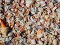
| 11/09/2004 11:09:55 AM |
Septemberby Mark of SRQComment: Doesn't really have anything to focus on. Perhaps two or three larger shells placed in areas to enhance composition elements would provide more interest and some contrast. |
| Photographer found comment helpful. |
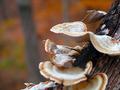
| 11/09/2004 11:07:19 AM |
Octoberby KanntaraComment: The composition is nice, but the large areas out of focus distract. I would find it more appealing if the larger mushrooms were in focus with the clarity fading toward the back. |
| Photographer found comment helpful. |
| 11/08/2004 08:48:34 PM |
November 2004by darixComment: Nice depth of field, however the larger out of focus leaf at the left seems to detract from photo. |
| Photographer found comment helpful. |
| 11/08/2004 08:46:00 PM |
Septemberby MAKComment: A lower point of view might be good with this scene. |
| Photographer found comment helpful. |
Home -
Challenges -
Community -
League -
Photos -
Cameras -
Lenses -
Learn -
Help -
Terms of Use -
Privacy -
Top ^
DPChallenge, and website content and design, Copyright © 2001-2025 Challenging Technologies, LLC.
All digital photo copyrights belong to the photographers and may not be used without permission.
Current Server Time: 06/17/2025 07:20:42 PM EDT.