| Image |
Comment |
| 03/21/2004 08:43:50 AM |
Longing For The West Coast by muur88Comment: I like this photo as it relates to the challenge, but the picture on its own seems a little off. The pillars are nice, especially the way you have the shadows almost straight below the pillars. The waves are an interesting element. But, the colors feel forced, like they were played with in photoshop. If they weren't then I appologize for marking this a little lower because of it. |
 Photographer found comment helpful. Photographer found comment helpful. |
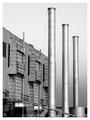
| 03/21/2004 08:38:22 AM |
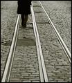
Cold Steelby Firstrich1Comment: I like this picture, but feel it could use a bit more contrast. More whites and less greys. The border also really calls attention to the lask of contract. If that's exactly the look you were going for, then ignore me. It's an artistic observation so...you know. |
| Photographer found comment helpful. |
| 03/21/2004 08:34:16 AM |
Curvesby MarieWComment: So the parallel is suposed to be the edge of the shadow and the edge of her body, right? It's a nice shot with good colors and tones, but I don't think everyone's going to see the parallel lines or agree that they are 'parallel' and you will be marked down for not meeting the chllenge. Too bad, good shot although the door handle doesn't do anything for me. |
| Photographer found comment helpful. |
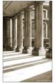
| 03/20/2004 04:01:28 PM |
Pillars I (white border)by KaveyComment: 9, I very much like the pillars and their shadows. It's a strong composition with nice tones. The only thing I don't like is the building in the back. I know you have no control over that, but somehow it detracts from the power nad strength of the pillars. The round windows are also trying very hard to steal the focus, although you've kept them in their place!
Personnally, I don't think the border adds anything, I would have kept it a simple black line. Message edited by author 2004-03-20 16:02:34. |
| Photographer found comment helpful. |
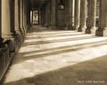
| 03/20/2004 03:59:10 PM |
Pillars IIby KaveyComment: I'd go with an 8 on this one. Nice tone and subjects, but at the same time it's a little dry. I can't really tell you why I'm not connecting with this image, but there's no emotion to it for me. Technically sound, but I don't like the crop the focus is too much on the empty space and not enough on the 'parallel' pillars. |
| Photographer found comment helpful. |
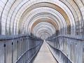
| 03/19/2004 10:14:36 PM |
Perspectiveby basia03Comment: Very nice. I like the conflict created between round and straight. TH emutted colors are interesting as well. Perhaps a bit too much focus on the round and not enough on the straight, but a good picture nontheless. |
| Photographer found comment helpful. |
| 03/19/2004 10:11:58 PM |
|
| Photographer found comment helpful. |
| 03/19/2004 05:49:11 PM |
Bird on wireby rameviComment: Simple but effective. It's nice and sharp and the colors are wondreful. I'm glad you shot it at a diagonal instead of straight across, that's what makes it interesting. Nice! |
| Photographer found comment helpful. |
| 03/19/2004 05:44:59 PM |
|
| Photographer found comment helpful. |
| 03/19/2004 05:43:36 PM |
|
| Photographer found comment helpful. |
Home -
Challenges -
Community -
League -
Photos -
Cameras -
Lenses -
Learn -
Help -
Terms of Use -
Privacy -
Top ^
DPChallenge, and website content and design, Copyright © 2001-2025 Challenging Technologies, LLC.
All digital photo copyrights belong to the photographers and may not be used without permission.
Current Server Time: 08/01/2025 09:39:30 PM EDT.