| Image |
Comment |
| 08/25/2009 03:43:55 PM |
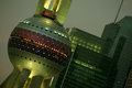
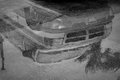
Castle Smegblot Leans Precariously in the Artificial City of Mehby surlybiffComment: Greetings from Andi via the Critique Club
First Impression: I'm one of the likers of the jaunty angle, bags of potential here but sadly the overall image is rather flat and boring.
Composition: A good composition that fills the frame well.
Subject: Great find for the circle challenge but think its a pity you left is so late to shoot and enter as I'm sure you'd have improved on this (might even have had a better shot from this visit as you were still downloading images?
Technical:I have a newly calibrated and slightly dark monitor, to me the image is a little dark, flat and lacks punch - all of which could be improved in an editing program (even a tweak of the contrast would have helped).
Final thoughts: I don't often comment on titles but this made me chuckle (still does). I'm pretty sure this would have scored much better with some minor tweaks though you'd still get a few haters of the jaunty angle (which makes the image for me). |
 Photographer found comment helpful. Photographer found comment helpful. |
| 08/25/2009 03:21:33 PM |
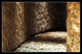
Stone Passageby CheerzComment: Greetings from Andi via the Critique Club
First Impression: At first glance this is a little boring although the shadows and textures work well, quite interesting but nothing that captures my eye.
Composition:Reading your notes you didn't actually make a tunnel or cave however that doesn't bother me too much as your shot leads me into what 'could' be a tunnel, the oof focus right hand stone helps the overal depth of the image for me.
Subject: Whilst I see a tunnel I don't feel as if I'm entering a tunnel if you see what I mean? Yes, you took time to construct something just for the challenge and thats always good in my books, its just that it seems to missing the main focal point.
Technical:Love the colours, a great dof of field and shadows though some of the lighter areas are a little overexposed.
Final thoughts: Overall I think this was worth more than its 4.9 and slipping over a 5 would have been about right for me. A decent shot that lacks any WOW, I wonder what it would have looked like from a lower angle? |
| Photographer found comment helpful. |
| 08/24/2009 05:57:23 PM |
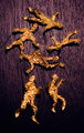
Brown Ribbons are People, Tooby posthumousComment: Greetings from Andi via the Critique Club. If I critique many more of your images people will start talking Don!
First Impression: My honest first impression was WTF! I'll hold my hand up and say even though I don't speed vote I totally missed the ribbon so apologise on behalf of everybody else without your imagination. The rest of the critique is made after seeing the ribbon and knowing the crazy mind that shot this btw.
Composition: Fills the frame well but maybe pulling back a little would have helped me see the ribbon during the first viewing before focussing on the little people?
Subject:Yup, its a ribbon but of course not of the colour required by the challenge description but guess thats why you did it and titled it thus? Whilst I appreciate the work involved in creating the ickle men I'm sure you agree its not your finest work don?
Technical: Whilst I understand why you changed the bg colour it all looks a little weird and on both monitors this was viewed on I'd say the people were more Bronze/Gold than brown. Did you use F/2,8 to deliberatley keep the subjects almost oof? am guessing with them being quite soft it helped the look you were after but maybe nice and sharp would have been better?
Final thoughts: Well, its not a 'brown' ribbon for me, nor the voters ;) Even though I see the ribbon nowit doesn't do much for me photo wise but makes me chuckle so guess your work is done here. Message edited by author 2009-08-24 18:05:47. |
| Photographer found comment helpful. |
| 08/24/2009 04:06:20 PM |
Obsessionby jotagaComment: Greetings from Andi via the Critique Club
First Impression: ok, it wasn't going to ribbon but even before I read it was a sp I felt it deserved better than 5.1. And no, its not as easy as peeps might have thought.
Composition:I like the crop you used, just showing what you needed to in order to convey your message.
Subject: Well done on the creation and execution, its something I've wanted to try for a while but lost patience trying a sp so thanks! The stare and ribbons do 'reflect' obsession so everything ties in nicely.
Technical: Me? I'm happy the bridge of the nose is oof, no need for it to be in focus to me (though been dinged for submitting purposefully oof eyes more than once). The eyebrows could have been a little sharper to frame the eyes but think what really lowered your vote were the blown areas.
Final thoughts: IMHO this should be in B&W, slightly underexposed with some burning of the blown areas and a little dodging to bring back some detail then finaly erasing the B&W from the eyes to let the brown & blue pop. Hope this helps? let me know if uou'd like to discuss further? |
| Photographer found comment helpful. |
| 08/24/2009 03:32:42 PM |
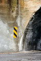
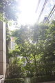
Yellow Magic Orchestraby posthumousComment: (Finally) Greetings from Andi via the Critique Club
First Impression: A rather tenuous title for me though I might have missed the Orchestra bit in this pic? This might never be seen hanging on somebodies wall but the more I view it the more pleasing both the colours and texture are.
Composition:At first the slighty wonky wall bothered me but its a great off centre divider between the tunnel and sign. I like the amount of tunnel, not too much and not too little - just right for me and think you'd have scored higher in the tunnel/cave challenge (even though I much prefer the image you settled on. Everything here fits well.
Subject:
Technical:At F2 you kept the 2 sides of the wall and tunnel in a nice sharp focus and let the foreground blur. Good detail in the tunnel and the overall exposure is spot on for me.
Final thoughts: Well, I like it and guess there is no need to tell you that the majority of voters were not as welcoming. |
| Photographer found comment helpful. |
| 08/23/2009 03:06:20 PM |
Yellow Magic Orchestraby posthumousComment: Don, this came up for a critique but can't do it tonight and it will dissapear after rollover so am leaving a comment to register and will pop back tomorrow to critique :) |
| Photographer found comment helpful. |
| 08/22/2009 11:55:57 AM |
Shinedownby micComment: Greetings from Andi via the Critique Club and congratulations on entering your first challenge here at dpc! (FWIW my first score was a 4.2). In case you were wondering the Critique Club is made up of a group of dpchallenge members but each critique is written by an individual not the group.
First Impression: Not heard of the band before and understand the link between title and image however its not a particularly inspiring image for me.
Composition: Whilst there isn't much to look at here it still appears quite busy, it needs roatating a touch to straighten it and thinking if you had turned to the right some more you would have lost the left building and might have improved the overall feel of the image.
Subject: Whilst you met the challenge there is nothing in the image that I can settle on and keep moving from the blown out sky to the rock at the bottom and distracted by the buildings on both sides.
Technical: OK, the overexposure was important for the challenge, to have scored any better you would have needed to keep colour and detail in the tree and its all a little washed out. As this is the only image you have here its difficult to understand your level of both photography or post processing, either way you will always get great help/tips/critique by posting an image in the individual photograph section of the site.
Final thoughts: Lets call this a benchmark shot for future challenges and since you placed 100th I guess the only way is up. Keep shooting, reading and learning and best of luck for future challenges! |
| Photographer found comment helpful. |
| 08/21/2009 07:15:43 PM |
Reflections on Water by Joachim Blatterby JEasonComment: Greetings from Andi via the Critique Club
First Impression: Interesting image though if this was taken after a thunderstorm maybe you could have found a puddle over more even ground and without the lampost though maybe they were included for interest?
Composition: Subject fills the frame nicely and wonder how this would have scored if you had flipped it to look 'normal'
Subject: Meets the challenge well and a reflected van is much more interesting than a straight shot of a van.
Technical: I think reflections can be difficult to portray well and this looks a little flat so maybe a boost in contrast would have helped convery the 'mood' you were after?
Final thoughts:Overall this image doesn't WOW me and whilst technically there is little wrong with it I guess voters wouldn't have stopped to view for long as there isn't much to keep the viewer interested. |
| Photographer found comment helpful. |
| 08/21/2009 06:38:37 PM |
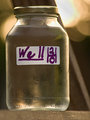
Well Water: "How to Be Responsibily Green, Surprisingly Healthy, And Thankfully Cheap!"by 777STANComment: Greetings from Andi via the Critique Club
First Impression: I may be being a little anal here? I found a book called 'Well Water' but didn't find the rest of the title - maybe because you spelt 'responsibly' incorrectly? and surprised nobody picked you up on it. Anyway I don't vote on titles although confess to disliking overly long ones.
Composition: The placing of the bottle looks ok to me but the diagonal wood? splits the image and is rather distracting for me.
Subject: I quite like the label on the bottle as without it or the title it is just a plain bottle of water and does lack any real interest (apart from the background bokeh that I just adore!)
Technical: Exposure looks ok to me, the wood the bottle stands on is neither sharp nor all oof so is a little distracting for me and I feel the bottle could be a little sharper. Did I mention I love the background bokeh?.
Final thoughts: Not an interesting subject nor image for me sorry so if I voted it would probably have been a 4. |
| Photographer found comment helpful. |
| 08/21/2009 05:59:41 PM |
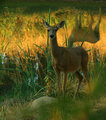
The Animalsby jdixonsdComment: Greetings from Andi via the Critique Club and congratulations on a new #2 image!
First Impression: The two main things that hurt this image were 1. The ,issing head that you mentioned and 2. The Deer is a little dull and dark for me.
Composition: I really like the composition here! The foreground grass is wonderfully blurred, a nice stone to anchor the image, the main deer is placed perfectly and the reflected colours in the water give this shot a warm Summer evening feel.
Subject: Can't really go wrong with a nice shot of a Deer (or two) and whilst the second Deer is good in the mostpart maybe you would have got that magic 6 score without it? (edited to add no you wouldn't cos then it wouldn't be the animals lol)
Technical: I do like the shot but think its a little flat and maybe playing with the brightness/contrast and even hue/saturation or curves and levels would have helped this pop and brought out more detail in the darkish Deer.
Final thoughts: Obviously a keeper and it must have been a great feeling capturing this shot, still loveing the colours here - well done. Message edited by author 2009-08-21 18:01:21. |
| Photographer found comment helpful. |
Home -
Challenges -
Community -
League -
Photos -
Cameras -
Lenses -
Learn -
Help -
Terms of Use -
Privacy -
Top ^
DPChallenge, and website content and design, Copyright © 2001-2025 Challenging Technologies, LLC.
All digital photo copyrights belong to the photographers and may not be used without permission.
Current Server Time: 06/23/2025 08:00:24 PM EDT.