| Image |
Comment |
| 02/01/2004 12:24:44 AM |
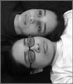
Gemini's Twinsby RoosterComment: I haven't been a big fan of twin photos like this thus far, but I say you've broken that mold. The setup isn't too original, but the shadows and light really take it somewhere. The shades don't blend with each other, they stand out and give each element a distinctive precense within the photo. |
 Photographer found comment helpful. Photographer found comment helpful. |
| 01/30/2004 07:05:56 PM |
|
| Photographer found comment helpful. |
| 01/30/2004 01:38:16 AM |
|
| Photographer found comment helpful. |
| 01/29/2004 05:00:54 PM |
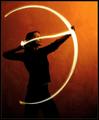
Setting A Heart On Fire by ndsComment: Absolutely beautiful. I love the natural gradient in the background, the thickness of the arc, the perfect shape of it. All around stunning and wonderfully executed. |
| Photographer found comment helpful. |
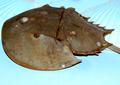
| 01/29/2004 04:59:25 PM |
Cancer the crab (Horseshoe Crab)by ladpupmoeComment: Sharp detail, but the angle on this doesn't really provide anything engaging for the viewer. The background almost looks textured, but simply remains confusing and detracts from the subject. |
| Photographer found comment helpful. |
| 01/29/2004 04:47:16 PM |
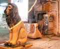
Leo the Regalby Glen KingComment: Sorry to be blunt, but... poor focus, harsh lighting, bland subject. The colors are vibrant, though! ;) |
| Photographer found comment helpful. |
| 01/28/2004 09:51:08 PM |
|
| Photographer found comment helpful. |
| 01/28/2004 09:45:38 PM |
Iconicby crabappl3Comment: Very interesting. From the thumbnail, I couldn't tell what the heck this was. I like how you've focused on the horn element; it definitely makes the viewer take in the photo differently. Instead of normally focusing on the face and then outwards, we're brough spiralling to the edge of the image. :) Very nice. |
| Photographer found comment helpful. |
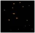
| 01/28/2004 09:42:40 PM |
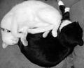
Geminiby Firstrich1Comment: Unless this is a constellation I'm not aware of, then I'd say this photo as a whole is rather bland. I like the idea, but it feels a bit too empty to work. Too much negative space with too little charisma to carry on the rest of the elements. Best of luck, though! |
| Photographer found comment helpful. |
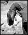
| 01/28/2004 09:34:34 PM |
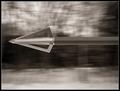
Archer's Wrath by casualguyComment: It's sharp and the blurred background implies motion, but the foreground still fails to keep my attention. The concept is there, but the fact that it's simply an arrowhead tip doesn't really keep me interested. |
| Photographer found comment helpful. |
Home -
Challenges -
Community -
League -
Photos -
Cameras -
Lenses -
Learn -
Help -
Terms of Use -
Privacy -
Top ^
DPChallenge, and website content and design, Copyright © 2001-2025 Challenging Technologies, LLC.
All digital photo copyrights belong to the photographers and may not be used without permission.
Current Server Time: 08/04/2025 10:16:50 AM EDT.