| Image |
Comment |
| 11/05/2005 09:49:12 AM |
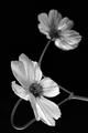
Cosmos bipinnatus Purityby banmornComment: Hello from the Critique Club!
I like this photo and I think there are plenty of reasons it "works." The lighting is interesting and crisp--the backlit near blossom seems very alive. The composition creates interesting tensions with the placement of the blossoms in two of the traditional rule-of-thirds spots. The black and white rendering focuses attention on the texture and line.
It's usually difficult to make a composition of two subjects work. I think this works because of the mirroring the second blossom does. The near blossom is backlit, light, crisp and full of detail. The far (and smaller) blossom balances this with solid lighting, shadowy, unfocused and modeled. These opposite qualities help play up the interest in the near flower.
The plane of the open blossoms gives a sense of diagonal direction (as does their relative placement)--these diagonals help give energy to the piece. The stems lend lines that help the eye travel, but the stems may be the weakest point of your image. Although I love the swoop of the nearest stem as it dives in and out of the corner of the image and leads the eye back around to the near blossom, the eye continues on toward the second flower and is tripped up by the other stem. Where the petals intersect with the second stem is, I feel, a weak spot in the picture. The eye wants to stay and figure out the complexity. I think a slightly lower or higher angle of view might have helped, then the petals would either fully overlap the stem or not at all.
I like the choice of black and white for your subject, it helps pull out the texture and detail in the blossoms. The black gives a solid support for the delicacy of the flowers.
Overall, a very fine image! I hope you took lots and lots of those nearly perfect blossoms while they lasted!
Cheers!
--Kadi |
 Photographer found comment helpful. Photographer found comment helpful. |
| 11/05/2005 09:11:37 AM |
Guiding Lightby gsalComment: Hello from the Critique Club:
A simple image with two subjects in silhouette for the most part. Grain was used to add texture to the background. The objects are related by the title and their general shape. The two subjects are centered against a relatively plain background enhanced with "grain."
I think it's difficult to balance a photo with two subjects. There is some tension as the light and the steeple compete for attention. In this case, the light tends to win because its brightness draws the eye. If this were composed in vertical the subjects might be held together better. The small cross at the top looks cramped for space--given its apparent significance to your topic that's not likely desirable. A vertical composition might have helped free up some space.
The application of grain does create a pleasing texture in the sky where otherwise none would be evident. However, I think photos that scored well in the challenge used grain to directly affect the subject or to give a mood to the entire image. Because these subjects are primarily black silhouettes this image could not make the most advantage of the technique.
The lighting situation appears to have been difficult with the brightness of the light competing with what appears to be a night sky. Trying to expose for both subjects leads to compromise--in this case, highlights barely contained and lack of any detail in the shadow. Perhaps an earlier time of day near sunrise or sunset would have given greater latitude in lighting your composition.
Overall, a fair attempt with a difficult subject.
Keep shooting!
--Kadi |
| Photographer found comment helpful. |
| 11/01/2005 05:59:46 PM |
delicateby rhipsterComment: What a fun image! Bright and sassy!
Wish the edges of the glass were just a little more "there"--hard to do under basic editing when you're fighting litlle blotches of sensor dust, though. Sweet composition, nicely done. |
| Photographer found comment helpful. |
| 10/31/2005 08:53:44 PM |
2.jpgby parrotheadComment: This couldn't be sweeter! Print it out for her to put by her bedside so she can always remember her dream and her dreamer... |
| Photographer found comment helpful. |
| 10/30/2005 01:59:41 PM |
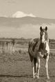
How the West Was Wonby jbsmithanaComment: Simple and effective composition. I like that you've maintained the range of tones in this image...they could have been so easily lost to the grain. Nice, timeless feel with the light duotone application. Something about the horse's pose and direct stare are just so appealing. |
| Photographer found comment helpful. |
| 10/30/2005 01:57:13 PM |
Walnut Eyes and Orange Tiesby stare_at_the_sunComment: Interesting composition. Can't say I get your title, though. I feel the silhouette would be stronger if it were perfectly black--perhaps one example of where applying grain to the entire image weakened a part of it. |
| Photographer found comment helpful. |
| 10/30/2005 01:53:09 PM |
Howdy!by parrotheadComment: Sweet expression. I like the dreamy quality of this image. The coarseness of the grain appears to be right for this image, but the flecks of color in the noise/grain detract from the dream. Perhaps applying the grain monochomatically or dropping the saturation on the reds would answer that? The pose and composition are wonderful however. |
| Photographer found comment helpful. |
| 10/30/2005 01:50:37 PM |
glimpseby mocabelaComment: I like the composition and the sultry expression on the young woman's face. The sharp highlights on the hair (or is it on the feathers or fur?) are somewhat distracting....perhaps with more detail in that part of the photo it wouldn't be such a mystery. |
| Photographer found comment helpful. |
| 10/30/2005 01:49:03 PM |
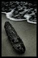
Margeby SondaComment: Simple and effective composition. The coarse power of the water on the sand and its effects on the wood begin to tell a story of the interaction of elements of nature. Nicely seen. |
| Photographer found comment helpful. |
| 10/30/2005 01:10:50 PM |
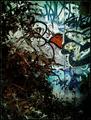
Unkeptby KonadorComment: Nice abstraction! I like the tension of the tow main elements in this image, the graffitied metal wall and the scraggly weeds. The grain helps lend a painterly quality--almost pointilism. There's a lot to interest the eye here. |
| Photographer found comment helpful. |
Home -
Challenges -
Community -
League -
Photos -
Cameras -
Lenses -
Learn -
Help -
Terms of Use -
Privacy -
Top ^
DPChallenge, and website content and design, Copyright © 2001-2025 Challenging Technologies, LLC.
All digital photo copyrights belong to the photographers and may not be used without permission.
Current Server Time: 08/26/2025 06:00:48 PM EDT.