|
|
|
Showing 301 - 310 of ~1363 |
| Image |
Comment |
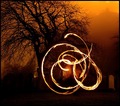
| 04/09/2007 05:15:10 PM | The dance of the flamesby purpleflutterby13Comment: This is a very interesting and exciting image to look at!
I love the setting--especially the glimpse of Edinburgh Castle in the upper right corner. Glad to see you're still working this subject! It's a great way to find what you want to say. |  Photographer found comment helpful. Photographer found comment helpful. |
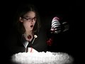
| 04/04/2007 09:06:14 AM | Disappearing Glassby riotComment: Lots of fun and humor in this shot! I really like the "floating" lollypop...it's weird in a a good way. I find the lack of detail in the center of the ice distracting, just a bit too blown out. The necklace also draws undue attention especially because it merges with the form of the wine glass. Limited color pallet is spot on, though, and the facial expression carries the theme well. | | Photographer found comment helpful. |
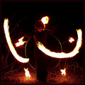
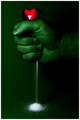
| 04/03/2007 09:15:58 PM | Painting with fireby purpleflutterby13Comment: Critique Club Comment...sorta...
I have looked carefully at your image and would like to give it the critique it deserves...but time is expiring and I am unable to squeeze within the shadow of the timeline. So....I hold my place with this comment and will "come back" tomorrow to add my thoughts. I hope you find that acceptable.
---
Finally getting back to you with something more like a critique:
This image has immediate impact of motion and fire. I especially like how the flame in front of the young woman appears. It is, however, a bit scary to look at--all that flame near dry brush and the fire behind her head make this seem dangerous. Yet at the same time the expression on her face is quiet. These factors do make me pause to figure out what's happening in the picture...what's the story?
Technically an image such as this is difficult to pull off. The light must be in motion but the model needs to be fairly still for the long exposure. Unfortunately the exposure is left with blown out whites in the flame and arms that disappear into the blackness. Digital, in general, has difficulty dealing with extreme lighting of this sort--the detail in the blacks (such as the clothing) is lost and the fire creates great swaths of empty space. It's not necessarily "bad" it's just something to be aware of when looking for depth in your image.
I like the choice of the square crop that frames the subject and keeps it contained with the space of the action. I like the way the face is lit with the softness of the lights. I like that this looks like a playful moment. But, in the end, I'm left wondering about the reason for the image...why it should interest me beyond the level of experimental photography. Your scores and comments clearly indicate that you grabbed people's attention...now I think you need to find some fire dancers. :)
Have fun with your photography and keep playing!
--Kadi Message edited by author 2007-04-09 17:11:45. | | Photographer found comment helpful. |
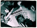
| 04/03/2007 06:40:56 PM | Vanished (outtake? unsubmitted?)by Sting11165Comment: A beautiful and emotive image! Choice of limited monotone really adds to the feeling of mystery. It seems so poetic and story-like. Even without a (proper) title one has a sense of what is happening here.
Oddly, the blurred face seems to add to the story...maybe if the entire image on the flier were blurred...it would make me think that the father/man was glossy-eyed in un-belief that this could be his daughter.
Certainly a wonderfully serious expression given the odd elements of the challenge topic! Sometimes the simple, unconnected pieces of ideas bring out the best in the author, no?
I would have been pleased to give this a very high score. It is technically and poetically very pleasing. | | Photographer found comment helpful. |
| 03/05/2007 04:26:57 PM | Envy Turns to Hateby levyj413Comment: Greetings from the Critique Club. The following comments are in response to your request for a critique on your challenge submission. Please feel free to send me a PM concerning my comments.
The impact of this image is immediate and lasting. It is a clear portrayal of an emotion and, in the context of the challenge, I appreciate that this shows what envy cum hate is rather than showing an object of hate.
Creatively an improvement, in my opinion, on your inspiration photo...though they do not carry the same message. I think the color choices and lighting carry a great deal of the impact. I would, however, like to see a bit more tension in the fist so that it really appeared to be squeezing hard. It would also have a little more impact if the heart could somehow look more squeezed itself, distorted in some way.
I'll also make a minor quibble with the tiny highlights on the one side of the heart...they appear to be from a secondary light source which doesn't appear to be contributing to any other part of the image. Of course, outside of basic editing, they could have been cloned away but perhaps the source could have been turned off in the first place? The main reason they distract, I think, is that white is so important in your image. The white V-shaped highlight on the heart so neatly leads the viewer to believe the white crushed "glass" coming from the fist. So, though it may seem picky, the tiny white highlights are made even more prominent by the other choices in the image.
There really is little else to quibble with in this image. (I will say I disagree with the commenter who wanted to see trimmed nails...as I usually do...but since when does envy stop for a manicure?) Overall, this is very well done technically, creatively, in subject and in conception...and the votes and comments agree. Congrats on your high-placing image! Keep 'em coming!
--Kadi | | Photographer found comment helpful. |
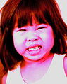
| 03/05/2007 03:47:12 PM | Jean's hate faceby pla2Comment: Greetings from the Critique Club. The following comments are in response to your request for a critique on your challenge submission. Please feel free to send me a PM concerning my comments.
First, welcome to DPChallenge and congratulations on entering your first image! I hope you'll consider entering more as it seems you have a pleasingly different way of approaching your subject.
My first impression was that the image really screams at the viewer. I've seen children so angry they nearly turn that color pink with rage. Red is definitely the color of anger and hate for me.
Your commenters clearly expressed that they thought you went a bit too far with your color choice. I find it fun and reminiscent of Andy Warhol poster portraits. The only way to take it farther in the Warhol direction would be to apply filters to heighten the graphic quality of the image...which, of course, is not legal in Basic Editing challenges. I think if I were to suggest a change to the coloring it would be to tone down the red in the hair and shadows a bit more toward the fuscia range--the combination is perhaps a bit too jarring and unnecessary given the great expression on the girl's face.
This image certainly has impact! I feel her angry stare. The composition clearly focuses on the face as the hair and other elements frame this portrait. There's nothing un-wanted within the frame that would distract me from its message.
If this were simply a full-color portrait, then I'd have to agree with one commenter that the highlights on the face are blown out and lacking detail that we usually like to see. But I feel you made this choice intentionally and that it adds to idea behind the shot. Even the blur around her neck and shoulders helps make it feel like she has just quickly turned her head adding a bit of dramatic motion to the image. And her expression is priceless with the little wrinkles above her nose!
Overall, I can't find much wrong with this other than it's obviously not the kind of image the voters responded well to. So the only advice I can offer is don't always believe the voters and keep shooting!
--Kadi
(By the way, I'd love to see it again if you try a different post-process on it...please post it in the forums if you do.) | | Photographer found comment helpful. |
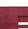
| 03/05/2007 03:01:38 PM | AWOLby posthumousComment: Greetings from the Critique Club. The following comments are in response to your request for a critique on your challenge submission. Please feel free to send me a PM concerning my comments.
This image got a chuckle from me when I saw it in the challenge because I enjoy word play. My second thought, however, was that this is not a wall that can be climbed over... For me, this would have had a stronger connection with the challenge if it also portrayed an escape...if, for example, there was a wall (or fence) with a shread of clothing on it suggesting that someone had actually gone without permission...it would have a double meaning and second connection to the challenge.
The composition has an interesting graphic quality. I like to see this sort of play with lines and shapes. The falling snow gives it some dimension. However, because the white at the top of the frame has no definition, it is not clear at first if that is blown out sky or snow on a roof. It is only because I know this type of metal garage that I can deduce it is a roof. The line of the roof edge has creates an interesting pattern but I don't see the purpose in including much more than a sliver of the white above the edge. The lightness of that large white area pulls the eye away from the more interesting shapes and textures below.
I feel this lacks a true center of interest. The pattern is interesting but not strong enough to keep me looking for long. As a whole it has abstract interest in passing but nothing that really holds me there. The element that piques my curiosity most is the dents near the door...but that doesn't seem to be part of the story here.
Stronger lighting (nearly impossible during a snow storm) would have heighted the relief in the textures of the structure. Because this is taken during a snow fall, I have to ask what does the snow add? Would you know it as snow if you had never seen snow fall beside a red barn?
Overall, I'm left with the impression that the only reason for the image is the challenge. I think it needed something more to carry the viewer toward seeing what you were seeing. Out of the box? Yes. Creative thinking is good excercise in these challenges, isn't it.
Hope you don't find my comments too harsh.
Keep creating!
--Kadi | | Photographer found comment helpful. |
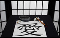
| 03/05/2007 01:54:18 PM | Love in Chineseby fas-ligandComment: Greetings from the Critique Club. The following comments are in response to your request for a critique on your challenge submission. Please feel free to send me a PM concerning my comments.
The first thing that strikes me about this image is the near perfect symmetry that frames the main subject. The repetition of lights and darks hold the theme together. I like the rhythm of lines as they repeat throughout--in the background, in the ink stone, and in the calligraphy. The composition seems carefully planned. It feels like a black and white photo in color...very controlled and interesting.
As a couple of your commenters mentioned, I too would like to see something a bit different with done with the lighting. I think, first, the white balance could be improved in post-processing to make the whites really white--they seem a bit grey and make the image feel a little dull on the whole. The greyish tones in the side panels indicate depth...but I wonder if their difference in tone doesn't hurt the graphic quality of the presentation.
I think lighting would also help define the center of interest. I'm not sure where exactly my eye should rest...I keep being drawn to the cross reflected in the puddle on the ink stone and keep wanting to explore the brush more but am drawn away. I wonder if the scene were not so evenly lit if a center of interest could be defined a bit more and if there might be a bit more energy in the image.
One of your commenters mentioned that the character does not seem like it was made with that brush and I agree. It seems slightly out of place because the scale does not appear correct for the tool. If, instead, you had made many of the characters on the paper as if a teenager were practicing...well, that would be a different image then, I suppose?
I think this image relates to the challenge "Love II" fairly well for those familiar with the character. The title really is needed for those who are not familiar with it. If the English word "Love" had been drawn on the paper instead I'm fairly sure the image would have scored lower as inconsistent with the setting. But because we are primarily looking at a word and there is nothing else here that necessarily conveys the concept of love the connection with the challenge is not as strong as it might be.
Overall, this is a wonderfully graphic image that has appeal. It would make a perfect cover for a greeting card.
Keep creating!
--Kadi | | Photographer found comment helpful. |
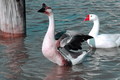
| 03/04/2007 06:00:42 PM | Back Off She's Mineby actnoutComment: Greetings from the Critique Club. The following comments are in response to your request for a critique on your challenge submission. Please feel free to send me a PM concerning my comments.
First impression, this image was taken at the right moment. The raised wings of the male and the way his eye meets the gaze of the camera convey the concept of warning an intruder. It makes me feel like I'm right there confronting this scene.
I'm drawn to the detail in the feathers on the male and the curve of his extended neck. I like the contrast between his alarmed pose and the more complacent mood of the female he protects. I like that the curves of their necks echo each other creating a rhythmn within the image.
I do find that the composition feels a little cramped. At first, I felt the post on the left really didn't belong since it somewhat stops the progress of the geese. Had the male somewhat overlapped the post it wouldn't feel like such a barrier. But, upon reflection, I find it helps to keep me in the frame sending me back to the subjects. However, the nearness of the one goose to the top of the frame of the image does cramp the view (in my opinion). I'd like to see just a bit more room at the top--either by stepping back a bit from the subject (or zooming out), composing the shot vertically, or choosing a lower angle of view. I think bringing the camera view back a little would also allow the inclusion of the female's tail which seems awkwardly chopped off by the image frame.
The lighting is clearly mid-day, a situation that causes harsh shadowing. In this case it doesn't seem to hurt the image very much but it does make it hard to retain detail in the white feathers of the female. Blowing out the highlights there causes a minor distraction.
The color in this image feels a little oversaturated. The cyan in the water creates a cold, icy feeling. At the same time the bill of the female seems unrealistically red. It appears that hue/saturation might have been increased on all colors at the same time, choosing individual color channels would provide more control to these two areas allowing you to bring up the lovely red-browns in the image while holding back the cyan in the water a bit.
Love, the subject of this challenge, certainly can involve protection. But I'd also like to see a stronger connection between the "lovers"... There is a start to connection in their similarity of poses and their proximity to each other. To me, however, love is something of a human concept. In order to relate this concept to animals, to get the viewer to anthropomorphize, it seems there needs to be something more human-like in their relation to each other....I'm not sure exactly what that would be. Perhaps more similarities, more proximity...or something else conveyed in a harmony of color or texture that would emphasize their relationship and help me empathize with their bond.
Overall, I think this is a technically good image taken at an interesting moment.
Keep shooting!
--Kadi
| | Photographer found comment helpful. |
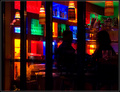
| 12/20/2006 01:11:10 PM | Shopping Spiritsby scarbrdComment: I like the patterns of color in this image. The dark mood of the bar seduces me. I wish this image delivered more in the silhouettes...were the profiles more distinctive, the heads turned a bit more toward each other, I might have felt the subjects connecting more strongly to each other and, by extension, to me as the viewer. Were I cropping this, I would have trimmed the black window frame(?) from the left so that it would balance with the open colors on the right...then cropped up a bit from the bottom as there is no real need for the extra black nor that annoying little object in the lower left.
--comment left per request in this thread. | | Photographer found comment helpful. |
|
Showing 301 - 310 of ~1363 |
Home -
Challenges -
Community -
League -
Photos -
Cameras -
Lenses -
Learn -
Help -
Terms of Use -
Privacy -
Top ^
DPChallenge, and website content and design, Copyright © 2001-2025 Challenging Technologies, LLC.
All digital photo copyrights belong to the photographers and may not be used without permission.
Current Server Time: 08/25/2025 04:34:13 AM EDT.
|