| Image |
Comment |
| 01/16/2003 08:10:18 PM |
Lunada Bayby daysezComment: That's a lovely photo - definitely a printable image. The colour is lovely, the water and clouds are a delight and the people provide a focus point. Thankfully the grass-like plants aren't in front of the people. I have nothing bad to say except that the gress is just a fraction distracting. I'm jealous. |
 Photographer found comment helpful. Photographer found comment helpful. |
| 01/16/2003 08:05:24 PM |
Refreshing!!by BigSmilesComment: It's an interesting photo although the depth of field appears to be a bit shallow - the middle is in focus, but the grass at the bottom looks blurred and the bank at the top is blurred. Without knowing the camera it's difficult to say if there is much you could have done about this though. |
| Photographer found comment helpful. |
| 01/16/2003 08:02:01 PM |
Stand Tallby TurbotechComment: I love the composition, and the reflection in the water. The tower is a little washed out though. It looks like the lighting was tough though (very bright sky, but very dark around pond). I wonder if a polarising filter would have helped - others would know the answer to this. Well done. |
| Photographer found comment helpful. |
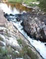
| 01/16/2003 06:28:27 PM |
The Temperature Falls at Niagaraby wargloryComment: Good photo - the colours are rich and the focus is nice. I'm curious as to why you chose portrait instead of landscape though. There is a bit too much sky for my taste and landscape orientation may have pushed the horizon up to about 1/3 from the top. Otherwise though the photo is nice - the foreground is particularly interesting |
| Photographer found comment helpful. |
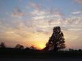
| 01/15/2003 08:12:21 PM |
Landscapeby fsieradzkiComment: The colours of the sky against the silohuette works very well. Focus and composition is very good - quite a nice photo, worthy of printing. Well done. As a suggestion, you could try cropping the right edge to include the power pole, although I would try to keep a landscape perspective to the image. |
| Photographer found comment helpful. |
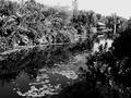
| 01/15/2003 12:18:12 AM |
Nature at it's best ...by CreativeFlyPhotoComment: I find the black and white a little too harsh - especially when the title mentions "nature" - I expected some natural greens and blues. It looks a little like an old photo and has lovely composition but I think colour would have gotten a higher vote from me - I don't see a need for b&w for this photo. |
| Photographer found comment helpful. |
| 01/15/2003 12:14:46 AM |
Silhouette at sunrise.by MarklaneComment: I love this photo. The range of colours is great, the silohuette of the tree is wonderful. It's a very interesting picture, and technically well executed. The border sits well, colours are natural yet interesting, focus is good, composition is very good. Well done - one of the best. |
| Photographer found comment helpful. |
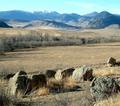
| 01/14/2003 10:58:01 PM |
Southeast of Nyeby BadPiggComment: A lovely classic landscape shot. The rocks in the foreground provide interest, whilst the mountains provide a sense of vastness. Technically very good - lovely colour, focus and depth of field. My only negative would be the squareness of this photo - it's not bad but I think I'd prefer a wider shot (depending on what was out each side). Well done though - one of the best and very true to the challenge title. |
| Photographer found comment helpful. |
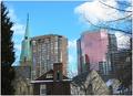
| 01/14/2003 10:55:05 PM |
Lanscape became Cityscapeby jgillardComment: Looking at those buildings I'd say it became cityscape a long time ago (100 years or more), but I still like the photo. It has an interesting mix of building types and colours and is nicely framed by the two trees. Good work |
| Photographer found comment helpful. |
| 01/14/2003 10:53:30 PM |
Place of stillnessby vjozComment: A great postcode like photo. The falling over signpost has an almost comical quality to it - which I like a lot. I think black and white was a good choice for this photo (I think a lot of people overuse b&w). Well done. |
| Photographer found comment helpful. |
Home -
Challenges -
Community -
League -
Photos -
Cameras -
Lenses -
Learn -
Help -
Terms of Use -
Privacy -
Top ^
DPChallenge, and website content and design, Copyright © 2001-2025 Challenging Technologies, LLC.
All digital photo copyrights belong to the photographers and may not be used without permission.
Current Server Time: 08/25/2025 01:16:33 PM EDT.