| Image |
Comment |
| 01/22/2003 06:53:42 PM |
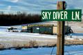
Feeling Daring?by alanfreedComment: Great photo - the sign really grabs my attention because the focus is so crisp and colour so vibrant. The depth of field also helps control my attention. Lighting is great and composition is good. Well done - definitely one of the best this week. |
 Photographer found comment helpful. Photographer found comment helpful. |
| 01/22/2003 06:51:40 PM |
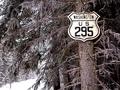
Look what I found in Canada,of all places.by camelotnorthComment: Nice composition. It looks like there is a tiny bit of colour left in the photo - I wonder if it would look good completely black and white (although I don't mind the touch of colour). Focus is crisp as well. |
| Photographer found comment helpful. |
| 01/22/2003 05:06:17 PM |
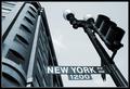
Start Spreadin' the News by magnetic9999Comment: Wow - such a vivid image. Black and white is a must for this image. The subtle grey line in the border is great and I love the contrast in this photo. The only thing I would have tried differently would be to move the sign slightly so that it didn't overlap the building - although it's hard for me to image what that would look like - perhaps it would destroy the towering effect. |
| Photographer found comment helpful. |
| 01/22/2003 04:54:12 PM |
At the Corner of Charles and Mapleby karmatComment: Unfortunately the tree really steals the show for me - probably because it's so well lit and the signs (especially Maple) are very dark to read. I like the composition though - it feels very balanced. The border feels appropriate and isn't overdone. Good job. |
| Photographer found comment helpful. |
| 01/22/2003 04:49:03 PM |
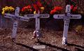
Road Sign Memorialby AnachroniteComment: The effect of the flowers being so much brighter than the signs is interesting, although it keeps drawing my eyes away from the signs themselves. I wonder if it would have been possible to use the flash to brighten the signs up or something? Besides that though, composition and framing is very good and well balanced all around. Such a tragic loss of young life. |
| Photographer found comment helpful. |
| 01/22/2003 04:40:23 PM |
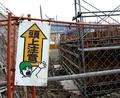
OMG!! Caution: Above!!!by AntithesisComment: I love the sign, or should I say "OMG, What a funny sign". Composition is fairly good - it's a shame you couldn't get a crane in the background somehow. Focus is also pretty good. |
| Photographer found comment helpful. |
| 01/21/2003 11:53:14 PM |
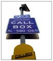
Freeway Call Boxby TarbiniComment: Effectively removing the background really brings attention to the sign. To me it feels that cropping part of the callbox was a bad move - could you perhaps have taken the photo from lower down to include all of it? Other than that the focus is pretty good. The border is also nice and simple. |
| Photographer found comment helpful. |
| 01/21/2003 11:47:53 PM |
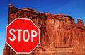
Red Rock, Red Stopby YomiComment: Wow - that's certainly an interesting place to find a STOP sign. Your colouring and focus is brilliant - so much detail. The sign is also "crispy clear". My only (possibly) negative comment would be the alignment of the left edge of the rock and stop sign - perhaps more or less overlap between the two would be better? |
| Photographer found comment helpful. |
| 01/21/2003 11:45:46 PM |
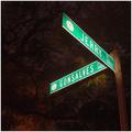
Gonsalves and Jerry Placeby daysezComment: The lighting on the tree is interesting. Did you use a flashlight perhaps to light the sign? Great clarity on the sign. I'm not sure from your title whether "Jerry and Gonsalves" is something I should recognise, or just a corner you chose randomly (perhaps where you live). |
| Photographer found comment helpful. |
| 01/21/2003 11:43:51 PM |
|
| Photographer found comment helpful. |
Home -
Challenges -
Community -
League -
Photos -
Cameras -
Lenses -
Learn -
Help -
Terms of Use -
Privacy -
Top ^
DPChallenge, and website content and design, Copyright © 2001-2025 Challenging Technologies, LLC.
All digital photo copyrights belong to the photographers and may not be used without permission.
Current Server Time: 08/26/2025 09:28:05 AM EDT.