| Image |
Comment |
| 02/09/2003 06:39:22 PM |
Happyby mariomelComment: Nice work - he has a wonderful smile. Personally I would have included all of his arms at the bottom of the shot. Also the photo looks like it has two much red in it - perhaps reflection from the red tube though - a little work in photoshop might produce a more natural skin tone. I really like this photo though - well done. |
 Photographer found comment helpful. Photographer found comment helpful. |
| 02/06/2003 08:50:38 PM |
Tuzik and Maxby basia03Comment: I think the white background and the darkness of the dogs makes them a little hard to look at. I like your composition - it's different and works quite well |
| Photographer found comment helpful. |
| 02/06/2003 08:49:05 PM |
Dozy Dogby marboComment: He looks sleepy. It's a good shot, but I might have tried taking it a little closer to the ground, and perhaps including more of his body. |
| Photographer found comment helpful. |
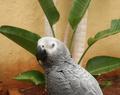
| 02/06/2003 08:45:40 PM |
Bird of Paradiseby CubComment: Nice photo - Focus is ok, colour is good and the bird is delightful. I might have tried applying "rule of thirds" to this image - perhaps placing the birds eye at the top/left third point. The shallow depth of field brings attention to the bird, but I might have tried even a shallow-er depth of field to really blur the background. Great shot. |
| Photographer found comment helpful. |
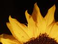
| 02/06/2003 08:37:51 PM |
Sun Rise Cliche'by justineComment: That's a very interesting crop. Colour is great and the water drops are nice. It looks like you had a very shallow depth of field - I might have tried to get the entire flower in focus since there is no background, but it's still pretty good as it is. |
| Photographer found comment helpful. |
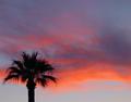
| 02/06/2003 08:35:57 PM |
Silhouette at Sunsetby briphotoComment: I think the palm tree is perhaps a little too small in this shot. Focus is quite good and the tree is almost completely black - which is very good. |
| Photographer found comment helpful. |
| 02/05/2003 11:56:14 PM |
Plain and Simpleby agwrightComment: Plain and simple - yet also elegant. Great focus and wonderful lighting on this flower. The border is also cliche, yet appropriate. I might have tried something other than awhite background, but I like the white anyway. Interesting choice of composition - it works really well. |
| Photographer found comment helpful. |
| 02/05/2003 11:50:52 PM |
E Type Jaguar 1961 Just add sales textby PaulkComment: I like the composition, although it's perhaps cropped a little too closely on the left edge. Orientation of the car is very good. The background is perhaps a little too dark for my preference. The reflections in the cars body and windscreen are well managed - nothing too distracting, but you could have played to remove more perhaps. Good work. |
| Photographer found comment helpful. |
| 02/05/2003 09:58:29 PM |
Noseyby SquiffyeitherjagComment: That's a very intense macro - perhaps a little too close. It's certainly an interesting shot though, with lots to look at. I don't like the shallow depth of field - too much of the image is blurred. |
| Photographer found comment helpful. |
| 02/05/2003 09:55:54 PM |
Camelliaby Geo_GriffinComment: I like the composition of this shot, although it looks like you have a bit of camera shake in the shot perhaps. Not knowing your camera it's difficult to tell how good a job this is - some camera's make this shot easy, on others this would be an extremely good attempt. Good work. |
| Photographer found comment helpful. |
Home -
Challenges -
Community -
League -
Photos -
Cameras -
Lenses -
Learn -
Help -
Terms of Use -
Privacy -
Top ^
DPChallenge, and website content and design, Copyright © 2001-2025 Challenging Technologies, LLC.
All digital photo copyrights belong to the photographers and may not be used without permission.
Current Server Time: 08/26/2025 02:29:01 PM EDT.