| Image |
Comment |
| 04/01/2003 12:59:38 AM |
Peaceful symmetryby johnmkComment: I like this shot. It has great colour and very good symmetry. You have also captured the details of the bricks without over sharpening the result. |
 Photographer found comment helpful. Photographer found comment helpful. |
| 04/01/2003 12:58:34 AM |
Architecture Symmetryby ladpupmoeComment: The photo is rotated slightly (obvious when you scroll down the page) - it's a good image but would have been more powerful is perfectly square. |
| Photographer found comment helpful. |
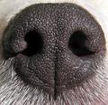
| 04/01/2003 12:56:54 AM |
Canine Symmetry....by Dallas_TXComment: That is a stunning macro. The detail is brilliant, and it happens to meet the symmetry challenge perfectly. Great work. |
| Photographer found comment helpful. |
| 03/31/2003 08:50:33 PM |
|
| Photographer found comment helpful. |
| 03/31/2003 01:26:01 AM |
|
| Photographer found comment helpful. |
| 03/31/2003 01:24:24 AM |
Melbourne Skyline by GordonComment: Nice work. I love the colour in this photo. The buildings are also very crisp, and the Yarra doesn't look brown in the nighttime. Yes, I'm from Melbourne myself - perhaps you'll recognise my entry, although it isn't as obvious. Well done. |
| Photographer found comment helpful. |
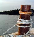
| 03/26/2003 12:27:40 AM |
Nautical Parkingby JeileenComment: I like the composition, although the bottom right corner would have looked nicer if it was a bit cleaner (which may or may not have been an option you had control over.
I can see a bit of noise in this image, particularly in the sky. Is it a long exposure, or perhaps a high ISO. I think you should see if you can reduce the noise using a filter effect.
The colours on the post and rope are quite interesting - it's a shame it wasn't a bright sunny day though, the background isn't terribly exciting on a cloudy day. Having said that, it does work well to bring attention to the post and rope - they are certainly the focal point. |
| Photographer found comment helpful. |
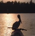
| 03/26/2003 12:24:15 AM |
Coming Inby JeileenComment: I like the silohuette effect of this photo. The composition is quite good, although the water skier in the background is a little distracting because they are so hidden in the darkness.
The edges of the silohuettes look a little soft / blurry, although nothing major. Since there is so much contrast it's possibly something that could be sharpened up with damaging the waves, but I'm no expert in this area.
I see humour in this shot - it's almost like the pelican is driving the jet ski. I assume this is what you mean by the title. |
| Photographer found comment helpful. |
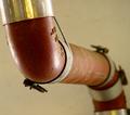
| 03/25/2003 08:09:09 PM |
abstract whiskby RefractedComment: Critique Club:
Composition: I like the intensity created by being so close to the whisk. The end of the handle is nicely located within the frame, and provides a focal point (helped by the shallow depth of field). The handle and it's shadow blend together a bit too much - perhaps more light on the handle would have helped this.
Technical Quality: I like the shallow depth of field - intentional or not, this really makes this shot interesting. The background is a little bit noisy, perhaps because of low light. I think lighting is the area in which this image could be most improved - by providing clarity and perhaps an even more interesting use of the shadows created.
Meeting the Challenge: Certainly does - clearly from the kitchen, and an artist interpretation. You didn't simply photograph a whisk - you tried to create a photo which stands on it's own. The photo meets the challenge without requiring assistance from the title - good work.
Creativity: The angle of the shot and the close crop are quite creative. Again though, I would have played with different lighting options to see if it could add another aspect to the image.
Border: None present, but none required for this shot.
Overall: Personally I think this shot meets the objectives of "Kitchen Art" quite well. I think it was perhaps a little rushed - the handle lets the photo down a bit by being so dark and merging with it's own shadow. Good work.
Cheers. |
| Photographer found comment helpful. |
| 03/18/2003 12:04:24 AM |
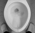
Number Oneby jerrftComment: Oh man, you're going to suffer some harsh comments and votes this week. |
| Photographer found comment helpful. |
Home -
Challenges -
Community -
League -
Photos -
Cameras -
Lenses -
Learn -
Help -
Terms of Use -
Privacy -
Top ^
DPChallenge, and website content and design, Copyright © 2001-2025 Challenging Technologies, LLC.
All digital photo copyrights belong to the photographers and may not be used without permission.
Current Server Time: 08/27/2025 11:16:35 AM EDT.