| Image |
Comment |
| 02/13/2015 03:14:55 AM |
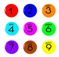
Call Meby ElaineComment: I would have preferred a real telephone key pad. This looks more like a drawing than a photograph. |
 Photographer found comment helpful. Photographer found comment helpful. |
| 02/13/2015 03:11:38 AM |
Area Code 815by giantmikeComment: I couldn't find an old rotary phone to shoot for this challenge. There were some of those in the houses i frequent (home, family, relatives...) but it was long time ago. I obviously like the idea and the composition is spot on.
I would love to see the red phone stand out more. The shadowy part in the earpiece of the handset is blending in the red background. I would have desaturated the red background and added some fill light on the (camera) right side of the phone. Maybe boost the reds a bit more, afterwards. But this is not my chief remark. The focus/DoF is not complimenting the idea, the challenge topic and the title. I wish the focus was either on the whole dial (1 to 0), or at least the phone number in the middle of the dial. If the phone number in the middle of the dial was in focus, it would have complemented the title very well. This way it looks kind of incomplete with the focus on the top row of numbers and the handset. All of the numbers could have been in focus without altering the DoF/aperture significantly if the camera angle was perpendicular to the dial and putting them all in the focus plane. This would, on the other hand, alter the composition in a significant way (where is a good tilt/shift lend when you need one). I cannot predict the effect of that change in composition. It might be good, but it might ruin it.
Specular highlight are tricky part of the image. On one side there are the ones that are defining the shape and the smoothness of the phone and the cord. On the other, there are some, especially bluish ones, that are distracting.
All in all, this is a wonderful image (idea, subject, composition...), that i would have chosen to execute and process in a slightly different manner. |
| Photographer found comment helpful. |
| 02/12/2015 08:25:43 PM |
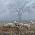
Counting sheep by P-A-U-LComment: A flock of racing sheep :-)
This comes from an anecdote from my childhood. "Look dad, racing sheep!", was my reaction when i first saw marked sheep, from a train window. I don't recall the event, but it was told and re-told many times by my parents. |
| Photographer found comment helpful. |
| 02/12/2015 08:20:51 PM |
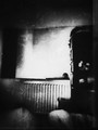
zeroby NiallOTuamaComment: Zero, as in zero number of numbers in the image? |
| Photographer found comment helpful. |
| 02/12/2015 08:14:02 PM |
|
| Photographer found comment helpful. |
| 02/12/2015 07:48:38 PM |
One Patient Wifeby MadMan2kComment: Interesting idea. Totally out of the box thinking. I predict that the majority of the voter wouldn't respond to it and vote DNMC.
My remark is not on the idea, but on the execution. The whole image is kinda flat and lacks contrast. Darker shadows. The lighting is good, though, with a nice soft transition from shadow to light (left to right) at the middle of the face. |
| Photographer found comment helpful. |
| 02/12/2015 07:41:19 PM |
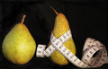
Counting calories sure works for youby enikoComment: One of the many images that bear resemblance to at least one of the ideas i had for this challenge. Apparently we have no tape measure at home :-(
I would have preferred if the background was not so black. And it's not even full black. There are dark areas that are not black and that's a bit distracting. I would have went to the other extreme, even. High key. Also, this image would have benefited from softer lighting (and shadows) |
| Photographer found comment helpful. |
| 02/03/2015 06:25:15 PM |
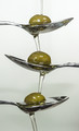
Olive oilby clickodakComment: This i have seen before, but i'm not going to hold that against you. :-)
It is certainly original to this challenge. The sharpness is good and the greenish color at the bottom of the background matches the color of the olives.
The lighting is a bit uneven (top to bottom). It looks correctable in post. The camera (or spoon) angle could have been a bit better as well. I see the sides of the top two spoons bu the inside of the third.
I cannot decide whether it needs a bit more color vibrance (or saturation) or not. |
| Photographer found comment helpful. |
| 02/03/2015 06:22:24 PM |
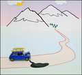
H(oil)iday ended ... !!!by SistoComment: Cute. Not very photographic, but cute. I cannot decide how to rate the idea, yet. It's original (good), funny (good), but not very photographic (bad). Setting this aside, there are some things related to the composition and lighting that should have been thought over in more details during the setup:
- I cannot see clearly, but the steering wheel seems to be on the left side. This should imply that the Mini should drive (and park) on the right side of the road.
- The shadow does not match the position of the depicted light source (the sun, the clouds, the time of day).
- A pissed of (or desperate) driver somewhere around the car would be nice, either as a figure or as a drawing. :-) But this is not essential.
Haven't voted yet. This is my first browse of the entries and this was the first image on my list. |
| Photographer found comment helpful. |
| 02/01/2015 06:52:12 AM |
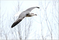
Sail on silvergirl, sail on by...by crikComment: It looks overexposed to me. There are details lost in the tail and the top of the head blends in with the background. Maybe it was repairable in post processing. |
| Photographer found comment helpful. |
Home -
Challenges -
Community -
League -
Photos -
Cameras -
Lenses -
Learn -
Help -
Terms of Use -
Privacy -
Top ^
DPChallenge, and website content and design, Copyright © 2001-2025 Challenging Technologies, LLC.
All digital photo copyrights belong to the photographers and may not be used without permission.
Current Server Time: 08/18/2025 09:21:27 AM EDT.