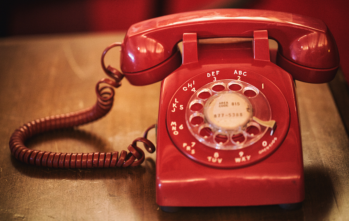
I couldn't find an old rotary phone to shoot for this challenge. There were some of those in the houses i frequent (home, family, relatives...) but it was long time ago. I obviously like the idea and the composition is spot on.
I would love to see the red phone stand out more. The shadowy part in the earpiece of the handset is blending in the red background. I would have desaturated the red background and added some fill light on the (camera) right side of the phone. Maybe boost the reds a bit more, afterwards. But this is not my chief remark. The focus/DoF is not complimenting the idea, the challenge topic and the title. I wish the focus was either on the whole dial (1 to 0), or at least the phone number in the middle of the dial. If the phone number in the middle of the dial was in focus, it would have complemented the title very well. This way it looks kind of incomplete with the focus on the top row of numbers and the handset. All of the numbers could have been in focus without altering the DoF/aperture significantly if the camera angle was perpendicular to the dial and putting them all in the focus plane. This would, on the other hand, alter the composition in a significant way (where is a good tilt/shift lend when you need one). I cannot predict the effect of that change in composition. It might be good, but it might ruin it.
Specular highlight are tricky part of the image. On one side there are the ones that are defining the shape and the smoothness of the phone and the cord. On the other, there are some, especially bluish ones, that are distracting.
All in all, this is a wonderful image (idea, subject, composition...), that i would have chosen to execute and process in a slightly different manner. |