| Image |
Comment |
| 01/04/2010 09:03:28 PM |
Beachfront Communityby bcrantsComment: The first thing I notice is the complete lack of focus, like there was an attempt to make the image in the 'dreamy' style. The second thing I noticed is the complete lack of contrast as well as any sort of semblance of white which every element in this piece is screaming for. It really feels bland, dull, faded and unappealing for me. |
 Photographer found comment helpful. Photographer found comment helpful. |
| 01/04/2010 09:01:57 PM |
* D U S K *by hotpastaComment: Now I can see some really fantastic potential for this image. It appears all of the elements are there. But for me, they are not pushed enough. The clarity could be increased as well as sharpness and colour saturation. However it is a very nice image and viewing it this second time I will offer a bit of a bump up. |
| Photographer found comment helpful. |
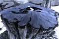
| 01/04/2010 09:00:19 PM |
Forgotten Treeby ConradyComment: Now this is an interesting find. However your title is disconnected for me because it does not tell me tree, but perhaps tar something. One may argue that you can see the tree on the bottom there, but one may also argue it does not really look like a tree most of us are used to seeing, nor can we see rings on the top which most of us would associate with a cut open tree. The narrow focal plane also leaves me something to be desired as well as the clarity of image. |
| Photographer found comment helpful. |
| 01/04/2010 08:58:15 PM |
Edelweiss Galleryby beekeeperComment: This piece has a strange feel for me. I really want a sharp focus on something here. Though it does not appear to be as sharp as it could be. The yellow colour I can not tell if it is poor white balance management or the actual colour or you left it for effect. It is a nice looking building however I feel with the snow and lighting it was done no justice. |
| Photographer found comment helpful. |
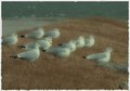
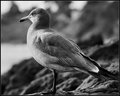
| 01/04/2010 08:56:23 PM |
Gull at Sunsetby bspurgeonComment: One of the better bird images in this challenge. I am very happy to see the detail was left in the feathers and not smoothed over. I also enjoy the contrasts and separation from background. However I do not care for the profile view nor the fact there is no hint, idea, or concept of sunset except for your title. For me it could be any time of day. However Because with this second look I can see how much detail was left I will bump the score a bit. |
| Photographer found comment helpful. |
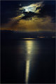
| 01/04/2010 08:54:41 PM |
A Tale Told By A Moonby HighNoonerComment: I look at this and I want to like it more. It has nice elements but it also have some not so nice elements. Center composition for one does not thrill me. The overly smooth feel of the image is a bit distracting. I cannot tell what I am looking at on the foreground and there is such a huge amount of it it distracts from the overall image. |
| Photographer found comment helpful. |
| 01/04/2010 08:52:54 PM |
Grand Finaleby ScholtenComment: This isn't too bad even with the amount of haze in the shot. It actually has a pleasant balance. However for me it just does not have a tremendous amount of pop. |
| Photographer found comment helpful. |
| 01/04/2010 07:35:50 PM |
Quality Timeby ButterflyGirlComment: This is a lovely family portrait and the selective colours works well, though you missed the spot over his shoulder and under her chin. Also the flower/leaves between her feet have no real concept of belonging. It does not make sense why they are there, much less in the middle of a bridge. So for me the leaves are a major downside. Otherwise it is a nice portrait and Im sure the couple would be excited to have this. Though for me it just is not enough. |
| Photographer found comment helpful. |
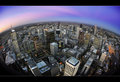
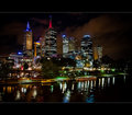
| 01/04/2010 07:34:16 PM |
Melbourne from the Gby millsaComment: It is a nice cityscape though for me there is something that just does not sit well. There almost appears to have a 'dreamy' effect on it which blurs everything slightly. I do enjoy the depth of detail in the trees. However there is just something about this piece that does not work for me. It just does not pop enough for me. Perhaps the flat colours or lack of contrast. |
| Photographer found comment helpful. |
| 01/04/2010 07:32:49 PM |
Melbourne from Princes Bridgeby vladoComment: A lovely night shot. The lights appear to be working well with you as is the glow in the background to give you a bit of depth to the piece. After looking the second time I am going to bump the score a bit because of the cleanness of the piece. |
| Photographer found comment helpful. |
Home -
Challenges -
Community -
League -
Photos -
Cameras -
Lenses -
Learn -
Help -
Terms of Use -
Privacy -
Top ^
DPChallenge, and website content and design, Copyright © 2001-2025 Challenging Technologies, LLC.
All digital photo copyrights belong to the photographers and may not be used without permission.
Current Server Time: 09/01/2025 03:33:29 AM EDT.