|
|
|
Showing 391 - 400 of ~2168 |
| Image |
Comment |
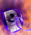
| 05/26/2008 05:14:58 PM | Petite & Sweetby sfaliceComment: First off I have to say I enjoy your creativity using the vase. The image really is eye catching at first. I also will admit that when I was voting this challenge I stopped and looked at this image hard.
One of the major things that throws me with this image is the depth of field. With having the ribbon and lense out of focus it distracts my eye. I say eye cause it seems it is heavy on the right side or possibly because that is where the ribbon leaves.
I am wondering now how deep the vase is and if there would have been a way to use a small block to elevate the camera up higher just a bit; it does not appear to be on the ground but I think a bit higher would help. Than have the entire plane the camera is on in focus with the ribbon transitioning from oof to focus to oof underneath.
I think there is a fairly nice control of the ambient lighting here. Though with the dark spot in the middle I think an extra light source or a bounce of light would have added to a stronger focal point.
On the blurred ribbon on the bottom right corner as I see it, next to the camera, it seems there is an odd focal area in how it stops abruptly from being ultra smooth to textured. Not sure if this was done in post, or natural oddity or other but it creates a hard line which may be for the added distraction.
I believe the biggest faults here is the shallow dof and the dark center. Other than that I enjoy the colours and simplistic creativity.
Andrew |  Photographer found comment helpful. Photographer found comment helpful. |
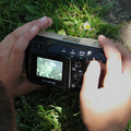
| 05/26/2008 03:42:58 PM | Ok.....Now, Give Me Sexyby XMountaineerComment: The first thing I notice is that the camera itself is not the star of this image. To me, there is just to much else going on to really give the camera center stage. At first look if it was not for the challenge I would just think its just another image of a person taking a photo. For me I would much rather have enjoyed the 'Subject' to stand out more than the rest of the image.
I am wondering if a tighter crop and fingertips on the camera would give a better feel of the subject. Though the current position of the hands seem a bit distracting to me, with one curled and the other appears to be blocking light on the wrong side. I at times have adjusted my 'trigger' finger to help block the sun, but this isn't the case here. Could possibly be her shooting style which there is nothing wrong with, just distracts me.
I seem to notice a stronger focus on her hairline than I do the camera as well. This takes away from the camera making the person the subject and the camera secondary. Also the camera appears to be aiming over your head, it is a distraction in that first glance it appears pointing at the viewer but with something off, because it is not. I think if the intent was to point towards the viewer a larger angle of the subject camera should have been granted.
I am wondering if you where at a fantastic location if you used the model as a hand model here, with a larger focus on the camera with a beautiful scenic background?
Overall it is a nice image, though the blues could be pushed up in saturation a touch. Just remember the main subject needs all of the attention than everything else is secondary. However, with your wife as the model what she says goes L()L.
Andrew | | Photographer found comment helpful. |
| 05/26/2008 02:38:01 PM | Still Clicking After All These Yearsby GeneralEComment: The first thing I notice is the blown out highlight and flat colours. Though the blown highlight and 'cover-up' take center stage for lower score.
As I look at this image, the flat color really stands out with the lake of 'whites' to go along with the blacks of the image. Though I am sure this is a difficult image to capture with the dappled lighting itself on the subject/s. I do not feel exactly that the camera is taking center stage. I am wondering if a closer perspective of the camera, well actually visualize this. rotating the camera so that the camera has the 'sun spot' and the hands are both in shadow. Have the model stretch farther so their head is not in the image and expose for the camera. Also with this, there will be that bright sunspot reflection on the body of the camera, so try to rotate the camera front or back so you can still see the screen as well as 'hide' the sunspot on an edge or button.
With the flatness of the image, I am finding it difficult to find the focal point. Though I see the grass blades at the bottom to be sharper than those at the top, I think the 'subject' is lost somewhere in the middle.
As for the screen, I noticed you did some editing to the screen itself, though I am not sure about it. Granted I am assuming this is an older camera and a lower quality of screen? It just feels overly bright to me, against the shadowed black of the camera body.
Lastly, I do notice the pink lines in the finger nails where you 'healed' out some areas. It is not a major distraction but it is noticeable to me.
Overall it is a nice idea, makes for a fun snapshot; but remember to adjust for best quality and control over the primary subject and everything else becomes secondary. Also remember to balance the whites and the blacks within the image.
Andrew | | Photographer found comment helpful. |
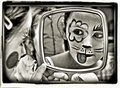
| 05/26/2008 02:23:58 PM | The Touristby JammurComment: The first thing I notice here is the dappled light on the body and the reflection on the lense. For me those are two huge distractions that even though they do not lower the image quality persay, it is perceived as lower.
I first notice that you are using natural lighting, which there is nothing wrong with it, but it does create a 'cooler' cast of light, or blue light. Most viewers prefer warmer tones to images for some reason. It also appears to have artificial lighting, maybe an overhead light? Though the natural light takes most of the cast.
Also, even though I understand and enjoy your concept I don't feel the subject takes center stage. There seems to be a lot of other things going on around it that distract the viewer, like trying to read the titles on the books and the highlight on the dolls face.
I personally feel if it was more simplistic (without the books) and a baffle to block the highlight on the doll would work better, and maybe landscape orientation , with a white sheet or something to cast a cleaner reflection on the glass.
I am looking at the subject itself, trying to determine the focus and it seems I can read the glass front just fine but the rest of the subject loses some focus. With these wonderful straight lines I would have preferred a strong sharp focus more so on the body, or even throughout the entire image.
Overall it is a nice job, just remember if you have a dark subject try not to put dark objects in the background, and avoid anything that may 'distract' the viewer away from the subject.
I do really enjoy the bamboo mate and the writing in the far background.
Andrew | | Photographer found comment helpful. |
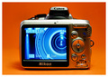
| 05/26/2008 02:11:11 PM | The Upgradeby Yo_SpiffComment: The first two things I notice straight away is the flat blue on the screen and the orange glare on the casing. Now the orange glare can be taken care of quite easily by placing another colour sheet (maybe white for the silver) just out of camera frame to catch the highlights. Next the blue screen seems a bit flat to me, the glare does not bother me as much as well, I do not know what the screen looks like exactly, but the 'icons' against the blue is make the whole thing seem a bit 'faked' to me.
Next, the hard light spot at 3rd location top right draws my eye a bit. Right above the w/t button. I am not sure what you used for lighting, but I would assume that is your main light based on the shadows cast, and such. I am wondering, if you used a white/silver bounce in front of the camera and moved the light more towards the rear instead of the top and side, and let it bounce off the reflector if it would gain a more even lighting cast and highlighted edge? Also help to eliminate some of the shadows on the body. To help eliminate the front shadow this would cause use a pin-light at the base to knock that shadow off.
I read your comment on the 'bully' idea, which I like the idea, though it appears to me that the Nikon is the bully here and not the Canon/Rebel. The reason is, the Nikon takes center stage here and even though the lense of the Canon is on screen the warm oranges push the Nikon out front. I think what I would have done to convey the idea would be to create a harsh angle whereas the Canon was in front and the Nikon behind giving an added distortion and monstrous size advantage to the Canon to truly give that Bullying feel. Maybe even a higher angle 'over the shoulder' so to speak of the Canon to show the little Nikon and an image of the Nikon nice and small on the Screen of the Canon?
Or, if you desire to keep this perspective with the Nikon in front raise the Canon up higher to make it appear larger than life. With a slight up angle, the Nikon looking up to the Bully would help convey this idea.
Overall you did a nice job, focus is nice and colour saturation of the background is nice.
Andrew | | Photographer found comment helpful. |
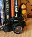
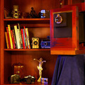
| 05/26/2008 01:30:38 AM | Old Man with Models and Studentsby wehrmacherComment: As I first looked at this image it is difficult to see who/what the subject is. Even though I enjoy the concept itself, I do not feel it worked well for a portrait type image.
My next impression is that there is not much focus to the image overall. Personally I would have really enjoyed a more narrow depth of field highlighting the main subject, the big'n with special attention to a sharp detailed lens. Also allowing for a slight blur of the bookshelf to allow the rest to take a back seat to the main subject.
Your lighting seems to be both natural from a window and also from a desk lamp. This is evident by the blue cast on one side and the yellow cast on the other. I am curious with this lighting what this image would have looked like as a b/w, maybe even with pushed contrast to give it an more edgy feel.
One aspect that may be picky, is the stagger of the heights of the books is a bit of a messy distraction. I think if they where cleaner organized by height it would have added a bit more. Or, maybe take the books out all together along with the statues, keep it all cameras for balance.
In a traditional 'class' portrait the 'students' are surrounding the 'teacher' if that was your concept here of students and teacher I would have rather enjoyed the main subject to take center stage with the others surrounding, which could have been done with this same setup, with a bit of reorganizing. To me, you seem to be more focused on everything going on and not enough on the main subject.
Andrew | | Photographer found comment helpful. |
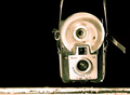
| 05/26/2008 01:14:47 AM | still hangin aroundby jdannelsComment: Looking at this image, straight away I notice it is a bit canted to the side and not level with the edge or parallel to the ground. A bit rotation in post or a reposition in capture would fix that easily.
Next, I enjoy the placement of the subject as well as the bottom plank. I believe it adds an extra depth and feel to the image.
I feel the sharpness and focal points of the image are strong on the subjects edges. Though with the flash disk there is a loss because of the smoothness of the disk.
The sepia tones I do not believe work well for this image, or they were not pushed enough, they seem a bit off tone. Though one thing that makes this image difficult to light is because of the large silver area and the blacks. Which create hot highlights within the tones. I am wondering how this would have been straight b/w without the sepia tone.
Overall I felt this was one of the better images because it focused on the subject without a lot of added flash and bang. However, the dish really distracts me.
I wonder, What if you used two lights from the rear, one on each side at a 45 degree, than use a pin-point light for the face plate but not hitting the dish, Than also another pin point light turned way down at a slight front angle, a bit more than your front light to light the dish. This should create strong highlights on the edges of the subject, as well as gain more control over highlights and shadows along the difficult silver and black combinations.
Andrew | | Photographer found comment helpful. |
| 05/09/2008 05:01:06 PM | D a y 4by mia67Comment: Very fun image, you did a fantastic job. (-; | | Photographer found comment helpful. |
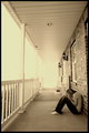
| 05/07/2008 12:19:13 AM | Day 6 - Nobody's Perfectby photokariangelComment: I enjoy how it goes into infinity with the bright light on the end of the porch. If you knew how many images I tanked because I didn't like them... to many self portraits I have done that never see the light of day L()L. Nice work. | | Photographer found comment helpful. |
| 05/04/2008 02:50:03 AM | | | Photographer found comment helpful. |
|
Showing 391 - 400 of ~2168 |
Home -
Challenges -
Community -
League -
Photos -
Cameras -
Lenses -
Learn -
Help -
Terms of Use -
Privacy -
Top ^
DPChallenge, and website content and design, Copyright © 2001-2025 Challenging Technologies, LLC.
All digital photo copyrights belong to the photographers and may not be used without permission.
Current Server Time: 06/19/2025 02:10:24 PM EDT.
|