| Image |
Comment |
| 09/12/2008 08:28:31 PM |
|
 Photographer found comment helpful. Photographer found comment helpful. |
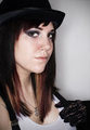
| 09/12/2008 08:28:07 PM |
Day 23by sillygoatComment: Ohh, I want to see more of this outfit. I love this look (-; |
| Photographer found comment helpful. |
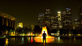
| 06/20/2008 04:10:38 PM |
Overtimeby zackdezonComment: At first view the only part in my opinion that is high contrast is the man and the fountain. There is an overall extremely present medium tone throughout the entire image and medium is not a contrast. Least not to me.
Overall it is a nice image, though the slant of the buildings and the unbalanced weight really throws me off. Also, the orange, yellow, white of the fountain are too separated, as if levels where pushed hard to really make them stand out more.
I enjoy this idea, but believe it could have been done better. Maybe a different camera position, whereas only the tall multi-lighted/window buildings in the cluster are directly behind the fountain which is directly behind the figure? The figure also may be standing more towards the corner of the pad there. With that aspect it may make it easier to get a more uniform shape to the buildings, though without the proper tools they will slant, but if they slanted into each other other than leaning on one side I believe it would have really enhanced the image.
Also to keep the tall height aspect of the buildings a portrait crop would be much more beneficial. To me this is way to wide, and if the portrait crop was used it would have allowed for a greater 'contrast' to come through and thus I believe would have given this image a higher score possibility.
Andrew |
| Photographer found comment helpful. |
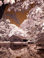
| 06/20/2008 04:02:16 PM |
Through the Treesby brownsmComment: First thing I notice as I opened the image is that the leaves at the top of the image appear to be 'drawn' I do not think they are, they just seem like something I would find in a comic book. The various colour tones really give that aspect as well as the lack of detail in the leafs and sharp contours.
As I scroll down and view the whole image my first thought is, the voters would love this, even though it is not high contrast in my eyes. Personally for me there are way to many levels of tonal qualities to be a high contrast image.
The IR or affect you have on here does make a nice surreal image, though very comicy as I stated above. There is not really much else to say, the elements all work nicely together, though the foreground leaves distract a bit. Overall it is a very nice image, just not really high contrast. |
| Photographer found comment helpful. |
| 06/16/2008 03:00:09 AM |
|
| Photographer found comment helpful. |
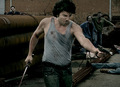
| 06/16/2008 02:58:33 AM |
Zone of the Deadby ZigomarComment: Ok, if he is killing undead, I am guessing there is no crime so there is no crime scene. |
| Photographer found comment helpful. |
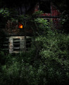
| 06/16/2008 02:57:17 AM |
Where he kept herby skewsmeComment: I enjoy this image the colours and textures and contrasts are nice. though where is the point to make me believe this is a crime scene? |
| Photographer found comment helpful. |
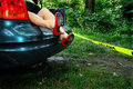
| 06/16/2008 02:56:45 AM |
Ditchedby XMountaineerComment: I wish there was something more of a story, this really does not sell me crime scene. |
| Photographer found comment helpful. |
| 06/16/2008 02:56:10 AM |
|
| Photographer found comment helpful. |
| 06/16/2008 02:55:01 AM |
|
| Photographer found comment helpful. |
Home -
Challenges -
Community -
League -
Photos -
Cameras -
Lenses -
Learn -
Help -
Terms of Use -
Privacy -
Top ^
DPChallenge, and website content and design, Copyright © 2001-2025 Challenging Technologies, LLC.
All digital photo copyrights belong to the photographers and may not be used without permission.
Current Server Time: 06/19/2025 07:56:14 AM EDT.