| Image |
Comment |
| 03/11/2007 02:56:11 PM |
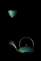
Upliftingby aahutch1Comment: I like this concept, However, I don't care for the invisible bottom of the tea pot. I would have loved to see it sitting on something than the cup floating. |
 Photographer found comment helpful. Photographer found comment helpful. |
| 03/11/2007 02:52:35 PM |
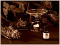
Aromatherapyby J-MeComment: I really like this concept, However, it is flat for me. I would like more contrast to this image, and also maybe a greater dof The stand seems a bit oof. Overall I enjoy this image. |
| Photographer found comment helpful. |
| 03/11/2007 02:51:29 PM |
In the Center of Mother Nature's Careby jeroweComment: I really enjoy the colours here, although the figure is a tad bright for me. Also I would have liked to see a bit more on the bottom edge. It appears his head was cut off to top. Lastly I don't care for this style of border, I would much rather have liked a more uniform distance on all edges. |
| Photographer found comment helpful. |
| 03/11/2007 02:48:41 PM |
MY "alternatvie medicine"by jolyn923Comment: I like the concept, however, the image is very small and the light itself really takes away from the effect the rest of the image can have. I would love to see a more advanced edit on this image. Maybe masking out the light so it is not so bright, and adding a bit more brightness to the glass/bottle/cork/doelly. |
| Photographer found comment helpful. |
| 03/11/2007 02:39:36 PM |
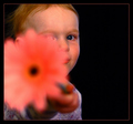
Sniff this and call me in the morning : Aromatherapyby timfythetooComment: I really like this concept, it is fun. However, there are a few things that really distract me. For one, the flower, it seems very smudged/blurred blown out in my opinion. Very distracting and being a large part of the image, it really brings it down. Second, would be the colour on the kiddo. The darker areas look really dirty and flat. It appears the highlight areas like his cheek look really nice but the rest is icky. Also, the catchlight in his eye is really distracting as well.
I would really like to see this without the blur on the flower and more even lighting. |
| Photographer found comment helpful. |
| 03/11/2007 02:22:58 PM |
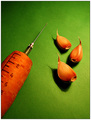
Acupunctureby veganmegan23Comment: As much as I really want to go with you on this one, I finding it a bit of a strech but I understand why just doesn't go all the way with me. This could have been a really nice image as will, with a stronger dof and colour that popped a bit more. The water droplets are great, so maybe even a tighter crop or macro would have been nice. |
| Photographer found comment helpful. |
| 03/11/2007 02:21:16 PM |
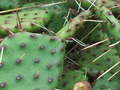
Nature's Drug Storeby GiorgioComment: looks like some seriously dried garlic. I think the carrot looks great but could use a bit more pop on the colour, or maybe a stronger dof. The concept is fun, but don't think I understand why the needle tip is discoloured? Nice colour choices and comp. |
| Photographer found comment helpful. |
| 03/11/2007 02:19:18 PM |
Naturopathy..!!!by srijan55Comment: First off the image looks dirty. A lot of gray here, and it appears you used on camera flash and an overhead light Just doesn't work for me. I do really enjoy the concept, really fun idea. The green cap vibrates and is really distracting.
I would like to see this with more even lighting, maybe even in a light box, they are fairly easy to throw together with stuff around the house. Balance out the lighting a bit more and allow the colours to really pop without looking flat and dirty and you will have a terrific image on your hands. |
| Photographer found comment helpful. |
| 03/11/2007 02:05:24 PM |
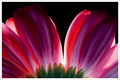
B.S.A. (Botanical Society of America)by davidus428Comment: From the Critique Club
How are you doing today? I am going to touch on a few items with your image.
Colour;
This image has some beautiful colour. I really enjoy that touch of green at the bottom, I think it adds a strong contrast and holds the images' interest for the viewer. The transitions between colours are smooth and delicate.
DOF/Focus;
It appears the green is slighting more in focus. It could be due to the texture difference, but everything seems to be strong and with this being a nearly 2D image the overall focus is nice.
Post;
I don't know what your post steps are, only basic editing is listed. Overall the image looks well done with only a couple items I will talk about below.
Off Items;
As much as I like this, the Dark tips of the petals that almost blend in the background really distracts the image for me. Even though I can see the full petals, they give the appearance of incompletion where it should be complete. Maybe angling your light stronger, or adding a second smaller light to keep the tips a bit lighter as to show the full effect. Also, the weakest part of the flower is also the spot of light area creating a blown highlight. My eye tends to be drawn right to that spot because of the darkness of the rest of the image.
Other;
I like your idea, and the border is nice as well. Your image was very well excepted by the voters. I believe you did a great job overall, and with a couple minor tweaks it can be a ribbon winner.
Nice Job
Andrew 'littlegett' |
| Photographer found comment helpful. |
| 03/11/2007 01:47:13 PM |
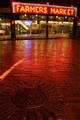
FMby madcrabberComment: From the Critique Club
How are you doing today? I am going to touch on a few items with your image.
Colour;
I really enjoy the colours here. The balance of the reds within the transition as well as the white lights creates a strong form. Along with the bits of yellow, blue, green inside gives the wandering eye something else to look at.
DOF/Focus;
I like the focus here, being have to see the wet brick is very important for this image I believe. Being wet adds a unique element. The sign itself, it is hard to determine if it is in focus or slightly off because it is neon. Overall this image holds strong focus for me.
Post;
I don't miss the clock so it was a good call to remove it, and it appears you have a good feel for the exposure/curves/usm you applied. The image does not seem blown out or overly dark in any areas and most important the image is not flat either.
Off Items;
I really enjoy this perspective, however, the tilting of the sign throws me. I understand you had to shoot at an angle to get the manhole and the sign, However, Maybe a stronger rotation of the camera to make the sign even more angled. For me it just throws me a bit. Also, because the smaller signs are straight.
Other;
As I continue to look through this image, I really enjoy the vanishing point created with the green pillars and light. I am thinking if you cropped it off on the outside edge of the outside pillar (getting rid of that yellow cone on the far left) and changing perspective of the sign to make it straight horizontal this image would have a much more dramatic appeal.
A very nice image and very fun concept for the challenge. And well, it also makes me miss Wa. a bit.
Nice Job
Andrew 'littlegett' |
| Photographer found comment helpful. |
Home -
Challenges -
Community -
League -
Photos -
Cameras -
Lenses -
Learn -
Help -
Terms of Use -
Privacy -
Top ^
DPChallenge, and website content and design, Copyright © 2001-2025 Challenging Technologies, LLC.
All digital photo copyrights belong to the photographers and may not be used without permission.
Current Server Time: 06/26/2025 10:12:36 PM EDT.