| Image |
Comment |
| 04/25/2004 10:15:21 AM |
Webster Lightsby cbellerComment: I can see what effect you were after, but it doesn't come out at all, the entire picture is way too dark. |
 Photographer found comment helpful. Photographer found comment helpful. |
| 04/25/2004 10:14:08 AM |
Sunset Flagby bjallenComment: Cropping out the rather large dark foreground (or maybe even the building, making it a square picture) would improve I think. Color of the sky is nice. |
| Photographer found comment helpful. |
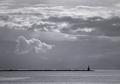
| 04/25/2004 10:12:12 AM |
For Which It Standsby hstegComment: Not much movement here because of the composition with the silhouette smack in the middle. Don't like DOF much: either have both the silhouette and the flag sharp, or have the flag much more out of focus. |
| Photographer found comment helpful. |
| 04/25/2004 10:11:05 AM |
Waitingby artvetComment: With this effect, I always have a feeling it's been done to cover up a technically flawed picture. Don't know if that's the case here, can't judge that with the excessive filter. |
| Photographer found comment helpful. |
| 04/21/2004 10:42:06 AM |
|
| Photographer found comment helpful. |
| 04/21/2004 07:45:26 AM |
The golden eggby jjbeguinComment: Good lighting, good focus, good idea for the challenge. Composition is the only thing I'm not happy about, the picture is too 'heavy' in the upper right corner. I think I would have cropped off more of the bottom. 8 |
| Photographer found comment helpful. |
| 04/21/2004 07:33:59 AM |
Lucky Charmsby sevenine0Comment: The diagonal composition is nice, but the upper left and lower right portions are way too dark, and it's unsharp. |
| Photographer found comment helpful. |
| 04/20/2004 01:25:05 PM |
Lightnessby ccjpComment: I agree with the comments about cropping. Otherwise, it's awesome, too bad you didn't submit this! I would probably give this an 8 or 9. |
| Photographer found comment helpful. |
| 04/19/2004 06:28:56 PM |
Attenuationby zeuszenComment: This is my absolute #1 pick! Can't think of anything wrong with it, contrast, lighting, composition are all perfect, and the impact of this picture is stunning. 10 |
| Photographer found comment helpful. |
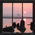
| 04/19/2004 11:03:24 AM |
Sunday Sunrise by UNCLEBROComment: Originally posted by nicoledb:
Capture of the sunrise is great, but the window distracts somewhat. For example, the highest stone with the interestingly shaped edge in the foreground is obscured from view. Not sure how to solve that though, without creating other composition problems. |
Since this is was a carry-along frame, why not position it better? |
| Photographer found comment helpful. |
Home -
Challenges -
Community -
League -
Photos -
Cameras -
Lenses -
Learn -
Help -
Terms of Use -
Privacy -
Top ^
DPChallenge, and website content and design, Copyright © 2001-2025 Challenging Technologies, LLC.
All digital photo copyrights belong to the photographers and may not be used without permission.
Current Server Time: 07/18/2025 09:45:29 AM EDT.