| Image |
Comment |
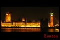
| 04/09/2009 01:42:59 PM |
Londonby PixelstateComment: The problem with shooting a scene we have all seen before (as you must for this challenge) is you can't help but compare the image before you with those in memory. This is a nice shot but for a few flaws, the blown out face of the clock tower, and the unlit portion of the building, both tough to deal with given constrains of shooting dates and limits on editing, but the strong yellow cast is not a choice that serves the image well. Did you choose this or forget to put it into sRGB before saving to web? |
 Photographer found comment helpful. Photographer found comment helpful. |
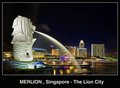
| 04/09/2009 01:36:51 PM |
Merlionby andrewtComment: Nice clear clen shot with the candy colored tones so loved here at DPC. The text has an odd distracting halo, the cloud just to the right of the statue is distracting and the crop seems just a bit too close to the statue's back. Never the less in guessing top ten. |
| Photographer found comment helpful. |
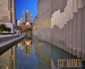
| 04/08/2009 09:25:37 PM |
San Francisco Museum of Modern Artby jdannelsComment: Lovely image, great framing, colors, depth of focus and even the type face is among the best. My only complaint is the proportions, what part would I lop off if I was the editor who was given this shot to put on a 4x6 card? the image is too pretty I'd have to add big black bands to the side. |
| Photographer found comment helpful. |
| 04/08/2009 09:16:00 PM |
|
| Photographer found comment helpful. |
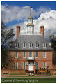
| 04/08/2009 09:09:51 PM |
The Governor's Palaceby vawendyComment: I think I saw this one on a rack there. A bit more lawn would have been nice, but it nails the challenge, well done. |
| Photographer found comment helpful. |
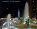
| 04/08/2009 09:04:16 PM |
Swann Fountain, City Hall, Philadelphiaby banmornComment: I hate you font therfore you get a 1.
well maybe not, i guess the rest of the image is pretty prefect, not sure how you managed to get the lights right on sigh a disparity of subjects, but there they are, just as they should be in a postcard. I'll give it an 8 and a ribbon prediction, even though I really don,t care for the font. |
| Photographer found comment helpful. |
| 04/08/2009 08:54:40 PM |
d a i s yby bnileshComment: Lovely shot, it would make a great "sympathy" or "get well" card, as a classic touristic post card, not so much. Beautiful exposure and very delicately handled processing. |
| Photographer found comment helpful. |
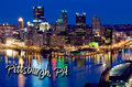
| 04/08/2009 08:49:47 PM |
Pittsburgh, PAby alanfreedComment: Yup, these are the sort of alarmingly loud and artificial colors that I think are right for a postcard. The way the font is pathed to follow the river bank is very nice. On the downside the brightness of the parking structure in the lower right is distracting, but such is the joy of basic editing. Top ten |
| Photographer found comment helpful. |
| 04/08/2009 08:46:04 PM |
Homage to the Linen Era by JammurComment: I think the linen look is at odds with the moder/action spirit of the shot. Had It been a lodge at a national park or Coney Island it would have worked. I like the idea, i like the shot, but I don't think they work together. |
| Photographer found comment helpful. |
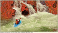
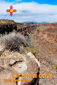
| 04/08/2009 03:39:49 PM |
Rio Grande Gorgeby chefsamComment: The hard, flat mid day sun really works against you here, but the subject matter is dead on, and I love the graphic and type. |
| Photographer found comment helpful. |
Home -
Challenges -
Community -
League -
Photos -
Cameras -
Lenses -
Learn -
Help -
Terms of Use -
Privacy -
Top ^
DPChallenge, and website content and design, Copyright © 2001-2025 Challenging Technologies, LLC.
All digital photo copyrights belong to the photographers and may not be used without permission.
Current Server Time: 08/14/2025 02:26:42 PM EDT.