| Image |
Comment |
| 04/11/2009 01:54:13 PM |
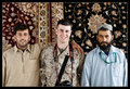
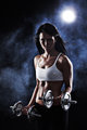
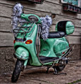
Blending inby MelethiaComment: I love the dead fish expression of the fellow in blue, when he had such an engaged smile in the image where he is looking at Cory's shot with him. nice portfolio, thanks for sharing
|
 Photographer found comment helpful. Photographer found comment helpful. |
| 04/09/2009 11:15:29 PM |
|
| Photographer found comment helpful. |
| 04/09/2009 11:15:01 PM |
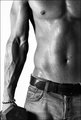
Skin Sculpture by LydiaComment: a simple shot well executed, the street pants instead of workout gear might make this a bit less likely to sell as stock, but Im guessing red ribbon here |
| Photographer found comment helpful. |
| 04/09/2009 10:59:10 PM |
Run More, Get Thinnerby AbstractComment: Great idea for an add campaign, very clever. The image has neither complexity nor bright and shiny colors, but you knew that going in. |
| Photographer found comment helpful. |
| 04/09/2009 09:47:31 PM |
Blue Steel by LalliSigComment: yup, that's a stock shot. nice raking light, easy to look at model with a hint of sexy. Might be a tough dark on the brow and shadow side of the nose, oh and i love the title. Blue steel, blue ribbon. |
| Photographer found comment helpful. |
| 04/09/2009 02:01:22 PM |
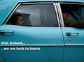
Visit Icelandby gsalComment: And the winner for most inventive goes to....
Not the most amazing image, but it sure gets the point across, and I love how you crowded the edges of the crop, it gives a pinched, constrained feel to the image that works perfectly with the child's expression. I'm hoping it makes the front page. |
| Photographer found comment helpful. |
| 04/09/2009 01:56:24 PM |
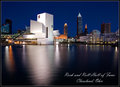
Rock and Roll Hall of Fameby ErikVComment: And the winner is....this. One question, did you set out to locally replicate the winning Sydney Opera house shot from last challenge, or did it just work out that way? Of course that was advanced editing and given those rules you could have dealt with the blown whites at the top of the hall, but that shouldn't keep this from winning |
| Photographer found comment helpful. |
| 04/09/2009 01:55:44 PM |
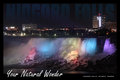
Your Natural Wonderby david_cComment: Best use of type in the challenge, some one has their graphic design chops down. the image is not the most amazing in the challenge, but it certainly nails the challenge, ought to be top five. |
| Photographer found comment helpful. |
| 04/09/2009 01:53:00 PM |
See Memphisby dixonp1Comment: I do like this image, the almost abusive editing mixes well with the playful subject matter, but it would have scored better in a free study than here. |
| Photographer found comment helpful. |
| 04/09/2009 01:49:15 PM |
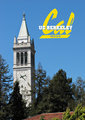
*Let There Be Light *by GeneralEComment: Great font and a well chose subject , but this is not exactly the most interesting view of the Campanile. It is well lit, but the roof top is distracting and it seems to float out of any defined place. |
| Photographer found comment helpful. |
Home -
Challenges -
Community -
League -
Photos -
Cameras -
Lenses -
Learn -
Help -
Terms of Use -
Privacy -
Top ^
DPChallenge, and website content and design, Copyright © 2001-2025 Challenging Technologies, LLC.
All digital photo copyrights belong to the photographers and may not be used without permission.
Current Server Time: 08/15/2025 12:46:59 AM EDT.