| Image |
Comment |
| 06/01/2015 12:29:07 AM |
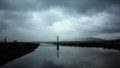
To the Northby GeorgesBogaertComment: Subtle, understated, elegant. I think if the central tower was not so centered it would have been stronger, but The rest of the composition would have been hurt by reframing. |
 Photographer found comment helpful. Photographer found comment helpful. |
| 06/01/2015 12:23:36 AM |
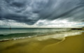
illusionsby NeatComment: The bouy, or sail on the left really nails this one down. One of my pick. I love the way the reflections and the sky mirror each other. |
| Photographer found comment helpful. |
| 06/01/2015 12:20:37 AM |
mixed medleyby PennyStreetComment: Great tone, but there is no center here. Well it is there, in the pond, behind, but it is hidden away by branches. My eye just roves around and around up the trees, across the horizon seeking something to settle on. |
| Photographer found comment helpful. |
| 05/29/2015 05:10:10 PM |
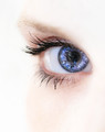
The Eyes of Truth (555955)by JudiComment: It's tough to get Manny's light, but a bit more brightness would have been nice here, but a nice emulation but the lack of focus on the lower part of the frame in the original forced attention to the eyes, here it wanders between the eyes and the beads. top 5 |
| Photographer found comment helpful. |
| 05/29/2015 04:58:26 PM |
Eye Magazine Revisited (Image ID= 65834)by LydiaComment: beautiful take on the original, but Arnit clearly shot in a dark room with one light and here I get distracted by the reflection of the 4 pane window, the head of the photographer and the wall behind them. The colors and editing are lovely, but those reflections may cost you the blue. |
| Photographer found comment helpful. |
| 05/29/2015 04:46:46 PM |
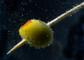
Bubbling Toothpick - illini75 - 1126974by hajekaComment: I think the power of illini75's version was that blue light coming from the bottom and the yellow light above and a true black behind to set the colors off. your bubbles are better, but it lacks the dance of light of the original. |
| Photographer found comment helpful. |
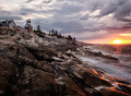
| 05/29/2015 04:31:34 PM |
Sailor's Delight (Neil, IMAGE_ID=640852)  by markwileyComment: I like the right side of this image better than Neil's, but the rocks on the left seem a bit flat while he got some nice tones out of his; the lighthouse here seems a bit cramped up into the corner while his nails down the horizon line. still, this is one of the best images yet and the right side is great. |
| Photographer found comment helpful. |
| 05/29/2015 04:25:03 PM |
|
| Photographer found comment helpful. |
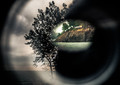
| 05/29/2015 03:59:07 PM |
on the floor of the dark roomby tateComment: I often like to comment on the image that placed lowest among my top picks. and that dubious honor is yours. Here is an image that returns dividends to the careful eye. There are layers upon layers here. I'm not surprised that it fell as far as it did because it is not simple and does not give rewards to the 3 second glance, nor am I surprised by those who have commented before me in praise of this image. These are the lovers of the poetic image,those who drink deep at the fount of photographic art and the people who you must turn your back on if our team has any chance in the DPL ;) Enough with the art, we need to move product. |
| Photographer found comment helpful. |
| 05/29/2015 03:47:29 PM |
gamineby MarfunComment: It is rare when the title, the model, the lighting, and the editing are all in perfect accord. Full marks. |
| Photographer found comment helpful. |
Home -
Challenges -
Community -
League -
Photos -
Cameras -
Lenses -
Learn -
Help -
Terms of Use -
Privacy -
Top ^
DPChallenge, and website content and design, Copyright © 2001-2025 Challenging Technologies, LLC.
All digital photo copyrights belong to the photographers and may not be used without permission.
Current Server Time: 07/31/2025 07:07:45 PM EDT.