| Image |
Comment |
| 06/10/2010 04:56:02 PM |
|
 Photographer found comment helpful. Photographer found comment helpful. |
| 06/07/2010 07:17:25 PM |
The End by LVicariComment: Deeply narrative, this looks like a frame from a stranger's dream. There is no where near enough face for this to be a true portrait, but it is so good, so well lit, executed, and processed, that it cant be denied. My pick for blue |
| Photographer found comment helpful. |
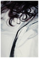
| 06/07/2010 07:16:51 PM |
Sleepy Headby luvmyaussieComment: How come someone always enters a lovely evocative image that you cant decide if it meets the challenge? There are rich hints of personality, but is that enough to make a portrait? Grrr, Ill rate this very nice image later.
Ya it is. 8 |
| Photographer found comment helpful. |
| 06/07/2010 03:32:21 PM |
Day Dreamerby wingyisleedsComment: This is a lovely shot, but the thumbnail looks amazing while the larger image is only good. On focus I agree with Mike, the narrow focus blurs much of her face, and when combined with the strong highlights on her fair skin, you have lost much of the skin detail that is so essential to a good portrait. Now when someone has a few wrinkles they want to hide, that is all well and good, but why hide her beautiful skin tone?
One other reason for the lower than expected score might be the hue. With her red hair and pink lips shifting away from the reds into the blues might have brought out more color contrast and have made her features pop. My daughter has similar coloring and I blue shifted the hue a touch on this one. I think it helps fair skinned redheads.
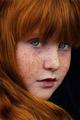
Im sorry if this comes off as critical, I think this is a very pretty shot, I was just trying to give you why I thought it might have scored lower than you thought it ought to have, or frankly could have. Same shot with deeper focus, a bit more USM, and a blue shift would have gone top ten IMHO. |
| Photographer found comment helpful. |
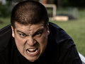
| 06/07/2010 12:29:43 AM |
Train Mailby cpanaiotiComment: Ok this is the goods. Very nice, this one might just make me vote on the challenge. |
| Photographer found comment helpful. |
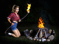
| 06/03/2010 04:56:07 PM |
Selfby BudyaComment: shame about that fold of cloth over the shoulder, all the detail in the fold steals attention from the mouth sending the eye off to examine the shoulder, rather than up to the face where the eye wants to go. I am not much of a fan of the top and bottom band frame, especially with a delicate high tone image.
Other than that, great work, the mood and lighting suit the face, interesting off kilter framing. |
| Photographer found comment helpful. |
| 06/03/2010 04:55:59 PM |
head and heartby posthumousComment: Seems the top of the crop are going for this dreamy look. This may be too far out of the box to score well, but it rocks. Gentle haunted and haunting. Message edited by author 2010-06-10 12:01:31. |
| Photographer found comment helpful. |
| 06/03/2010 04:16:00 PM |
|
| Photographer found comment helpful. |
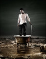
| 06/03/2010 03:12:28 PM |
The Great Outdoorsby ShermyComment: Beautifully lit, funny set up, very nice image, but not your classic portrait shot. when the face is taking up less the five percent of the frame, its going to knock your score down a bit. full marks on everything else though. |
| Photographer found comment helpful. |
| 06/03/2010 03:08:01 PM |
|
| Photographer found comment helpful. |
Home -
Challenges -
Community -
League -
Photos -
Cameras -
Lenses -
Learn -
Help -
Terms of Use -
Privacy -
Top ^
DPChallenge, and website content and design, Copyright © 2001-2025 Challenging Technologies, LLC.
All digital photo copyrights belong to the photographers and may not be used without permission.
Current Server Time: 08/09/2025 07:20:26 AM EDT.