| Image |
Comment |
| 07/07/2014 12:13:43 AM |
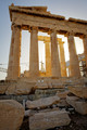
Pentelic Marbleby tomeComment: I'm not sure how this tumbled so far. I thought it was a perfect subject, well framed and you really got the way the marble glows in slanting light. I figured it was an easy top ten. |
 Photographer found comment helpful. Photographer found comment helpful. |
| 07/07/2014 12:08:20 AM |
|
| Photographer found comment helpful. |
| 07/04/2014 04:44:40 PM |
Battle of Trenton Tower (New Jersey)by mefnjComment: If you had used a polarizer or slammed the luminance on the blue channel, I think the tower would have popped off the sky. Here the subject and background are similar enough in tone and texture to confound the eye a bit. |
| Photographer found comment helpful. |
| 07/04/2014 04:38:56 PM |
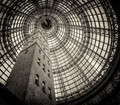
Defining my Cityby SaraRComment: The leading lines and layering here are wonderful. The grey tinge of the image feels like it is caught between full saturation and B&W, and for me either would have put this in ribbon land, as is..top ten.
Editing out the security camera and pole would have been a good idea, that is a strong vertical in the wrong place. |
| Photographer found comment helpful. |
| 07/04/2014 04:26:51 PM |
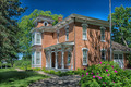
First South Dakota Governor's home.by Jules1xComment: The tone mapping seems a bit strong, I like that you showed us detail in the shadows but the brickwork ends up over flattened. Framing up the flagpole on the exact edge of the building is a bit bothersome. It is a nice shot, but seems like it could have been more. |
| Photographer found comment helpful. |
| 07/04/2014 04:23:16 PM |
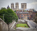
V&A Museumby DistantColoursComment: I wish you had framed in the rest of the door. I'm sure it was cluttered with people and other distractions, but this feels truncated, leaving me wondering what is missing rather than admiring all the lovely detail that you did present. |
| Photographer found comment helpful. |
| 07/04/2014 04:20:37 PM |
Taipei Story Houseby GeorgesBogaertComment: The whole scene seems a bit too yellow. Shifting it blue would have darkened the sky and made the foliage greener. Cloning out the street light would have helped as well. A good shot with well chosen subject, well framed, but it could have been more. |
| Photographer found comment helpful. |
| 07/03/2014 03:10:43 PM |
Home, Three Thousand Chickensby C_Steve_GComment: I like the image more than the entry. There is some great stuff in this image from the weird clouds to the constrained color palette, but the silhouette is a very, very small piece of the image |
| Photographer found comment helpful. |
| 07/02/2014 09:24:08 PM |
AAZ_2401-1awebby JohnFordComment: So you found out 2 things DPC voters like; straight horizons and clever titles. Those 2 could have given you another half point or so by my guess. |
| Photographer found comment helpful. |
| 06/18/2014 05:30:52 PM |
Storm Warningby pixelpigComment: Congratulations on being the lowest scoring of my high scoring images. The MUA of the MUAs. The reflections on the street alone are worth getting lost in, lovely shot, but it might take more looking than some are interested in giving. Message edited by author 2014-06-18 17:31:20. |
| Photographer found comment helpful. |
Home -
Challenges -
Community -
League -
Photos -
Cameras -
Lenses -
Learn -
Help -
Terms of Use -
Privacy -
Top ^
DPChallenge, and website content and design, Copyright © 2001-2025 Challenging Technologies, LLC.
All digital photo copyrights belong to the photographers and may not be used without permission.
Current Server Time: 08/02/2025 01:43:16 AM EDT.