| Image |
Comment |
| 03/23/2006 01:43:13 PM |
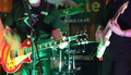
Band Handsby obsidianComment: too much band, not enough hands. nice colors and mood, but getting tighter on the hands of one player or the other would have worked better. |
 Photographer found comment helpful. Photographer found comment helpful. |
| 03/23/2006 01:40:33 PM |
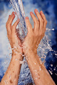
Refresh by JulieGComment: I wish the hands had a bit more shadow on some side or the other, the lighting is a bit too even making them look flat. Other than that, every thing is just right, ought to be top ten. |
| Photographer found comment helpful. |
| 03/13/2006 01:27:19 AM |
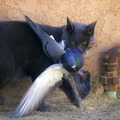
Caught!by RistyzComment: How this image gets this many votes below a five is beyond me. Keep up the quality of these shots, the scores will come. I was sure this would top twenty at least. |
| Photographer found comment helpful. |
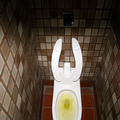
| 03/12/2006 04:58:10 PM |
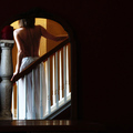
Mirror Imageby JutildaComment: I wish the balluster wasn't squeezed out tof the frame on the left, but the use of empty space on the right is great, the shadow controll on the model's back is quite fine and the colors and lighting create a tranquil fluid look that ought to score right up there in a particularly tough challenge. |
| Photographer found comment helpful. |
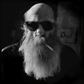
| 03/12/2006 04:55:16 PM |
Untitled, 2006by pawdrixComment: I wish there was some light defining the shadow side and punch up the smoke against the dark, but on the whole it is a very nice shot. I particularly like the skin texture behind the sunglasses. |
| Photographer found comment helpful. |
| 03/12/2006 04:52:46 PM |
|
| Photographer found comment helpful. |
| 03/12/2006 04:48:27 PM |
Caught!by RistyzComment: good capture, very well processed, At first I didn't like the pipe line on the right edge, but it does give some balance and greater sense of place. The expression in the cat's eyes and the perfect framing of the bird's wings and feet pointing to the corners of the frame make this a top ribbon contender. |
| Photographer found comment helpful. |
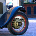
| 03/12/2006 04:44:28 PM |
The Great Gatsbyby Rae-AnnComment: on my screen the cyans seem to be oversaturated and the blusih cast is too dominant. I like the sweep of the fender and the texture of the road, but the dense well focused stuff above the brick wall in the upper right of the frame is distracting and doesn't help your composition. |
| Photographer found comment helpful. |
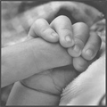
| 03/12/2006 04:41:15 PM |
A hand that will lead his futureby DiComment: Nice composition and a sweet sentiment. I wish you had a darker black somewhere, the highlihgts are well done, but the darkest tones seem to be a middle grey, and the flatness steals some of the drama from this shot. |
| Photographer found comment helpful. |
| 03/12/2006 04:36:58 PM |
Simple Lifeby whiteroomComment: I like the way the road takes the eye up and through the frame, and the placment of the people on that line, but the focal softness throughout the frame is unfortunate. |
| Photographer found comment helpful. |
Home -
Challenges -
Community -
League -
Photos -
Cameras -
Lenses -
Learn -
Help -
Terms of Use -
Privacy -
Top ^
DPChallenge, and website content and design, Copyright © 2001-2025 Challenging Technologies, LLC.
All digital photo copyrights belong to the photographers and may not be used without permission.
Current Server Time: 08/10/2025 01:42:59 PM EDT.