| Image |
Comment |
| 08/15/2006 02:25:40 AM |
Flameby marboComment: nice macro, but it feels like there is almost a depth of field issue going on, as if the flame is some distance behind the match and it doesn't feel as if the match has actually been lit. it's a weird optical illusion i guess. it's a nice study of what happens once a match is struck, but i do with the flame element was more defined. 6. |
 Photographer found comment helpful. Photographer found comment helpful. |
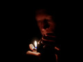
| 08/15/2006 02:23:05 AM |
midnight smokerby saintaugustComment: one feels if the guy was directly head on partly obscured with a trilby hat might boost its noir quotient a bit... as it is, i like that it's quite a moody shot, though it feels that the white balance is a bit off (bit too red for me) and his fingers on his left hand both obscure his face and appear fuzzy in comparison with the rest. as you can tell, most of my criticisms are regarding his posture; technically (apart from the WB thing) this is really nice. i especially like the large portions of black; it feels like its enveloping and suffocating your subject (but in a good, cool way). you can also sense the immediate darkness as soon as the lighter goes out. yeh, this is really evocative in terms of mood and style. more i look, more i like it. 7. |
| Photographer found comment helpful. |
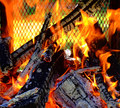
| 08/14/2006 04:16:26 PM |
Smoke Gets In Your Eyesby gsalComment: challenge description is more fire than smoke... i do like the pictures menace though ;treatment in terms of colour and shades and ever so slight desat works reall effectively. i think it might be better if he didn't have the phone to his head though, just seems a monir distraction for us the viewer. it's a cool candid portrait; but still not sure how relevant it is to this challenge... 7. |
| Photographer found comment helpful. |
| 08/14/2006 04:13:55 PM |
This single flameby strangeghostComment: has such a simple elegance... puts me in mind of the cover to the cd single Garbage did for one of the bond films... it has a sensuous curviness that i like very much. gorgeous and lovely - 9. |
| Photographer found comment helpful. |
| 08/14/2006 04:08:17 PM |
Find the Deranged Jack O'Lanternby KelliComment: nothing in the frame really appears to be in focus, or maybe everything feels slightly over sharpened. either way, i can't really see any real focal point of interest within the shot, and i think that it might have been more effecive as a whole piece if it were taken at night... 3. |
| Photographer found comment helpful. |
| 08/14/2006 04:06:29 PM |
Firepower - keep your sponsors happy!by boomeraklComment: superb timing, and brilliantly captured; the nature of the sponsor just makes this even more perfect. only slight thing is that i wish it were a bit more centred, but it's just me reaching for anything to criticise; really it's a great shot, perfect for the challenge and 10 times better than anything i could do. 10. |
| Photographer found comment helpful. |
| 08/14/2006 04:03:21 PM |
She Hates To Be Betrayed by De SousaComment: for sheer effort alone you get a ten. for the ever so slight cheesy and tacky benny hill-esque you get another ten. deeply impreseed with this; which is the obvious intent, i suppose. i do think you might have been a little bit over zealous with the old noise reduction, there, but generally this is superb to the nth degree. creative, imaginative, bit funny, excellently executed. 10. |
| Photographer found comment helpful. |
| 08/14/2006 03:55:43 PM |
Yeah I got my (fish)eye on that new GT.by MattOComment: you've somehow made what was a very pretty car into something resembly a tacky limo! i really don't think the fisheye is the best sort of lens on this sort of subject ;at least not head on. it does have the benefit of looking like nothing else though! i like how sharp it is, and the clean whiteness of the car really shows between the sky and paviors. the sunlight on the left is far too harsh, though, and the building on the left and the red car on the right distact some. as does your reflection! 6. |
| Photographer found comment helpful. |
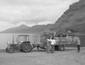
| 08/14/2006 03:38:03 PM |
Country styleby MarellaComment: it certainly has a certain rustic charm about it... i feel that it looks a bit grey and washed out though; if you have ps elements or similar play with the levels a bit (sliding the left most one in elements up a fair bit would make the darker shades richer and more defined). the mountainous setting looks really nice in a remote kind of way, which suits your subjects. 6. |
| Photographer found comment helpful. |
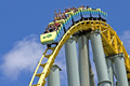
| 08/14/2006 02:32:37 PM |
E-ticket transportationby MelethiaComment: a great shot. great sense of scale, gorgeous bright colours, lovely clarity and level of detail. i love how the front end is about to plummet out of the frame of the photo. can't really fault this picture, so have no cause to give it anything other than a 10. |
| Photographer found comment helpful. |
Home -
Challenges -
Community -
League -
Photos -
Cameras -
Lenses -
Learn -
Help -
Terms of Use -
Privacy -
Top ^
DPChallenge, and website content and design, Copyright © 2001-2025 Challenging Technologies, LLC.
All digital photo copyrights belong to the photographers and may not be used without permission.
Current Server Time: 09/04/2025 11:35:25 AM EDT.