| Image |
Comment |
| 08/16/2006 04:24:06 AM |
Blue Stupid!by charliebakerComment: HA HA HA HA HA HAAA!!!! gnnnrrr - my sides are splitting!!! this is hilarious! did you do the fire picture on purpose just to set up this entry? if so, you're a total comic genius and should be saluted! OH i hope this ribbons. this is the funniest thing ever! 10. |
 Photographer found comment helpful. Photographer found comment helpful. |
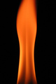
| 08/15/2006 04:08:24 AM |
Blue Fire Cogby hotpastaComment: surprisingly few burners in this challenge, don't you think? i think this is a lovely shot of one; the flames are so well captured that they look tangibly touchable. i also like the detail and the texture of the black metal element. it's a very lovely macro - 8. |
| Photographer found comment helpful. |
| 08/15/2006 03:48:55 AM |
Blue Fireby charliebakerComment: erm. yes. good depth of field, nice to see rule of thirds being applied so well....
i don't know. it's a bit, you know, a bit tooo abstract, perhaps? maybe? it's a nice blue. very bright. might have used the burn tool in the top left a bit. i think you could do with a nice border to set it off. i'm guessing it does actually meet the challenge. so 2. |
| Photographer found comment helpful. |
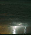
| 08/15/2006 03:44:16 AM |
Fire Startersby vtruanComment: a gorgeous and exciting image. i normally consider lightning pictures to be passe and havign seen so many, not really get stirred up by them. THIS, however, is stunning. the lightning itself is beautiful, but the way the underside of the cloud is illuminated is starkly beautiful. i think the amount of sky in the top half is a bit excessive, to be honest, given the beauty of light and colours in the lower third. it's a really lovely image. 9. |
| Photographer found comment helpful. |
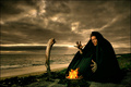
| 08/15/2006 03:16:50 AM |
Summoning the flames by TUBORGComment: super lovely, albeit slightly scary creepy, stylish image. lovely ominous sky (oh, weird, i can see two eyes above your character in the clouds staring at the stick - creepy!). the colours of the image are impressively striking and rich in hues, though in that sort of familiar icelandic way. your PP skills are really top notch. i love how the flames glow such a nice bright orange against the rest of the image. the set up is great, the bent stick, the star wars garb, and the remote feeling environment all add to this. the fact that your model looks like a younger thinner meatloaf lessens the darkness factor a bit, but other than that, great stuff. 9. |
| Photographer found comment helpful. |
| 08/15/2006 03:03:25 AM |
Fiery Beautyby skasubaComment: nice; i see the line of a back, and it's very visually appealing. the deep orange against the black is also strikingly effective, and looks immediately really cool. the top of the flame loses its sharply defined edge evident in the rest (might have cropped it out myself) but otherwise very lovely. 8. |
| Photographer found comment helpful. |
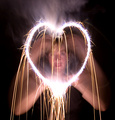
| 08/15/2006 03:01:09 AM |
The Fire in My Heartby scarbrdComment: it's an amazingly dynamic and exciting effect, but it is let down somewhat by the blurry person doing it. if you get her to wear a black coat, black gloves and maybe a black balaclava with no eye holes, and had the heart on it's own, i think it would prove to be a remarkable piece of symbolic artwork. but the unavoidable movement lessens the overall impact. 7. |
| Photographer found comment helpful. |
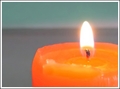
| 08/15/2006 02:50:01 AM |
Tameby pacpintoComment: this feels a smidgeon over exposed, though it might be the background that gives that impression - just feels to light and bright really. there's also weird artefacts along the edge of the candle... i like that the wick is nice and sharp, and it does work to focus the eye on the flame in the first instance. but then my eye wanders around and there's not a lot to absorb. just doesn't really grab me, i'm afriad. sorry. 4. |
| Photographer found comment helpful. |
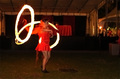
| 08/15/2006 02:46:00 AM |
Fire Dancerby drz01Comment: it's a dramatic image, but i think it suffers a little from the camera being hand held (use a table if without tripod), and to be honest, the girl dancing around too much. in terms of composition, i feel that you could get away with having her centred because the right half of the frame looks a bit redundant, and the blur of camaera movement is more apparent here. or alternatively, go mad with the burn tool; you're allowed to and blackening out a lot of the background would draw principal attention back to the girl. the ghost effect of the girl is a bit unnerving (her second head is creepy!) and the "i'm a little teapot" pose that she's now doing feels a bit silly... i do sympathise; i've tried shooting similar performers and it's a right bitch! 6 for the drama and the high difficulty level. |
| Photographer found comment helpful. |
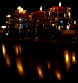
| 08/15/2006 02:31:55 AM |
Candlelight Reflectionsby andrea22_alsComment: i'm guessing you also has a mirror behind the candles, because there is something very odd going on with the candles at the back left. i'm also guessing you might have had some preconceived ideas about what you wanted to achieve, and i think the picture suffers as a result; the desire to include the reflections in the bottom half doesn't really add to the overall picture - i think i'd have cropped it out entirely. it's also giving the illusion of being wonky (which voters never like because it's usually the first thing they see), and it's far too dark; i think some additional lighting (like a typical flashlight) rather than a longer exposure might have helped, because the way you've set the candles up is really nice, almost like a city skyline. 4. |
| Photographer found comment helpful. |
Home -
Challenges -
Community -
League -
Photos -
Cameras -
Lenses -
Learn -
Help -
Terms of Use -
Privacy -
Top ^
DPChallenge, and website content and design, Copyright © 2001-2025 Challenging Technologies, LLC.
All digital photo copyrights belong to the photographers and may not be used without permission.
Current Server Time: 09/04/2025 11:35:24 AM EDT.