|
|
|
Showing 131 - 140 of ~830 |
| Image |
Comment |
| 08/30/2006 03:34:42 AM | Psycho - Shower Sceneby MarioPierreComment: wow - the resemblence to janet leigh is extraordinary (much more convincing the anne heche!) one of the most famous scenes in film history, this homage has been excellently captured and has the feel of horror convincingly running though it. 10. |  Photographer found comment helpful. Photographer found comment helpful. |
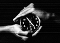
| 08/25/2006 02:32:34 PM | Essence of Timeby bharathmcComment: stylistically, i really do like this; as a thumbnail amongst all the others it really grabbed my attention. seeing that the actual image isn't that much bigger than the thumbnail was, must confess, a bit disappointing. it's also not big enough to determine whether or not the focus is actually soft. i think there's a tutorial for resizing; it's worth having a quick read. like i said though, conceptually, i love it. the B&W works well with the static type effect. lighting seems pretty well done. i also love the detail of the symmetry, in that at 4.55 it would be almost the same photo upside down. great thoughtful stuff - 8. | | Photographer found comment helpful. |
| 08/25/2006 02:26:46 PM | Soft Touchby LokiComment: a very pretty girl, but dress sense is erring a bit on the glamour-esque / page 3 sort of thing. the heels and knickers kind of limits the level of elegant subtlety a little bit; but that's just preference. it's really a picture of two halves; i tried cropping her from just below her hair and upwards, and really, i felt it would make (composition wise) a bloody gorgeous prtrait. true, you'd lose the tatoo which is a nice touch of personality, but her face ,skin, arms and hair is really brought out by the sepia and the black background, and her pose really suits the rule of thirds you've followed more... the softness is well achieved; it's there but not overly done to be obvious. 7. | | Photographer found comment helpful. |
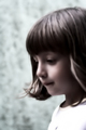
| 08/25/2006 11:53:11 AM | Dreamerby gocComment: really like this one. the bluey greys in the background really sets it off nicely. the white shirt, though an obviously blown highlight, also works well and doesn't distract too greatly. the focus seems to be a mix of softness and noise reduction, which is a little odd, i think. but i like it in that you get a sense of motion, or the feeling that there is about to be motion, like the girls attention is very precisely focused on somthing she's about to grab. very nice. 8. | | Photographer found comment helpful. |
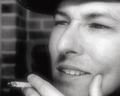
| 08/25/2006 11:34:03 AM | Bogartesqueby BooZonComment: not sure why, but i immediately thought it was more Bowie-esque. still, here is a good example of when a soft focus should be used and actually enhances the image. i'm sure a sharp version would be just as effective, but here the softness artificially ages the shot to another era and style. so power to you for inteptreting the challenge so successfully. i like how it's a nod to the actors of that era, and to an era where smoking looked cool! only slight criticism is that i thought the crop is a bit too close to your subject, but other than that, it's very well done. 9. | | Photographer found comment helpful. |
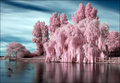
| 08/25/2006 11:16:15 AM | Candyfloss Lakeby marboComment: gorgeous. another (typically) brilliant example on the joys of IR when you have someone who knows what they're doing behind the lens! however, the decision to keep the pink on the trees is genius; gives it a great effect and does differentiate from what you would expect. it's really beautiful, and the mirror like flat water only enhances that. only minor criticism is that for the challenge focus doesn't feel soft enough. it has that glow, certainly, but i don't know, it just doesn't say it's any softer than any IR photo. so, err, 9! | | Photographer found comment helpful. |
| 08/25/2006 10:47:52 AM | London Next >>by names_amitComment: this is a novel and interesting use of a shop front! i actually prefer the lower half to the top half; i feel that portion is a little redundant and unbalances the composition a bit, plus the top right corner detracts a bit. I also don't feel that the focus is particularly soft; looks quite sharp and hard, even (especially the next sign, which is the most prominent thing in the frame). i like the sepia, and i like the position and angle of the NEXT. 5. | | Photographer found comment helpful. |
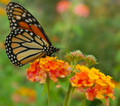
| 08/25/2006 10:25:57 AM | A Delicate Balanceby dolphnz8Comment: there is a fine line i think between soft focus and out of focus, and to me, i'm sorry to say, the butterfly seems to be in the latter camp. the flowers, on the other hand, fit in the former lot! very weird mix - i guess this might have been aluded to in your title! i've said this on a couple of other entries, but i personally do not feel the image is enhanced by the soft focus; if it were sharp (especially the butterfly) i think it would frankly rock - which makes the soft treatment mildly disappointing. the colours and composition are both extremely visually pleasing; and the background complimentary to the whole shot and style. really good, but for me, not great. 6. | | Photographer found comment helpful. |
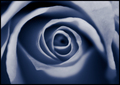
| 08/25/2006 10:11:26 AM | Soft Blue Roseby cryanComment: ever such a pretty image, and the combinations of lines, dark and light all works very nicely together. the colours feel nice. personally, i'm not sure that a soft (or slightly out of) focus does the rose justice here; i just suspect that it isn't really enhanced with this techinique, and as a consequence, one wonders if it truly meets the challenge. just thinking out loud really. it's not that i don't like it though, i really do; the centred composition is spot on, and the frame nicely restrained and simple, but does enhance the blues against the DPC grey background. 7. | | Photographer found comment helpful. |
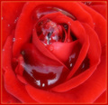
| 08/24/2006 11:42:11 AM | "From the Heart"by ThaiComment: you're reflection in the water adds some humour to this, actually. i like the way it looks you take pictures; it seems you arms are stretched out and you're zapping the flower. the water does have the negative impact of uglifying the rose a little bit though, i'm afraid. it also feels unbalanced composition-wise; i wonder how it might look with a bot cropped off the bottom? giving this a 5. | | Photographer found comment helpful. |
|
Showing 131 - 140 of ~830 |
Home -
Challenges -
Community -
League -
Photos -
Cameras -
Lenses -
Learn -
Help -
Terms of Use -
Privacy -
Top ^
DPChallenge, and website content and design, Copyright © 2001-2025 Challenging Technologies, LLC.
All digital photo copyrights belong to the photographers and may not be used without permission.
Current Server Time: 09/01/2025 12:35:09 PM EDT.
|