|
|
|
Showing 1571 - 1580 of ~1950 |
| Image |
Comment |
| 09/09/2014 03:34:08 AM | |  Photographer found comment helpful. Photographer found comment helpful. |
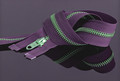
| 09/09/2014 03:33:07 AM | Z is for ....by adriano74Comment: Nice colors. Would have worked a little better if you nailed the symmetry in the framing. | | Photographer found comment helpful. |
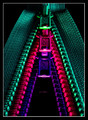
| 09/09/2014 03:31:51 AM | YKKby mrbig65Comment: Nice idea, but the asymmetry and areas of focus/out of focus don't quire work for me. I'd like to see the frame shifted right a touch as well. | | Photographer found comment helpful. |
| 09/08/2014 06:19:16 PM | | | Photographer found comment helpful. |
| 09/08/2014 03:03:15 PM | Back to school - Back togetherby clickodakComment: Critique Club Comment:
A very familiar site to many of us, and a sure sign of back to school. A nice image, for sure, but not anything that really grabbed my attention after I got past the familiarity. Given the lack of a specific subject all I am left with is the overall symmetry within the shot, which would be fine if you nailed it.
Alas, there are two main issues with that symmetry. First, the centerline of the symmetry is off center - the center of the aisle runs to the right of center. But that's not all that's wrong, the plane of reference is rotated slightly right as well. So while the crop looks like you left too much to the left, if you look along the windows you have more of the right side showing - sure evidence of the need for horizontal perspective correction. This image greatly benefits from first correcting the horizontal perspective, pulling the right side towards the front slightly, and then cropping so that the center line runs directly down the center.
You still have some issues after that in that the bus is empty and there is a lot to distract you outside the windows. You need something to command the viewer's attention. Maybe boost the contrast between the seats and the aisle to pull the eye through the photo down the center to the back of the bus? Darken the seat covers while lightening the center strip, allowing the metal ridges that border it to focus the attention through the frame. While I am not particularly a fan of selective color, perhaps you could have played off the black and white dreariness of the inside of the bus taking you to school with a full-color view outside the windows, highlighting the freedom you're now losing for most of your day?
Again, not a bad photo, outside of the symmetry issues. But not one that holds the attention. | | Photographer found comment helpful. |
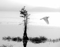
| 09/08/2014 08:37:46 AM | ~l o o k o u t~by KMcCComment: Critique Club Comment:
This is really a lovely photo in a beautiful setting. The soft feel plays very well into the subject, and I think this works very well as a black and white. I do think a couple compositional and post processing changes could have greatly improved it, however.
One of the first things that will always kill a photo for me is a crooked horizon, and you have one. Even with the various skewed lines you have working here (particularly the line made by the sun reflecting on the water against the upward flight of the bird), correcting the faint horizon in the rear anchors the photo for the viewer - or for me at least (it's my #1 critique point when leaving comments).
My only other comment about the processing would be that I find many of the blacks to be "too black", particularly at the base of the upright shrub and in the shadows of the grasses. With the softness of everything else it feels too aggressive, as if it was overly backlit, which it obviously wasn't looking at the details in the birds.
Otherwise, compositionally there are a few things I could wish were different. I'd love for there to be a little more room to the right to give the bird more room to "fly" within the frame. I would have also loved to have seen a little more room under the reflection of the shrub and grasses - maybe another half-as-much. If I had my way I'd love to be able to grab the bottom-right corner and expand the crop down and to the right, landing the birds as close as I could to the left and right 1/3 lines of the photo. Or, choosing a different crop within the current view that brings the seated bird a little closer to the left edge so there's as much open space to the left as to the right. This would also eliminate some of the foreground grass that I find just a little distracting.
| | Photographer found comment helpful. |
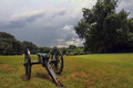
| 09/08/2014 07:17:12 AM | Distant Thunderby cowboy221977Comment: Critique Club Comment:
OK, nice sky, nice colors, nice scenery, making for a "nice" picture. But these elements are combined with a couple flaws in composition that I would consider rather considerable, causing me (and 55 others) to give this a 5.
Problem number one is the rather minor one that none of the various elements give you any grounding on a solid vertical or horizontal. Perspective combined with the rolling hills and the angle of the cannon leave me wondering if your one vertical line (the left cannon wheel) really should have been? Both wheels appear to be mounted slightly askew, so I'm wondering if a slight rotation to the right would have fixed this (I believe it helps).
Problem number two is the big one for me - cannon direction. The subject of a photo needs to have a way to interact with the rest of it, regardless of what it is. Unfortunately, your cannon flows directly off the left edge. Were it oriented even with the rotational issue, but facing left, it would improve this 100%. Had you walked to the left and composed the image so the cannon sat on the right 1/3 line instead of the left, it would improve this 100%. As is the entire image just points left.
It's not that the composition itself is off - the elements play straight into the rule of thirds - it's that the subject's direction within that composition doesn't play into the image, it plays out of it. If your subject was a person walking you want them to have somewhere to walk to within the photo, not look like they're walking out of it and you just caught them late. If they're staring you want their gaze to lead you through the photo not out of it. The cannon is pointing the viewer away from the rest of the photograph, and ultimately that keeps this from working.
Otherwise, the processing and compositional elements of this shot are all solid. | | Photographer found comment helpful. |
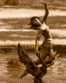
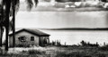
| 09/08/2014 06:49:41 AM | Fisherman's Paradise by Ja-9Comment: Critique Club Comment:
A really nice image that obviously did rather well. The elements all work really well, balancing the idea of "abandoned" with a beautiful setting that makes you wonder why. All of it worked for a nice top 10 image, but I have to be honest and say that somethings didn't work for me (I was originally one of your 5's), so let me go into them - and feel free to ignore me as an obvious outlier. :)
I would have to see the starting image SOOC to try and understand why you went with the squat crop, but I don't really like the long and flat look here. Compositionally there a sense of unbalance for me. I'm not speaking specifically of adherence to the rule of thirds, or golden triangles or golden ratios, but more of just something that feels off, and for me it has to do with the crop ratio. Not that I'd want to crop anything out, but at nearly 2:1 it makes me want to see the tops of those palms on the left instead of seeing those two branches pop in from nowhere.
There's also some spot issues. First, that single dot in the top center that I might have masked out - once I notice it my eye keeps going back to it. After that, there seem to be dust spots between the clouds and horizon to the right that probably were absolutely invisible until the Nik tools pulled them out (happens to me all the time).
I've had this in my critique queue for a week now, and it's taken me a few runs through to try and wrap my thoughts around why it didn't fully work for me when it obviously worked for others. I do like it, just not as much as most folks did. The spots are likely what kept me from being one of your 6's instead since these things to me always give the impression of being a little sloppy/lazy in post, and if there is one overriding thing in the photo that I'd want "fixed" it's that. Otherwise, well done on a to 10. | | Photographer found comment helpful. |
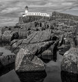
| 09/08/2014 06:19:21 AM | Lighthouse Rockby KroburgComment: Really nice shot, Kees, but I have to say, when I first saw it I had to wonder what it would have been like with a 10 stop ND and some movement in the clouds, and the water. That said, the water's stillness tells me that you could have sat there all day shooting 10 second exposures and still got next to no movement. As others have mentioned, there's something I can only call "incomplete" about the composition that makes these wonderful elements feel "off" just a little. More sky? More foreground? Shallower DoF focused on the foreground rocks giving less definition and prominence to the lighthouse and sky? I don't know. Still, like many, it should have done better. | | Photographer found comment helpful. |
| 09/07/2014 09:02:41 PM | | | Photographer found comment helpful. |
|
Showing 1571 - 1580 of ~1950 |
Home -
Challenges -
Community -
League -
Photos -
Cameras -
Lenses -
Learn -
Help -
Terms of Use -
Privacy -
Top ^
DPChallenge, and website content and design, Copyright © 2001-2025 Challenging Technologies, LLC.
All digital photo copyrights belong to the photographers and may not be used without permission.
Current Server Time: 09/02/2025 03:52:22 AM EDT.
|