| Image |
Comment |
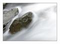
| 02/21/2004 05:24:16 PM |
Running Waterby agwrightComment: This photo stands out from the rest of the flowing river photos because of the sense of movement. You must have used a very long shutter speed to get this effect, and it works great. I also like the composition, the rocks aren't in the center, but are offset which in my opinion is good. |
 Photographer found comment helpful. Photographer found comment helpful. |
| 02/21/2004 02:10:21 PM |
Fish Out Of Waterby qmdiComment: I like the texture of the sand, the little grains of different colors are great. You shouldn't have put your subject in the middle of the frame, offset it a little to the side, and up or down.. |
| Photographer found comment helpful. |
| 02/20/2004 11:06:31 PM |
Shattered Glassby peeceeComment: This is an interesting texture, one I haven't seen used in the challenge yet. This photo needs an object too focus on, not just a plain texture. |
| Photographer found comment helpful. |
| 02/20/2004 11:05:32 PM |
Circlesby fayenetComment: The reflections are a little distracting from the headlight. I like the composition, its a nice take on an average object. |
| Photographer found comment helpful. |
| 02/20/2004 09:56:52 PM |
Smoothby orussellComment: Smooth is a texture, but you could've shown it better. Having reflections coming from the surface would have shown the it was smooth, although that may be hard or impossible with what you are photographing. |
| Photographer found comment helpful. |
| 02/20/2004 09:50:10 PM |
The Enduranceby GPComment: This photo needs a focal point, its just a texture right now without a real subject. |
| Photographer found comment helpful. |
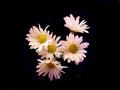
| 02/20/2004 09:23:14 PM |
Black and whiteby neenee1999Comment: If I remember correctly the description for the challenge said a black object. Other than that I like the contrast between yellow, white, and black, makes the flowers stand out. You could have positioned them better, being in the middle of the frame doesn't help much. The lighting on that bottom flower is a little too dark, some light would help it come out more, unless you wanted it to be dark. |
| Photographer found comment helpful. |
| 02/20/2004 09:20:40 PM |
Buck - An American Classicby orussellComment: The composition is good, the silver button is placed well in the frame, and draws my attention, although the lighting is a little too bright there. I would've liked this better with a white background to contrast the black, and go with the white button. Or you could have a black bacground with no texture. |
| Photographer found comment helpful. |
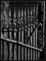
| 02/20/2004 09:17:45 PM |
Gated Communityby sherComment: I like the black tones in the photo. The composition/ point of view could be better. There is too much in the photo, I don't know what to focus on so my eyes keep jumping around. |
| Photographer found comment helpful. |
| 02/20/2004 09:12:17 PM |
Beauty on Blackby JeileenComment: I like the photo, the contrast between yellow and black is always great. You will probobly get voted down because the description of the challenge said a black object, this is a yellow object with a black background. On a different challenge this would've been a top 10. |
| Photographer found comment helpful. |
Home -
Challenges -
Community -
League -
Photos -
Cameras -
Lenses -
Learn -
Help -
Terms of Use -
Privacy -
Top ^
DPChallenge, and website content and design, Copyright © 2001-2025 Challenging Technologies, LLC.
All digital photo copyrights belong to the photographers and may not be used without permission.
Current Server Time: 06/15/2025 03:33:25 PM EDT.