| Image |
Comment |
| 06/03/2004 02:40:58 PM |
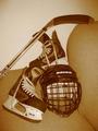
hockeyby DebohComment: I think I would have liked this better if the equipment was sitting on some ice. I like the sepia tones, but the couch and the blank white wall doesn't really do anything for the composition. Maybe if the equpiment was cropped a bit closer it woud have imprved things just slightly. |
 Photographer found comment helpful. Photographer found comment helpful. |
| 06/03/2004 02:40:15 PM |
Thomas And Mack After Darkby michaelkComment: Really awesome! Great that you were able to get into an empty stadium. I love the rich colours - your cmaera does a great job of picking up the saturation. Also, very sharp. I relaly like the over-blown lights set to the left side instead of straight in the center - very good balance and composition - 10 |
| Photographer found comment helpful. |
| 06/03/2004 02:39:26 PM |
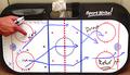
Modern Day "Chalk" Talkby TommyMoe21Comment: All I have to say is... awesome. The hand seems a bit red - maybe the person has a sunburn - but it may be that the colours are slightly off on your camera. |
| Photographer found comment helpful. |
| 06/03/2004 02:27:48 PM |
The Balancing Actby aerogurlComment: Fantastic shot and finally someone who is able to capture rich and saturated colours. Like the square image. Good composition. |
| Photographer found comment helpful. |
| 06/03/2004 02:27:20 PM |
Old School Decisionsby Melly8522Comment: Really great shot. My only suggestion woudl be to increase the use of negative space slightly - maybe to the top. Also, it seems very grainy. The lighting is supurb and works well in black and white. Good luck -7 |
| Photographer found comment helpful. |
| 06/03/2004 02:26:41 PM |
Off-Season Field Maintenanceby pmichaudComment: Love this one. Love the composition, the angle, that my eye is drawn in and can move around. Good use of colour and saturation> may have been that much better if shot in very early morning or late evening - but not necessary. 8 |
| Photographer found comment helpful. |
| 06/03/2004 02:26:01 PM |
Across the Generationsby HifiComment: Really good idea for this challenge. In teh future you may want to icnrease the actual size of your photo because people in DPC tend to vote lower on small images. Try to use up the maximum 640 x480 - as much as possible. I think the sunlight in this one is a tiny bit too harsh and may have been a bit better in the early morning or late evening - the composition of the hands is good, but the pantleg with no shoe is maybe not necessary - try thinking about your use of negative space. GOod luck! |
| Photographer found comment helpful. |
| 06/03/2004 02:24:41 PM |
Caged CATby redmondson01Comment: I'm wondering if it woud have been that much better if you shot it with the pole of the cage a bit to the left or the right. However, good idea for this challenge. 6 |
| Photographer found comment helpful. |
| 06/03/2004 02:24:10 PM |
America's Pastimeby pogboy4Comment: This is my favorite of the baseball shots. Great idea, really wonderful angle. Finally-- someone who thought about negative space, composition, saturation, etc. 10 |
| Photographer found comment helpful. |
| 06/03/2004 02:23:41 PM |
|
| Photographer found comment helpful. |
Home -
Challenges -
Community -
League -
Photos -
Cameras -
Lenses -
Learn -
Help -
Terms of Use -
Privacy -
Top ^
DPChallenge, and website content and design, Copyright © 2001-2025 Challenging Technologies, LLC.
All digital photo copyrights belong to the photographers and may not be used without permission.
Current Server Time: 07/23/2025 08:32:07 PM EDT.