| Image |
Comment |
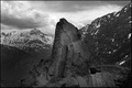
| 08/25/2006 10:31:16 AM |
Mordorby adamwebComment: I like the centered composition and the dramatic conversion. It looks oversharpened to me. I can see a halo between the dark rocks and the sky. |
 Photographer found comment helpful. Photographer found comment helpful. |
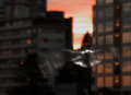
| 07/12/2006 11:25:23 AM |
Flight of a Seagullby ArtysteComment: This shot is amazing, but the sunset lighting on his head and wings truly makes it sing. I love the perspective and the blur of the wings is just right. I am sure you had to act fast to get this shot, and you did is spectacularly. I am adding it to my favorites now. |
| Photographer found comment helpful. |
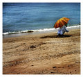
| 07/03/2006 11:42:32 PM |
The Clam Diggerby amberComment: I love your color and composition. THe diagonal line of the water works great and the texture of the water and sand is really nice. I like that the subject is facing away from the camera and out of the frame, too. It emphasizes how absorbed he is in his activity. |
| Photographer found comment helpful. |
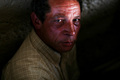
| 07/02/2006 07:38:34 PM |
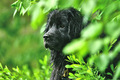
Living under the bridgeby TOYComment: Greetings from the critique club,
THis is a great shot. I think your score was lowered because people were not looking for a portrait in the 'desolation' challenge. It says desolation to me, though. Well done.
The lighting makes this image outstanding. I love the beam of light that illuminates his eyes and forehead, leaving the rest of his surroundings darkened. It really works for this shot, excellent job finding your light. The angle you chose, looking down on him, works really well, too. The eye contact is great. His eyes look right through you.
Composotionally, I might have cropped in a little closer, taking some room off the right of the frame and bottom. This would bring his eyes a little lower in the frame and not so centered horizontally. I think he is a little crowded to the top the way it is. Other than that, I am struggling to come up with a great suggestion to improve this. The light tan patterned shirt is a little distracting, especially where the light hits his shoulder. I might try to burn that down a little.
Please feel free to pm me with any questions about my comments.
Cheers,
Liza
|
| Photographer found comment helpful. |
| 07/01/2006 09:26:34 PM |
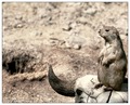
Dust Bowlby SJCarterComment: Greetings from the critique club,
What a cool shot to get to critique. I love this one and I thought it was well suited for the challenge. My challenge in critiquing it will be to find some constructive things to suggest for you.
I love the tones here and the monochromatic feel. I love how contrasty you made it, too. I think both really enhance the mood of the image. The little prairie dog is perfectly sharp and you got great texture in his fur.
My favorite part of the image is the composition. I really like how you broke the rule of thirds and put him so far over in the frame. I think it is especially appropriate for the 'desolation' theme. It draws attention to all of the empty space in the frame that he is facing. In fact, if you had room, I think you could have made this an even skinnier aspect ratio (like 5x7 maybe?) and had even more space for him to look into.
I can't tell exactly what your aperature was, maybe it was F10? You mention gradient blur in your notes, so I am thinking you used the blur to make it look like shallower DOF than you really had. If this was shot at F10, I would suggest opening up more and letting the DOF fall off more naturally. It seems like there is a kind of abrupt transition where you faded the blur in, right about the middle of the frame if I am looking at it right. Maybe my eyes are playing tricks, but it looks a little off to me.
Zoo shots are tough to get a good angle, I know. In a perfect scenario, I would suggest getting a little bit lower for this shot, but that probably wasn't possible.
Really cool shot. In fact, I am adding it to my favorites. Please feel free to pm me if you have any questions about my comments.
Cheers,
Liza |
| Photographer found comment helpful. |
| 06/23/2006 01:41:32 PM |
Zoeby BlackNewfsComment: I love the sharpness of the dog with the out of focus foreground and background. Definitely nice bokeh. I would have liked a little more space on the left side of the frame, so that the dog was not so centered. 7 from me. |
| Photographer found comment helpful. |
| 06/23/2006 11:54:37 AM |
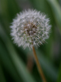
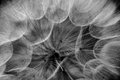
The Dandelion Fairyby agwrightComment: This is beautiful, but looks very flat and underexposed to me. Curves or levels could really make this one pop. I love your DOF here. |
| Photographer found comment helpful. |
| 06/20/2006 09:14:43 PM |
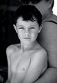
The Boyby CalliopeKelComment: Wow! What an expressive look you captured here. I am drawn right in. Stunning. I think I would burn down the right side of the frame (his mom) a little, especially the bright spot in the upper corner. |
| Photographer found comment helpful. |
| 06/12/2006 12:19:38 PM |
|
| Photographer found comment helpful. |
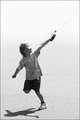
| 06/12/2006 11:51:20 AM |
Soarby SJCarterComment: Lovely. I love her running with the one leg up. Her hair blowing really shows the wind (of course, for a kite-flying day), but I really glad we can still see her great smile, too. THe line of the string and her arms is very cool. |
| Photographer found comment helpful. |
Home -
Challenges -
Community -
League -
Photos -
Cameras -
Lenses -
Learn -
Help -
Terms of Use -
Privacy -
Top ^
DPChallenge, and website content and design, Copyright © 2001-2025 Challenging Technologies, LLC.
All digital photo copyrights belong to the photographers and may not be used without permission.
Current Server Time: 08/04/2025 05:59:51 PM EDT.