| Image |
Comment |
| 06/21/2012 10:16:40 PM |
|
 Photographer found comment helpful. Photographer found comment helpful. |
| 06/21/2012 10:15:58 PM |
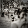
The Camperby MAKComment: The woman in the foreground ends up being a very large blurry area in front of an in-focus photo. It might have worked better if there was more of a transition from in-focus to blurry. |
| Photographer found comment helpful. |
| 06/21/2012 10:13:55 PM |
Visitationby Bear_MusicComment: The foreground bokeh is confusing. There's no easy explanation for why it's there and it's different in tone from the rest of the photo. |
| Photographer found comment helpful. |
| 06/21/2012 10:09:50 PM |
blowby RKTComment: A great idea for making the foreground bokeh part of the concept. |
| Photographer found comment helpful. |
| 06/21/2012 10:07:58 PM |
|
| Photographer found comment helpful. |
| 06/21/2012 10:06:34 PM |
sphereby klkitchensComment: This has a beautiful combination of colors and textures. |
| Photographer found comment helpful. |
| 06/21/2012 10:05:08 PM |
|
| Photographer found comment helpful. |
| 06/19/2012 01:12:24 PM |
|
| Photographer found comment helpful. |
| 06/19/2012 01:04:40 PM |
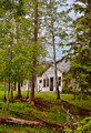
Left to Rotby LawtonComment: Nice composition. The sky coloring in and around the branches is uneven and makes the darker blue patch above the building be distracting. |
| Photographer found comment helpful. |
| 06/19/2012 01:01:57 PM |
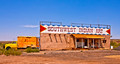
Contrastby JamesDowningComment: The high-contrast B&W takes away some of the "new & shiny" look from the upper portion and hurts the concept a bit, but otherwise it's a great concept. |
| Photographer found comment helpful. |
Home -
Challenges -
Community -
League -
Photos -
Cameras -
Lenses -
Learn -
Help -
Terms of Use -
Privacy -
Top ^
DPChallenge, and website content and design, Copyright © 2001-2025 Challenging Technologies, LLC.
All digital photo copyrights belong to the photographers and may not be used without permission.
Current Server Time: 08/20/2025 08:17:07 AM EDT.