| Image |
Comment |
| 07/23/2012 04:56:36 PM |
|
 Photographer found comment helpful. Photographer found comment helpful. |
| 07/23/2012 04:51:42 PM |
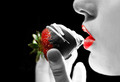
A Girl's Favoriteby jusjoshingComment: I like the concept and the combination of red strawberry and lips. I feel like a little too much of the image is blown out and loses its details. |
| Photographer found comment helpful. |
| 07/23/2012 04:49:24 PM |
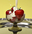
Wimbledon's Smashing Treatby KroburgComment: I really like the concept of freezing the motion of the cream as it strikes the strawberries and it's one of my favorite ideas in the challenge. However, the choice of a fairly low viewing angle, formal upright presentation and wide crop rob the concept of a lot of its energy. If you tilted it about 45 degrees to the right and cropped it tight to just the strawberries it would have lots of action. The goblet and the platter are not the interesting parts of the image and they should be eliminated almost entirely. Also, it may be my monitor or the background but the white balance looks a little too yellow. |
| Photographer found comment helpful. |
| 07/23/2012 04:41:23 PM |
Almost Sinfully Good. by LydiaComment: This is an attractive setup, well-lighted and photographed. I especially like the choice of plate and how it fades into the background. However, the angle and relatively large DOF make it a bit too flat. The cropping could be quite a bit tighter, especially on the left. |
| Photographer found comment helpful. |
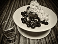
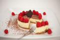
| 07/23/2012 04:36:34 PM |
minute on the lips... life time on the hips...by GilesComment: This is an attractive presentation and the lighting, focus and colors are good. However, I think the cropping is far too wide. I don't feel like you need to include all four corners of the plate, all four extra raspberries and all the cocoa powder, or even the whole dessert. Also, the depth of the fork compared to the DOF makes the tip disappear into blurriness and that looks a little strange. |
| Photographer found comment helpful. |
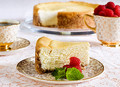
| 07/23/2012 04:31:15 PM |
Greecian Baked Cheesecake by hotpastaComment: This is a beautiful set-up and nicely photographed, but I think there's too much in the frame and the main subject ends up looking too small. |
| Photographer found comment helpful. |
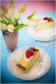
| 07/23/2012 04:29:20 PM |
New York Cheesecake With Fresh Raspberries by CuttoothComment: Nice lighting, focus and color balance. In judging this challenge I don't ask "Does this photo make me want to eat this?" -- I ask "Would I want to hang this on my wall?" This is good technically and might be a good photo for a foodie magazine, but it isn't that exciting for an artistic photo. I feel there are too many elements in the photograph (cheesecake and more cheesecake, a cup and another cup) and the background elements demand too much attention. |
| Photographer found comment helpful. |
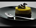
| 07/23/2012 04:29:09 PM |
The Loch Ness Pastry Monsterby wejnaComment: In judging this challenge I don't ask "Does this photo make me want to eat this?" I ask "Would I want to hang this on my wall?" Other than some weaknesses this is good technically and would be a good photo for illustrating your dessert in a menu or cookbook, but it isn't that exciting for an artistic photo. It could be cropped tighter since the eye moves between the "monster" and the tip and bowl of the spoon and there's extra space that is unused. Also, the plate is a little dark as a backdrop for the dark chocolate. |
| Photographer found comment helpful. |
| 07/23/2012 04:29:01 PM |
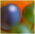
fresh blueberriesby skewsmeComment: This is one of my favorites! I love the colors and the creative use of abstraction compared to other entries in this challenge. Normally I don't go for the "abstraction by blurriness" technique but you use it to good effect here. The overlap of shadows makes an interesting combination of intermediate colors. |
| Photographer found comment helpful. |
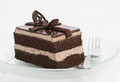
| 07/23/2012 04:28:45 PM |
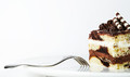
Chocolate Tuxedo Cakeby vawendyComment: This is a very good entry. I love how the fork leads the eye into the dessert and the color of the plate is only slightly darker than the background so as not to distract from the main subject. The cropping choice is excellent and the little extra space at the top gives room for the converging lines of the rolls to lead away. |
| Photographer found comment helpful. |
Home -
Challenges -
Community -
League -
Photos -
Cameras -
Lenses -
Learn -
Help -
Terms of Use -
Privacy -
Top ^
DPChallenge, and website content and design, Copyright © 2001-2025 Challenging Technologies, LLC.
All digital photo copyrights belong to the photographers and may not be used without permission.
Current Server Time: 08/20/2025 08:15:02 AM EDT.