| Image |
Comment |
| 04/18/2005 09:24:51 AM |
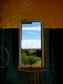
Forgotten Viewby LynnSComment: A nice shot but in this challenge there was a lot of window views (this being one of the better ones IMO). Altho I'm no expert I would have prefered to see the whole picture 640 X640 to get a better feel of the room I'm looking out from. It's got great clarity and some beautiful colors. It's centered to the frame yet kind follows the rule of thirds and has a great view. Personally I think this would have done better in a windows challenge. The overhang in the window is very distracting and if the shot was taken from a higher angle or perhaps a different perspective that could have been eliminated. Personally I just would have liked to see more of the room. Goodluck in this challenge.
Up'd score on second pass. |
 Photographer found comment helpful. Photographer found comment helpful. |
| 04/18/2005 09:16:55 AM |
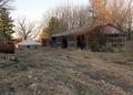
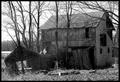
Long Forgottenby ReallyColorBlindComment: I find the dirt is unneeded for the shot because it makes the property look underconstruction not abandoned. I also find the picture to be grainy either from high ISO or from the resizing. The contrast off the dirty at the bottom of the screen is also very distracting and draws my eyes towards that instead of the building. Just from looking at the shot it is hard to tell what the challenge is supposed to be about. Perhaps a closer shot of the building and a lot less landscape woul have made for a better shot. The building you have chosen is not a bad looking building for this challenge but because of the size it makes it very hard to see any kind of detail or what the building could have been used for (altho the buildings use is not that important). Also the time of day is very important to shots like this because the sun can play havoc on the contrast of the trees either close or in the distance. |
| Photographer found comment helpful. |
| 04/18/2005 07:31:08 AM |
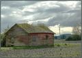
Home Sweet Homeby OzzieComment: Personally I would have gotten a little closer and tried to show more house with better detail on the roof. In this shot I find its the stuff growing on the roof that makes this photo interesting. I'm also not fond of the grey border on this photo and think it would have looked better black. Good luck in this chalenge. |
| Photographer found comment helpful. |
| 04/18/2005 07:29:15 AM |
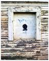
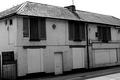
Boarded Upby rookComment: The contrast in the picture is a little bright and makes the picture looked a bit washed. I also think your shot should have included more of the building instead of just a window. I do however like the paint peeling off the buildings exterior and think it adds to the picture. Good luck in this challenge. |
| Photographer found comment helpful. |
| 04/18/2005 07:27:07 AM |
Spirit Barnby SuntikiComment: I find the building to be a little on the dark side while the sky is way to washed out/over contrasted. The bright spot on the left side is a tad distracting as well. It is a great barn shot tho nd good luck in this challenge. |
| Photographer found comment helpful. |
| 04/17/2005 10:13:51 AM |
|
| Photographer found comment helpful. |
| 04/17/2005 10:07:05 AM |
Abandonedby p3wizComment: lol Nice shot. Did you find mine yet??? a 10 cuz your gonna have to buy coffee's if you win :D |
| Photographer found comment helpful. |
| 04/16/2005 04:34:13 AM |
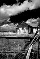
Little House on the Prairieby waterliliesComment: Really neat looking sky but the fence and sky appear to me to be more in focus then the building. I like the border but think you could have gotten away with a little more cropping of the sky to put more emphasis on the building. It is a well composed shot and good luck in this challenge. |
| Photographer found comment helpful. |
| 04/16/2005 04:31:28 AM |
Old Man and the Seaby cpurserComment: a well composed shot and one of the beter I have looked at with a scenic view. The photo looks a little OoF but I bet thats due to the resize for this challenge. Altho I am not fond of the shot I find it fits the chalenge well, its pleasing to the eye, has color (which is rare for this challenge), and is wel composed. Well done and cgood luck with this challenge. <8> |
| Photographer found comment helpful. |
| 04/16/2005 04:27:26 AM |
End of The Little Chefby SteveJComment: The contrast of the sky and off the roof is very distracting. I find it to be a little on the bright side. I also find that the shot is a little OoF and I'm not sure what prompted you to shoot this particular building from this angle. I do however like the B&W conversion and find they all stand out a little more in this challenge. Good luck in this challenge. |
| Photographer found comment helpful. |
Home -
Challenges -
Community -
League -
Photos -
Cameras -
Lenses -
Learn -
Help -
Terms of Use -
Privacy -
Top ^
DPChallenge, and website content and design, Copyright © 2001-2025 Challenging Technologies, LLC.
All digital photo copyrights belong to the photographers and may not be used without permission.
Current Server Time: 08/09/2025 04:51:57 AM EDT.