| Image |
Comment |
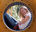
| 01/07/2004 12:44:28 PM |
Young at Heartby ckrolstonComment: I like this. Strong composition. I like the DoF. Good lighting, although I wish there were highlights on the model's face rather than her hand. Yellow element in the background is distracting. Really good expression of the theme. |
 Photographer found comment helpful. Photographer found comment helpful. |
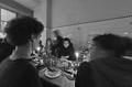
| 01/07/2004 12:38:09 PM |
When you do dance, I wish youby sergutComment: Interesting shot. Action and placement of elements make it a strong composition. Nice tones. I don't understand the title or the fit to the theme though. |
| Photographer found comment helpful. |
| 01/07/2004 12:27:33 PM |
|
| Photographer found comment helpful. |
| 01/07/2004 12:24:40 PM |
Saveby cvt_Comment: Good technically, but too little there creatively to engage me. |
| Photographer found comment helpful. |
| 01/07/2004 12:00:24 PM |
Achieveby sherComment: Good composition. I like choice of B&W. No technical problems. Good expression of theme. |
| Photographer found comment helpful. |
| 01/07/2004 11:57:43 AM |
|
| Photographer found comment helpful. |
| 01/07/2004 11:24:22 AM |
hands offby GinaRothfelsComment: Funny! Nice idea and expression. Filtering needed, as the artificial lighting made all the ice creams unnaturally yellow. |
| Photographer found comment helpful. |
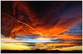
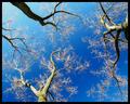
| 01/07/2004 10:53:44 AM |
Reaching new heightsby pitsamanComment: Very good technically and artistically. I like the play of the brightly lit small branches against the dark blue sky. The only distracting blemishes I can see are the two shadows on the branch in the bottom left corner (easy to fix later). Very good expression of the theme. Well done. |
| Photographer found comment helpful. |
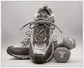
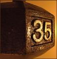
| 01/07/2004 10:36:06 AM |
Hit the Weights!by MJENNIComment: Nice composition, texture, colour and lighting. I would have prefered a little more depth of field so that the '5' wasn't so soft. Thematically - maybe it's me, but I would not have recognized this object as a weight if you hadn't titled it so. |
| Photographer found comment helpful. |
| 01/07/2004 10:30:30 AM |
Three Oh Fourby C_Steve_GComment: Good fit to the theme. Technically weak though. Different lighting would have been better, to avoid the reflection hot spots on the glass and the overall color cast. If that's a belly in the foreground, to have had it more in focus, and lit so that was the same flesh tone as the feet, would have been clearer and less distracting. |
| Photographer found comment helpful. |
Home -
Challenges -
Community -
League -
Photos -
Cameras -
Lenses -
Learn -
Help -
Terms of Use -
Privacy -
Top ^
DPChallenge, and website content and design, Copyright © 2001-2025 Challenging Technologies, LLC.
All digital photo copyrights belong to the photographers and may not be used without permission.
Current Server Time: 08/17/2025 08:15:24 PM EDT.