| Image |
Comment |
| 12/17/2016 10:19:08 PM |
The Witnessesby Bear_MusicComment: My first inclination was that I didn't like this... but the more I look at it, the more I like it. The colors threw me at first, but I'm starting to appreciate it more. Maybe a touch too much magenta in the blacks. |
 Photographer found comment helpful. Photographer found comment helpful. |
| 12/17/2016 10:16:16 PM |
|
| Photographer found comment helpful. |
| 12/16/2016 09:02:55 AM |
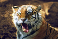
Hairballby riotComment: Greetings from the Critique Club Eugene.
This is a pretty funny shot. It takes a majestic animal and makes him a little more like a house cat. Great timing.
Sounds like you did a lot of editing on this. It doesn't look overworked, so I think you were successful there. I agree that a damp green background might have been a little overpowering, but its hard to tell without seeing it. I personally think you should have darkened out the background a bit more to make the tiger stand out as the subject a little more. As it is, he and his hairball appear a little to muddled by the background and I don't think they demand enough attention. On first inspection (I try to just give it a real quick once-over before really analyzing it.) I missed the hairball altogether. Not until I read the title did I begin to see the hairball, and then the link to the challenge. That may be at the heart why this didn't score a little higher.
Technically the shot is pretty good, but with any portrait, the key is in the eyes. I know you can't really control the lighting there in the zoo, but I wish the tigers eyes stood out more. Here, instead of the eyes, I find myself looking at the nose. I think that's also why the hairball doesn't stand out. For some reason my eye just stays fixated on the details of the nose.
Anyways, I hope that gives you a little insight at least into what I saw, and some food for thought. Cheers. |
| Photographer found comment helpful. |
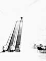
| 12/12/2016 10:07:23 AM |
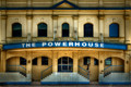
The Powerhouseby JudiComment: I do like this shot, but I personally wonder if it would have been more powerful without the young girl. Possibly an older person descending the stairs if you felt like it needed more subject - but I don't think it does. The saturation and colors are great, the evenness and crop make it powerful. The girl is out of place in my mind. I even wonder if you could have cropped it even tighter, keeping the center-line and the bottom crop location - really emphasizing the stairs and the geometry. The area above the second story windows isn't doing anything for the image. I could be wrong, but I'd still like to see it.
Cheers. |
| Photographer found comment helpful. |
| 12/10/2016 11:02:01 PM |
A Cow's Hurdle by WonderDudeComment: Greeting from the critique club.
I appreciate the impressionistic look of your photo. However I don't believe that is what you intended. A big blown up photo like this is a serious technical challenge, and I think that your camera just wasn't quite up to it. It looks like you struggled with noise that you were trying your darndest to elliminate. It was a good effort, which works when small, though looks poor when blown up on a big screen. Otherwise, I would have loved some creativity here in some way. Something to make it unique.
I hope you gathered a bit of insight from this critique, cheers. |
| Photographer found comment helpful. |
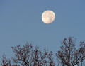
| 12/09/2016 05:34:41 PM |
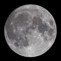
Moonby ladpupmoeComment: Greetings from the Critique Club, Peggy. Sorry this review is a little late.
The first thing I notice is that the image is very common. There are two common subjects with no special interaction between each other. You brought out the detail pretty well in the moon, but its not a big enough subject to really appreciate the detail.
I notice the moon is at 1/3 vertically, but horizontally its in an awkward spot, not at center, and not at 1/3 - the common locations for subjects. That's not to say there is anything particularly wrong with what you have, its just awkward. I also notice a lot of noise in the shot. Adjusting that out could make this incrementally better.
I could see this image getting a little more interesting if you were to position the moon at 1/3, or even further towards the edges... just to give a little more playfulness. I think it would also be interesting to bring up the contrast a lot and bring down the saturation to give it a little more of a artsy graphic feel. I'd also like to see what it would look like with the moon positioned differently relative to the tree branches - just to see what it could do. I would have tried to walk towards the tree and seen if there was any interesting composition to be had - add some interest. To get rid of the sensor noise, try a lower ISO (might require a tripod).
Hope you found some value in this. Cheers. |
| Photographer found comment helpful. |
| 12/09/2016 05:17:25 PM |
|
| Photographer found comment helpful. |
| 12/07/2016 11:26:17 AM |
|
| Photographer found comment helpful. |
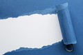
| 12/07/2016 11:25:42 AM |
Torn Blue Paper by clickodakComment: Personally, I like the left half of the image much better than the whole thing. I'm not a fan of the rolled paper and sardine can tab. That half doesn't mean anything to anyone other than maybe just being "clever". It looks like you just wanted to fit a theme. Taken out of this challenge context, I think this image falls flat - there would be no hope of a viewer "getting it". The left side of the image could at least be viewed as emulating mountains or a river or something. The right half is just "why"? Don't take this wrong, I appreciate the creativity, I just didn't see it the same way everyone else apparently did. Figured even blue ribbons need a little dissenting opinion from time to time to help them grow. Cheers. |
| Photographer found comment helpful. |
| 11/09/2016 09:20:51 PM |
|
| Photographer found comment helpful. |
Home -
Challenges -
Community -
League -
Photos -
Cameras -
Lenses -
Learn -
Help -
Terms of Use -
Privacy -
Top ^
DPChallenge, and website content and design, Copyright © 2001-2025 Challenging Technologies, LLC.
All digital photo copyrights belong to the photographers and may not be used without permission.
Current Server Time: 07/31/2025 12:23:19 PM EDT.